Who doesn't like watermelon? I don't think there is anyone who doesn't. Probably no other food encapsulates summer as much as a watermelon.
Hers is my take on the simple watermelon. Delicious slices. I've painted these two pieces of watermelon with just a little bit of a shadow underneath. I wanted to give some dimension to these slices, not just make them pink slabs with a green end and some black dots.
What I did was to make the hard edge of the slice the lightest part of the painting. normally, I like the foreground to be the darkest part of my paintings, but here I had to make an exception. The white on the corners is supposed to, along with the drawing, make this really look three dimensional. I think I've accomplished that somewhat. Tell me what you think.
Hope you enjoy this little painting I did. If you would like to see a video of it, check it out below. Thanks for the quick read. Stop back again for the next update.
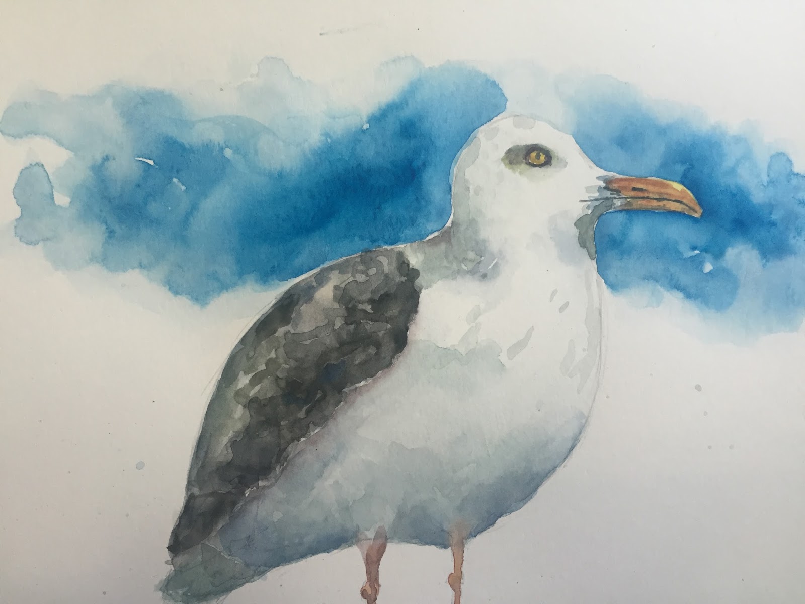
I've been invaded by seagulls!!! Living near the ocean, it's hard not to see seagulls every day. Usually I try to pay them as little mind as possible. For some strange reason, I got a hankering for painting them. Here is what I came up with. One I did on my lunch hour, and one I did in the studio.
There are bits of both that I really like, and bits on both that I wish I could do over again. I'll not go into what things are which, but let you all take a guess at it.
On both of these, I started drawing from the head, and, as it turned out, should have either made the head smaller or started higher up on the page. The bird kind of ran off the bottom of the paper. For me its not a big deal since I don't like painting feet anyway, but it would have made a bit nicer picture if the bird was planted on something.
As in the past, I did make a video of myself painting this seagull. If you have an interest, please check out the video below.
Thanks for the quick read, and I hope you enjoy the paintings.
Ok, the title is a little misleading. I kinda did that on purpose. Every time I put a title like that I get a massive amount of hits to that posting. I am sure the same will happen to this one.
But what I actually have is a Blue Footed Boobie. Fantasticly weird bird. He was fun to paint, and fun to research, I'm gonna keep going with painting odd, different things that most people wouldn't paint. This one is a start. Anyway, he's fun and funny.
I struggled with two things on this painting, and if I had to do it again I would change a few things. First, I would put some green in the lower half of the sky. Make it look like very far away hills. His right foot just gets lost. I don't really like that at all. Secondly, I would barely tap in the shadow that is under him. I got a bit carried away with it in this painting.
I might just have to paint this guy again just to make those changes, or maybe I should do a whole series of paintings of boobies. I'll think about it. At any rate, there is a video that goes along with this one. You can check it out below. Thanks of the quick read, and the view.
So here is it, the first piece I've made to display my art. I've got stacks of painting in the studio and yes, I could pin them to the wall, but that would put holes in the paper. I don't really want that. What I wanted was a quick and easy way to display my paintings. Something I could move around at a whim, was cheap, and something I could make all on my own.
Enter Mr. Fork. The perfect utensil for the job.
The fork is nearly perfect. Its got a long handle that will help support the paintings as they as standing upright. The tines can be bent so that the ones in front hold the picture in place, and the ones in back provide stability. If the handle isn't quite at the right angle, its just a quick bend away to make everything perfect.
So with that in mind I set about trying to make one of these. Yes, before you ask, I do have a video of my making one, but lets not get ahead of ourselves. This one is actually the only one I've made to date. I've got a stack of other forks, but have yet to set about bending them. You can see that it really doesn't take very many bends to make a highly effective holder. The only thing to watch out for is that you get the two upward bends of the outside tines as close to the same as possible.
Once you've gotten the outside tines bent, the rest really is just adjustment. You can make the fork sit up higher, or lower, you can adjust up or down the handle. Whatever you want.
But you know what? I don't want to give away too many of my tips here. If you want them all, you are gonna have to watch the video below. Don't worry, its short and painless. LOL.
At any rate, enjoy the picture, enjoy the video, and thank you for the quick read.
So, I've been trying to get better at painting animals. I love cats, so it made sense that I would paint a few of them. I've tried to paint animals in the past and have always been disappointed in how I painted fur. At that time I was trying hard to make photorealistic paintings. It was all ok, but thats not really how I want to paint. I want to give the impression of a thing. When you look at one of my paintings I want you to get the emotion and feeling that I put into it out of it. If the painting looks exactly like the object it was taken, great, if it doesn't so be it.
So, here I am painting this cat, and wanting to convey to you a bit of grumpiness from this cat without explicitly painting a perfect cat. I think you get a bit of that from this cat.
Want to see how I painted it? Check out the video below. Want me to paint something for you? Curios how someone would paint something. I'd love to take a crack at whatever you can dream up. Leave me a comment or shoot me an email. Thanks for the quick read, and enjoy the video.
Back again with another bird painting. This one is a great blue heron. These prehistoric birds are all over the place where I live, and I hope you have them where you live too. Here they stalk the tide pools and seashore looking for small fish to eat. I've even seen them in the fields and on the golf course looking for mice or moles. A big one can stand in excess of 4 feet tall. I don't know what its wingspan is, but its big. They will stand motionless for quite a while waiting for a tasty morsel to come into range. As soon as it does,... Whammo! Thats is. Feeding time.
I've got a nice heron her for you to view. He is in a classic standing stance. Just surveying his surroundings, waiting, biding his time. I've used a healthy dose of cerulean blue in this painting. Used it both in the bird and on the background. The bird itself is tempered with a little mix of my own grey too.
For those of you interested in seeing how I painted it, you can view the action below. Even if you don't give a view to the video, thanks for taking the time to read a bit about this bird. Enjoy the video.
Alas, that ever present bird has made a comeback on Dabfly Arts. Living by the water, I see them every day. Some days they look like they are having fun floating on gentle ocean breezes, others they look like they are hating life trying to stay warm in a cold winter wind. This guy falls into the former category. He is definitely loving life. Nice warm climate, a nice dock to stand on.
Birds are fun to paint. I don't know why I like them so much. I guess its because each one has its own personality. Every bird I paint gets its own story. This one is definitely looking at something on the dock. Maybe a tasty bit of food has blown onto the wood, he has just seen it, and it about to go over and have a snack.
Whatever his real story, he was a blast to paint. I hope you enjoy it. If you want to see how I did it, I have, as has become my custom, made a video of it. You can see it below. Thanks for the read, and the view if you have the inclination.
I must be on some kind of bird painting kick. Here, I've painted an Oriole. He is sitting on what appears to be a broken branch.
This bird was really fun to paint. The vibrant orange color is made from a couple of different reds, and a couple of different yellows. I did use a pre-mixed grey (payne's grey) but I augmented it myself. I don't usually use the grey right out of the tube. It's mot a bad color, just a little bit flat.
I've given the bird just a few indications of feathers. Just enough to enhance the shape of the bird.
He sits on a stick that has obviously seen better days. Its got some pitting and dents in it.
The background was originally going to be a bit more mottled, but I think I forgot to mix another color into it. As it is, the colors are phthalo blue and ultramarine blue. The green parts are windsor green and viridian. The blue behind the orange really makes this bird pop off the page.
Well, I hope you enjoyed the painting and the quick read. If you want to see how I painted it, check out the following video.
So, I went fishing and didn't catch anything. As a consolation, I painted this fish. Ok, thats not actually how the story goes. I did go fishing. I didn't catch anything. I did have fun fishing with my children. That fishing trip had nothing to do with this painting.
I've been meaning to paint a betta for quite some time. My friends over at Doodlewash painted one about the time I was getting started. I didn't want to post mine close to the time that that one was painted. So I waited. Finally, I was kicking around the studio the other day when I came across the reference photo for this. Finally, I had to paint it. I will admit that the background needs a bit of work. I wanted a really mottled background that had a lot of interest. What I ended up with it s a background that is rather plain. I will admit that I am a bit disappointed with it. But no mind. It is what it is. I enjoyed the experience painting it. You can too by viewing the video below.
Thanks for the view. Hope you enjoy.
If you want to see the video in less than half the time, there is a speed painting of it too.
As you have seen in an earlier post, I've started on my Christmas cards a bit early this year. I didn't want to wait until the end and then have to rush to get them done.
Yes, this is essentially the same card I did last year, if you were lucky enough to receive one of those, but with a couple notable exceptions.
Even though this years cards are not really what poinsettias look like they are much closer than I got last year. Last years had much longer thinner leaves/petals. This year, I've moved to a bit more of a realistic flower, but not too far.
This flower, as you can see, has red petals, but each petal also has a healthy dose of yellow also. The effect gives the petals a lot of life in them. They look much better than just a plain old red petal. And if you look closely at the second level of petal, you will see that not only is there yellow in the red, but the shadow color is actually green. 3 colors in those petals!!! Finally, the green leaves aren't just green, they have a bit of yellow in them as well. Just enough to bring them to life a bit.
Well, thats probably more than you wanted to know about how I painted this christmas card, but since you asked. Oh, wait, you didn't? Well, I wanted to tell you anyway. And don't forget, if you want to watch me paint it, you can do it below. Thanks for the quick read, and take a look at the video, it's really pretty good.
Don't forget I've got some social media accounts. Check them out below.
Links: YoutubeInstagramTwitter
So, I have started painting my Christmas or Holiday cards for this year already. I want to start early. Last year I got a little behind, and it was hard trying to catch up. So here is the first one that I am posting. It is of course some hanging ornaments.
You might wonder how I got the balls so perfectly round. Well, let me tell you. Electrical Tape. It is the perfect size for balls on a 5 x 7 card.
So, I figure I've got about 20 cards to paint. It seems like a lot, but not a lot. Between work, family and friends, that could easily be many many more. I've limited the number to just those that have made the biggest impact in my life over the previous year.
The cards? Well, last year, i bought packs of them at the local hardware store. This year.... Amazon. I got a pack of 100 for 30 bucks. Thats pretty good. I'm pretty sure that means I get them for 30 cents a piece.
I think this one looks pretty good, and its pretty easy to paint. If you have an interest in seeing how it did it, you can watch the video below.
I did a similar painting several months back. It just kind of happened organically. I didn't purposely go into thinking I would paint all the negative space around an object, but it kind of worked that way. In this painting, I specifically set about trying to paint only the negative spaces. I do with I had mixed in maybe a little purple or magenta with all the blue but I came out pretty neat.
Also, I think, that if I do this again, or maybe I'll go back and do it on this painting, that I'll incorporate some veins into the leaves. I did put the button in the middle of these flowers, but that was all. Perhaps a bit of veining will really bring this painting to the next level and give the leaves a little more texture and depth.
Well, regardless of whether I go back and do more or not, I had a great time painting this one. I hope you enjoy the painting, and if you would like to watch it, I do have a video of how I did it.
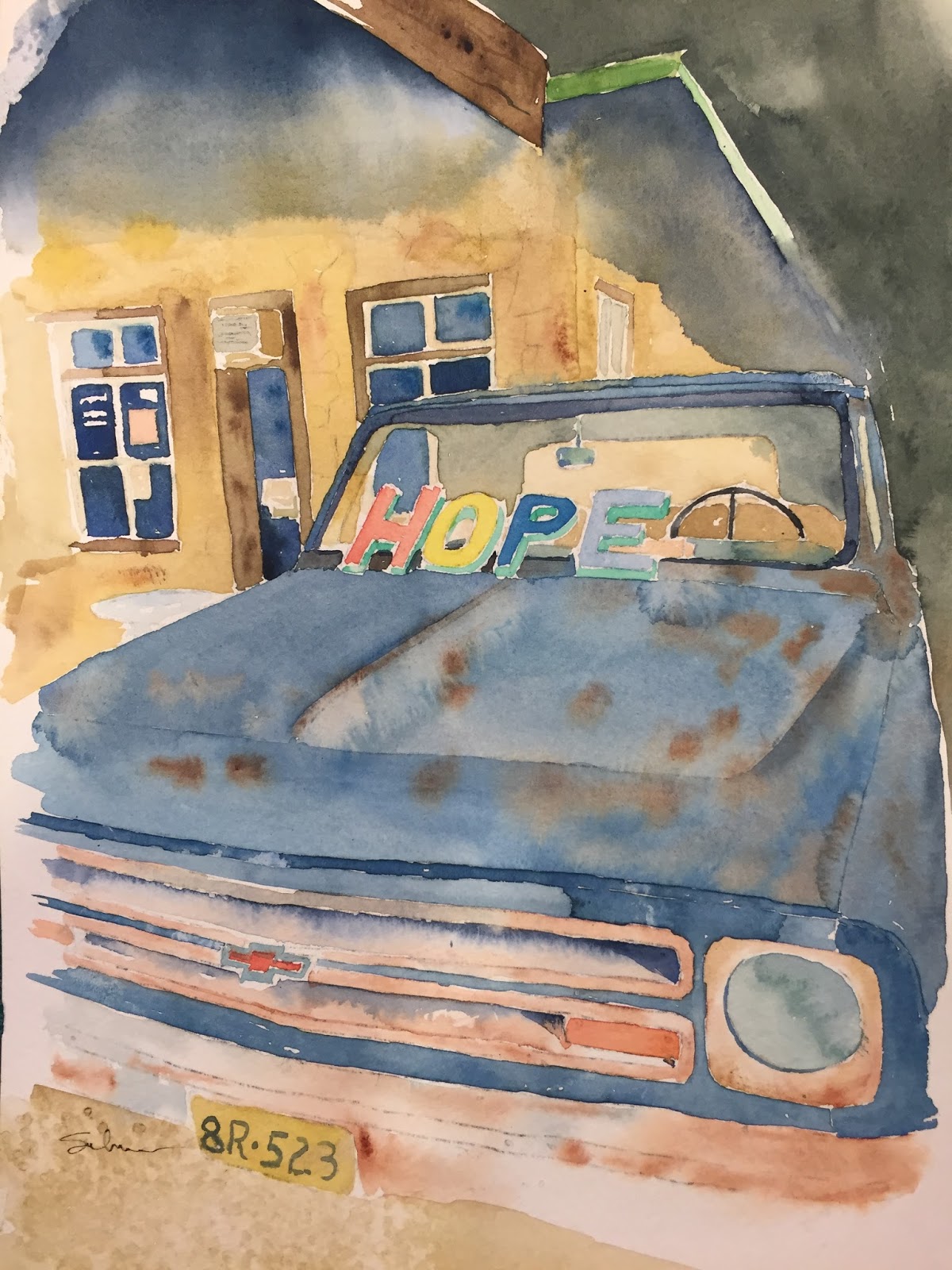
This is my latest painting. It is the HOPE truck from Dripping Springs, Texas. A friend of mine took the picture and it was too much for me not to paint it. I had a great time with this. I love all the rust and faded colors.
Painting the shadow and darkness at the top of the painting (under the eaves and the tree shadow behind the building) was completely terrifying to paint. I had what I thought was a good painting, but needing the shadow and I had to put it on. the color is so dark, I was afraid I would totally mess it up.
Luckily, I like the way it turned out.
I was told that maybe i should have left the windows jus ta bit lighter, and darkened the ground below the truck. Hmmm. Something to think about.
I love this painting. It is hanging proudly in my office. I'm so juiced at the way this one turned out, I can't wait to paint my next one.
Oh, and by the way, if you want to see how I did it, I do have a video. Thanks for the quick read. Hope you love the truck as much as I do.
I've been doodlewashed!! Our good friend Charlie over at Doodlewash asked me if I would do a small piece for his website. He's got quite a few people asking for videos for beginners, and boom! there I was.
Check out his website. Not only is Charlie a fantastic artist with interesting paintings and takes on his paintings. He also asks guest artists (such as myself) to submit for his site. The result is a website that is replete with interesting and beautiful artwork. Please take a moment and check out his site.
Here is a picture of a VW parked on the street. Could be anywhere, but in my mind its somewhere like Philadelphia. Or maybe some other big city in the eastern US.
The car is just sitting on the side of the street begging to be painted.
Oh, like many of my paintings from the past few months, this one comes with a video. If you have an interest and wanna see it, click the link below.
Here is a little painting I did over the weekend. It Pictured Rocks National Lakeshore in the Upper Peninsula of Michigan. I've been there many many times and it is truly a beautiful place to be. I painted a picture of the lakeshore a few years ago and always wanted to do another one, but never got around to if for some reason. Well, last night, I finally did it. I make myself sit down and paint it again. Of course, I had to make a video to go along with it.
I had a lot of fun painting it, I hope you enjoy viewing it. and if you are so inclined, paint along with me.
I haven't forgotten about all you avid Dabfly Arts readers. I have been busy. In the past week, I've worked overtime, held a garage sale, been across town about 14, flown to the moon and visited the rings of Saturn. Let's just say I've been a bit busy. Well, no matter, I'm back and putting up the pictures I should have been putting up all along.
The first painting is of course some apples still on a tree. They must be getting ready to pick they are slowly turning red. The second a Scrub Jay which we have in the western states. They are actually really nice birds, not like those nasty Blue Jays. Finally a simple painting of a Kingfisher. Each of these now comes with a video showing how I made it. (Picture on left, video on right) Take a look to see how I do it. Thanks for the view.
These Two were practice for my video ( which can be found here. ) I just threw on a mottled background to make the birds stand out a bit. They were a little too stark on the white paper. I love painting birds, and think these came out great. I hope you enjoy them, and if you have a chance, take a look at the video.
I'd love to get some feedback on the paintings, both here and on youtube. If you've got a moment, leave a message, and/or like and subscribe to my channel.
For anyone not able to follow the link above, here is an additional link to the video.
I had a lot of fun with the previous painting of Chinese Lanterns that I did. I thought I would see if I could recreate what I did.
Again, like last time this was a quick painting, trying to let the paint do whatever it wanted to do on the paper, and as little as possible on the palette.
It had been a few days since I picked up the brush and I wanted to make sure I don't forget to do that. So, today, like many days, I substituted lunch with painting. This is what I came up with. I like it, hope you do to. Thank you.
Another lunchtime sketching session today! We all walked across campus to the market and sat at picnic tables. I didn't have the best view, so i decided to paint what was right in front of me, literally.
Ed was busily painting the CAMPUS MARKET sign above the doorway while I was painting him. When we were done and comparing paintings, we all had a good chuckle over my painting of Ed.
Yes, I know that the painting is completely bisected by the umbrella pole, that is kind of the point. We are trying to paint exactly what we see. I could have looked around the pole to paint Ed, but for what we were doing this is much more accurate, fun and funny.
I'm having just a bit of trouble with this paint kit. I feel like the paint is either too strong or too weak, and I can't quite get it right. The background in this painting should have been weaker to push it back further, and the cement table should have been a bit darker to bring it forward. Well, live and learn. It was still fun.