Ahhh... one of my favorites. I love little turtles. In fact, I used to have one. His name was Tucker, and he was the funniest little guy. We don't really think of turtles as having a personality, but I kid you not, Tucker had one. Tucker was by far the most social turtle I have ever been around. Instead of diving in the tank to get away from you, he would try to swim towards you. And when I took him out of the tank, he would follow me around my apartment wherever I went. When I sat down, he would stop right by my feet, and when I walked away, he got up and followed me, albeit at a slightly slower pace.
Well, here I've painted a red eared slider. I think it turned out really nice, and this guy looks totally at home sitting there among the grasses sunning himself.
Anyone wishing to try this out will find it fun and rewarding (and it was easier than I thought it would be). Check out the video below to see how I did it. Thanks.
Ahhh the lovely camellia. Such a nice flower. I wanted to paint one and and thought this would be a good time to do some graded washes. Well, I accomplished both of those things with this painting, but I don't think I did either really well.
The painting is OK. There really isn't anything wrong with it, though its a bit banal. I could really have punched this up by doing a couple of things.
See, in watercolor to make a dramatic painting you need to have lights next to darks, and darks next to lights. Well, I've got lights next to darks with the petals. you can see how the center is lighter and the tips darker. This makes for a nice petal (here its a bit bland, but nice). But Ive also got a background that is the same intensity as the petals. There is no room for light and dark to touch, both edges are dark. Hmmmm what to do...
Well, I could just as easily put on another row of petals (this would have made the flower look fuller too. Right now its a bit small). The outside row of petals would have been all light. That lightness would have served two purposes. First, it would have ensured that they looked as though they were behind the petals in front, then it would have allowed me to make my background as dark as I wanted.
Well, there is always next time. I think its a good project for tonight, paint this one again.
If you have interest in seeing how I did this one, watch the video below. Thank you.
With Valentine's Day approaching, I thought it appropriate that I put up a Valentines posting. The first was the idea I had to make a heart into two lovers heads This one has the man on the right and the woman on the left. I added the extra splashes of paint and water to give the picture a little bit of life. I'd do it just a bit differently if I had to do it again, but I think that it tuned out quite nice regardless.
My second picture is two chili's that come together to form a heart. One pepper is just in front of the other. I guess if you have a spicy hot lover, you could give this to him or her.
As with other paintings, I do have videos of these two, you can find them below.
For those of you who still make valentines day cards. I thought that instead of just a heart, it might be nice to do something a little different. The difference is, of course that each lobe of the heart is a persons head. On the left a woman, an don the right a man. They must be in a passionate embrace.
I did a little splatter over the top of the heart to give a little more movement and life to the painting. It's just a valentines day card, but I think its a whole lot better than any card you could buy in the store.
As you have seen in an earlier post, I've started on my Christmas cards a bit early this year. I didn't want to wait until the end and then have to rush to get them done.
Yes, this is essentially the same card I did last year, if you were lucky enough to receive one of those, but with a couple notable exceptions.
Even though this years cards are not really what poinsettias look like they are much closer than I got last year. Last years had much longer thinner leaves/petals. This year, I've moved to a bit more of a realistic flower, but not too far.
This flower, as you can see, has red petals, but each petal also has a healthy dose of yellow also. The effect gives the petals a lot of life in them. They look much better than just a plain old red petal. And if you look closely at the second level of petal, you will see that not only is there yellow in the red, but the shadow color is actually green. 3 colors in those petals!!! Finally, the green leaves aren't just green, they have a bit of yellow in them as well. Just enough to bring them to life a bit.
Well, thats probably more than you wanted to know about how I painted this christmas card, but since you asked. Oh, wait, you didn't? Well, I wanted to tell you anyway. And don't forget, if you want to watch me paint it, you can do it below. Thanks for the quick read, and take a look at the video, it's really pretty good.
Don't forget I've got some social media accounts. Check them out below.
Links: YoutubeInstagramTwitter
So, I have started painting my Christmas or Holiday cards for this year already. I want to start early. Last year I got a little behind, and it was hard trying to catch up. So here is the first one that I am posting. It is of course some hanging ornaments.
You might wonder how I got the balls so perfectly round. Well, let me tell you. Electrical Tape. It is the perfect size for balls on a 5 x 7 card.
So, I figure I've got about 20 cards to paint. It seems like a lot, but not a lot. Between work, family and friends, that could easily be many many more. I've limited the number to just those that have made the biggest impact in my life over the previous year.
The cards? Well, last year, i bought packs of them at the local hardware store. This year.... Amazon. I got a pack of 100 for 30 bucks. Thats pretty good. I'm pretty sure that means I get them for 30 cents a piece.
I think this one looks pretty good, and its pretty easy to paint. If you have an interest in seeing how it did it, you can watch the video below.
What is cooler than a bunch of Sea Lions lounging on a buoy in the ocean. If you are a sea lion, then nothing. These guys are just snoozing and watching life pass them by. It sure was nice of someone to put this out in the harbor for them to sleep on.
If you are a mainlander and haven't come across sea lions before, you really need to make a trip to the coast to find some.
I live a half mile from the Pacific Ocean and I can hear them barking all night long. I don't know how far their voices carry, but it sounds like they are just across the street.
When you encounter them in the wild, they are naturally inquisitive and, of course, always looking for a bite to eat. They patrol the harbor hoping to get anything that might fall off a fishing boat, or whatever tourists toss to them (don't do the latter, please).
Anyway. This one was a hoot to paint, and if I do say so myself, turned out pretty good. I've got a speed painting of it. If you can spend a few minutes it's not a bad view.
In a quick painting session over the weekend, I managed to bang out a few tomatoes. These ones look so good you could pick them off the page and eat them.
I went with a lighter background rather than darker. As I made up the story of the tomatoes in my mind, these were still on the vine in late summer. The heat of August is bearing down on these tomatoes. They are hanging just under a large group of leaves and waiting to be picked.
Mmm they look delicious and ready to pick off the vine and put on your dinner table.
Additionally, I made a video about painting these. Check it out.
I actually meant to make a video about these. I sat down and started painting last night, but the paper and I were feuding a little. Or maybe it was the paint or the water. I don't know but whatever it was, I wasn't feeling confident enough to make a video about these. I am hoping that I'll feel it more tonight, but we'll see.
I have been out of the studio for about a week. I didn't really think I would be able to sit on the stool and paint an entire painting without my back erupting in pain. Last night I ventured out, and the pain was manageable. So, with that in mind i started to dabble again. This is the result.
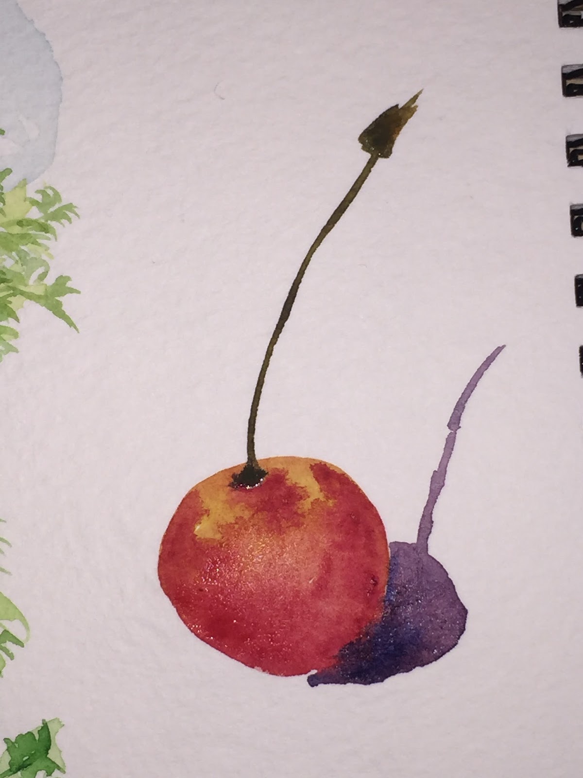
I had a little time on my hands during lunch, so I decided to sketch a few fruits. Yes, red was the theme. I gave myself two minutes a piece to paint each one. I like the apple and the single cherry. I really want o like the double cherry but the shadow i put on it kind of ruins it for me. The tomato..... well, i think it went a little south. lol.
In a first attempt to paint red pears for my video (see video here), I painted these pears. I wasn't really happy with them so i started over and did what you see in the video. I thought, however that I should at least post these that I did in preparation.
I like certain things about this painting, but there are a few I wish I did differently. I should have put both stems from the pears in the rear pointing up. I wanted to cross the one from the back with the one in the front, but in hindsight, I think it causes a little confusion for your eye. Additionally, I think I should have put the red of the background color in the foreground and moved the green tinting to the back. Doing this would have made the picture look a lot deeper.
Well, live and learn. I was trying to do this all in 15 minutes and guess I was feeling a bit rushed. Its still not a bad painting. I like it. Hope you do to...
I painted a few flowers on my lunch hour today. They are just quick coneflower, not the most detailed, but for me, thats ok. I want to give the essence of the flower, not an exact copy of it. I think they look great and were a lot of fun to paint. (yes, I realize I forgot the splatter on the first one.)
Hope you enjoy. (oh, and you might see a video of a coneflower soon.)
This lovely little painting is the product of my video last night. I sat down to just paint some random stuff and flowers popped out of the painting. Ok, I knew I was going to paint flowers, I just didn't know what they were going to look like.
After dabbing some paint on the paper, and allowing it to dry a bit, this is what I got out. Not too bad. Looks like some flowers popping out of a little garden area.
I was painting with my daughter this weekend. I always struggle when we paint together because she want me to paint something totally fantastical, and I want to paint something real. Well, this weekend, I decided to paint what was in front of me. My coffee cup. Ok, it didn't turn out exactly like the real cup, but I think it came out nice anyway.
BTW, she painted a dog that walked over a tree that had fruit in it. The fruit got all over the dogs feet and made tracks all over the paintings.
Yes, if you were wondering I did dip my brush in my coffee by accident. But only once!
Still not quite done with this but I suppose it is near enough. All I have to do is throw on some king of mottled background and voila.
Faces seem to be really hard, and I don't know why. Scratch that, I do know why. We all know what faces should look like. We all know where eyes go, and noses and mouths, ears, etc. And we also know exactly how they should be positioned on the head. We see faces every day, and so, if one object that makes up a face isn't quite right, it makes the whole face entirely wrong.
Well, I got this afce probably as close as any other face I've painted. I think I got a bit stripey with the dark in the hair, but I needed to do something to it. With just strands of red, there wasn't enough depth to it. the stripes really help bring it out. Well, it is practice.
I had absolutely no idea how I was gonna do this. I was worried about color, shape, fur.... I really didn't know what to do. So what I did was this:
I dropped on some basic color. Red/Orange for the face, leaving a little white on the chin and chest, and then some green in the background.
I came back and just started putting in fur in one place then another, then another. Just little bits here and there. Patches no more than a quarter to a full in width and only the length of a few hairs. I perhaps did more under the chin than any other place. Then when it was totally dry, when back over it with another coat of base color. It kind of smoothed it out enough that it doesn't look too staccato, but not so much that it doesn't look like fur. For a first attempt that I made up on the fly, I think it turned out pretty good.
The eyes just turned out to be black spots. Thats not what I was going for, I may have to go back and lift out a little black to give a little more color and drop in a highlight.
Not exactly sure I am finished with this yet, but I'm pretty far along. There are some parts of this that I really love, and some that I'm not quite so fond of.
I really had trouble with the front wheel on this. The fender isn't quite right, and wheel isn't quite right. But after that, I think the whole painting is gravy. I love the back 2/3s of this bike.
I got the shading mostly right, I think, and I got the amount of detail in the engine about right.
I had originally planned on painting all of the engine. Incredibly detailed, like I've tried to do before. But this time, I painted just a few strokes on it, then stepped back, and WOW, it seemed right. I did put in a few more squiggles and lines, but noting approaching any real kind of detail in the engine. Your eyes just kind of fill every thing it.
Like I said to start, I don't know how much more I'm gonna do on this, but I'm pretty happy with it so far.
You knew it was gonna happen. it was only gonna be a matter of time until I got back to painting cars and trucks and the like.
I put on a really loose layer to get some base color, and have been slowly adding to this painting. I think I started a week ago, and while waiting for other paintings to dry, or while in between other projects, I put just a touch of paint here and there. I don't know how much time I've got into this, And I don't know how much I have to go. I'm gonna keep on pecking away at it and we'll see how it goes. For now, it's still a work in progress. enjoy.
Two things I really like. One, for some reason, painting poppies. 2 painting where I don't have to stay in the lines. This painting checked both those boxes for me.
I did one thing a bit different with these poppies that I didn't do with all my other paintings of this style. Normally i'll start by putting down some color in the general shape of the flower, making sure that all the color flows from the bottom of the petals, and gets lighter and less intense as it goes up. then I redefine the shape of the petal on a second layer of paint.
On this particular one, I didn't worry so much about keeping the bottoms intense. I really let the paint and water go where it wanted to on the first layer. As a result I got a fairly uniform layer of paint. Albeit a layer that still had not a lot of shape or definition to it. As before, I went back with a second layer and defined the petal edges. The only difference is that on this one, I tried to then go back to the base of the petal and put in some intense red and let it diffuse to the now defined petal edge.
Not entirely sure I was successful. But from looking at the picture, I wasn't completely unsuccessful either. Enjoy.