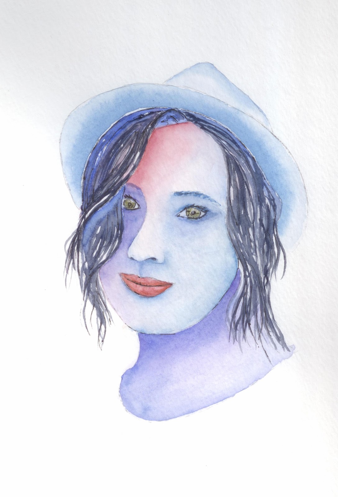
Still not quite done with this but I suppose it is near enough. All I have to do is throw on some king of mottled background and voila.
Faces seem to be really hard, and I don't know why. Scratch that, I do know why. We all know what faces should look like. We all know where eyes go, and noses and mouths, ears, etc. And we also know exactly how they should be positioned on the head. We see faces every day, and so, if one object that makes up a face isn't quite right, it makes the whole face entirely wrong.
Well, I got this afce probably as close as any other face I've painted. I think I got a bit stripey with the dark in the hair, but I needed to do something to it. With just strands of red, there wasn't enough depth to it. the stripes really help bring it out. Well, it is practice.
Showing posts with label face. Show all posts
Thursday, June 18, 2015
Wednesday, October 8, 2014
Portrait of a Friend of Mine
I've been trying to work back slowly into this watercolor thing, and I like painting birds but.....I guess I just needed to do something a bit more.
In addition to posting my artwork here, on my art blog site, I post to G+. Somewhere on G+ I ran into a fellow artist and contributor named Kelly. I didn't really wanna paint a picture of myself (tried it, bad subject matter that turned into a bad portrait), but I wanted to paint a portrait. Kelly was gracious enough to allow me to paint a picture of her. Two days later and this is what I came up with.
BTW, if you are interested in some good artwork and an uplifting look at life, check out her blog site.
So, I think I'm getting a little better with hair, though its a long slow process. And I guess I can say the same about portraits in general. Looking back at the first portraits I've done, I see some really rudimentary work. This one, while not a Rembrandt by any stretch is miles ahead of what that one was.
I feel like I am not nearly as afraid to leave a hard edge on the paper. I used to be afraid to do that and had to smooth all the edges before I could move on. It made it an extremely long process to do anything. Like probably 2 or 3 times as along to paint any given picture. Yes, on this I did smooth a few edges out. I didn't feel as though I should leave all hard edges, but a few weren't too bad. It's a little unfortunate that I used the mixed media paper instead of watercolor paper because the water kept pooling and made it harder than I think it had to be. But I just thought that with as hot as its been here, the watercolor paper would dry too fast.
Here is the picture I used as a reference. I had a little trouble with the shadows in her hair on the right hand side of her head. If I were to do this one agian, I would try to get that a bit better, but I'm happy with it. I think the representation of Kelly is pretty good. And what is more important is that when I sent this picture to her, she liked it. In the end, I think that is more important than producing a great work of art. I got the enjoyment of painting it, and she got the enjoyment of seeing it. For me that's enough.
Hope you all enjoyed this as much as I did. Enjoy.
In addition to posting my artwork here, on my art blog site, I post to G+. Somewhere on G+ I ran into a fellow artist and contributor named Kelly. I didn't really wanna paint a picture of myself (tried it, bad subject matter that turned into a bad portrait), but I wanted to paint a portrait. Kelly was gracious enough to allow me to paint a picture of her. Two days later and this is what I came up with.
BTW, if you are interested in some good artwork and an uplifting look at life, check out her blog site.
So, I think I'm getting a little better with hair, though its a long slow process. And I guess I can say the same about portraits in general. Looking back at the first portraits I've done, I see some really rudimentary work. This one, while not a Rembrandt by any stretch is miles ahead of what that one was.
I feel like I am not nearly as afraid to leave a hard edge on the paper. I used to be afraid to do that and had to smooth all the edges before I could move on. It made it an extremely long process to do anything. Like probably 2 or 3 times as along to paint any given picture. Yes, on this I did smooth a few edges out. I didn't feel as though I should leave all hard edges, but a few weren't too bad. It's a little unfortunate that I used the mixed media paper instead of watercolor paper because the water kept pooling and made it harder than I think it had to be. But I just thought that with as hot as its been here, the watercolor paper would dry too fast.
Here is the picture I used as a reference. I had a little trouble with the shadows in her hair on the right hand side of her head. If I were to do this one agian, I would try to get that a bit better, but I'm happy with it. I think the representation of Kelly is pretty good. And what is more important is that when I sent this picture to her, she liked it. In the end, I think that is more important than producing a great work of art. I got the enjoyment of painting it, and she got the enjoyment of seeing it. For me that's enough.
Hope you all enjoyed this as much as I did. Enjoy.
Labels:
face,
Kelly Murphy,
portrait,
stare,
sunglasses,
watercolor
Location:
Morro Bay, CA 93442, USA
Tuesday, June 3, 2014
Sunglasses
I still don't think I've mastered hair, but I definitely think I'm getting better at it. Ok, ok, it's a slow go to get better, but as Dr. Leo Marvin said to Bob Wiley, "Baby Steps."
My big regret with this painting is that the shadow on her cheek looks a little to linear. I tried to fix it, but it didn't quite work out and I didn't want to futz too much.
Location:
Morro Bay, CA 93442, USA
Friday, May 23, 2014
Face, Finished
Stop me if I've said this before.... I hate hair. Hair is so hard to paint. I feel like I am never gonna get it. I thought I might have been onto something with the hair on this painting, but then.... no. What you see on this is mostly done with watercolor pencil. I put on a basic color of the hair, then tried putting in some detail with the brush. Err, grrrr, huh. Terrible! So then I tried to fix it a bit with watercolor pencil. I guess that it isn't too bad, but I wouldn't say that it's good either.
Ok, lets get off the hair and try to look a little more critically. I tried to get a little color in the whites of the eyes. and I guess I did that, but they still look flat. The lips fell a bit flat too. Maybe a bit of highlight with my favorite white pencil would help that. I don't know. I do like how the ball of the nose is. Can't believe that that is my favorite part of the painting. LOL. I just think thats kinda funny.
Well, hope you enjoy it.
Ok, lets get off the hair and try to look a little more critically. I tried to get a little color in the whites of the eyes. and I guess I did that, but they still look flat. The lips fell a bit flat too. Maybe a bit of highlight with my favorite white pencil would help that. I don't know. I do like how the ball of the nose is. Can't believe that that is my favorite part of the painting. LOL. I just think thats kinda funny.
Well, hope you enjoy it.
Location:
Morro Bay, CA 93442, USA
Wednesday, May 21, 2014
Face WIP
Trying to get back into painting again after a month off. I think I've said that before. And I don't really have any specific thing that I want to paint, so on a whim I decided to paint a face. I've seen lots of portraits that look absolutely fantastic, and then I look at mine and they usually, well.... don't look fantastic. The best luck I've had with faces is many really light, transparent layers. Usually, I don't have the patience for that kind of nonsense. For me it seems like I put on a few light layers, here, a little there..... then.... BAMMO!! Whoops, too thick, or too heavy, or too opaque. Then I've got a painting that looks like a 3rd grader did it. Hmmm. well, what to do? Maybe with a little work, and a lot of luck, I can conquer that whole, glob the paint on thing.
With this painting, I've got lots of layers on it. Really thin! I put on some, then take some off, then put some on, then try to make the gradient go to nothing. Then repeat. Even having done this, I've made some major mistakes, but thats ok. I don't pretend to be perfect, and I certainly don't pretend that my paintings are.
I've forsaken the brush on this picture in lieu of watercolor pencil on several places on this painting. I'm sure you will be able to pick the places out quite easily. Again, that's ok. This is a WIP (Work In Progress). I don't know if the watercolor pencil will still be visible when I am totally finished or not. If they are, good, if they aren't, that's good too.
Well, I haver too much sometimes. Err, well, maybe I don't. Maybe you all want to hear about this. No, definitely havering. With that..... I'm out.
Location:
Morro Bay, CA 93442, USA
Tuesday, November 19, 2013
Lips Incorporated
Ok, so last week I did a little study on eyes. This week I am doing a small study on lips. I had a few minutes at lunch so I quickly drew out some lip shapes, and then splashed on some paint.
Oh, and the flower was an extra doodle that just worked its way there. No real reason why.
I saw a quick video on how to make lips a little more realistic, and thought I would give it a chance. Basically it went like this.
1. Draw two circles separated by a third (invisible) circle, all of them the same size.
2. draw a center line where the lips meet. The line should be slightly raised in the middle.
3. Draw a third circle the same size as the first two below the center of the mouth, as distant from the line as the two circles above it.
4. Make an arc just above and between the two circles above the mouth.
5. connect the arc to the ends of the mouth and connect the two ends of the mouth by drawing a line around the circle on the lower lip.
TA DA - now you should have two basic lips.
I guess it helped a little. I don't know how great a help it was, but it did get me drawing and sketching.
Now, I tired to put my eyes and mouth together. I know its not a great painting. Remember, I'm sketching quite quickly. I just kind of guessed at the proportions of nose to mouth to eyes, so that might be a bit off. I'm still not happy with the eyes. More practice!!
Oh, and the flower was an extra doodle that just worked its way there. No real reason why.
I saw a quick video on how to make lips a little more realistic, and thought I would give it a chance. Basically it went like this.
1. Draw two circles separated by a third (invisible) circle, all of them the same size.
2. draw a center line where the lips meet. The line should be slightly raised in the middle.
3. Draw a third circle the same size as the first two below the center of the mouth, as distant from the line as the two circles above it.
4. Make an arc just above and between the two circles above the mouth.
5. connect the arc to the ends of the mouth and connect the two ends of the mouth by drawing a line around the circle on the lower lip.
TA DA - now you should have two basic lips.
I guess it helped a little. I don't know how great a help it was, but it did get me drawing and sketching.
Now, I tired to put my eyes and mouth together. I know its not a great painting. Remember, I'm sketching quite quickly. I just kind of guessed at the proportions of nose to mouth to eyes, so that might be a bit off. I'm still not happy with the eyes. More practice!!
Location:
Morro Bay, CA 93442, USA
Thursday, July 18, 2013
The Next Drawing
Ok, here is the next drawing. I even managed to erase the gridwork over her face. I know you need to put dark next to light when drawing. It helps to add form to what you are drawing. I tried it with this. Not sure if it is working for me or not. Well, I think this is a good effort none the less.
Wednesday, July 17, 2013
Lunchtime Drawing
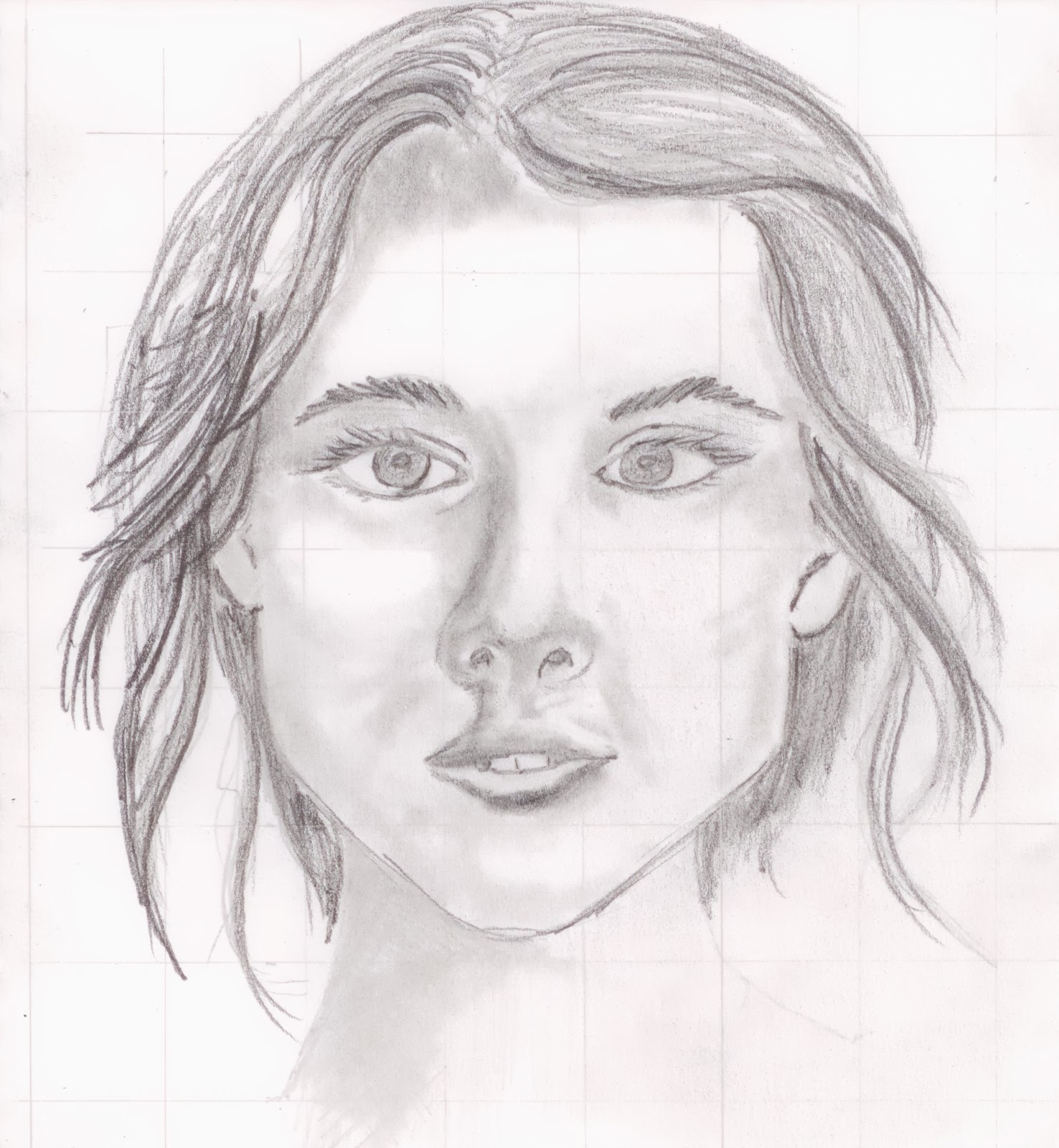
So, I am determined to become better at drawing. So, today during lunch, I drew a face. Here it is. As you can see I used a grid to make sure I had all the proportions and everything right, and set apart to draw it.
Well, as you can see, it helped, but not enough to make it look great. I guess there is still a lot more to learn. I'm gonna be sticking with this whole grid thing for a while at least in order to figure out proportions and what not. I've got a grid draw on the photo I drew this from so you may see this one again at some point.
Hope you enjoy looking at this slightly cross-eyed girl. lol
Well, as you can see, it helped, but not enough to make it look great. I guess there is still a lot more to learn. I'm gonna be sticking with this whole grid thing for a while at least in order to figure out proportions and what not. I've got a grid draw on the photo I drew this from so you may see this one again at some point.
Hope you enjoy looking at this slightly cross-eyed girl. lol
Friday, June 7, 2013
Senorita
![]() |
| This painting for sale. Watercolor 9x12. $30 |
I'm proud of this painting, and it is gonna hang in my office for a while. I've taken down all my previous paintings, and made room for everything I am going to paint over the summer. This is a great start to the wall. I'll probably do some more portraits, at least until I feel I've mastered eyes, and lips and hair. I'm working on more pictures of Ellie, and I want to start a series of everyday things. Be sure to watch out for them
Hope you enjoy the painting. I enjoyed painting it. Thank you.
Thursday, May 16, 2013
The Best Subject Matter
Well, I have finally found the perfect subject to paint, and if you cannot tell, it's me! LOL. Ok, I was busily pouring through the internetweb looking for a picture to paint, when I thought to myself, "Self, I think I ought to paint myself just to see if I come out with something recognizable.
I think what I came out with it something that is a little closer to a police sketch than a photograph. Actually, now that I am looking closer at this, I look more like Data from Star Trek than a real person. I'm not totally disappointed with it since I can still recognize myself, but I think i need a little more work before I go into the portrait business.
I tried hard to get a lot of subtle color into my face. I don't know if you can see them all but there are reds, greens, blues, purples, and yellows in my face. All of these together help to give a lot of texture to my skin. I wasn't going to put on any background, but I had some leftover paint on my palette and thought I would just use them rather just cleaning them off.

Some of you are going to look at this and tell me I don't quite have the eyes right, or the eyebrows or the mouth or ...... It doesn't matter. Please don't tell me I didn't make an exact copy of this picture. I know that. This is a practice exercise and thats all.
You all might have to get used to seeing some more pictures of me. Ha ha ha ha ha.
I think what I came out with it something that is a little closer to a police sketch than a photograph. Actually, now that I am looking closer at this, I look more like Data from Star Trek than a real person. I'm not totally disappointed with it since I can still recognize myself, but I think i need a little more work before I go into the portrait business.
I tried hard to get a lot of subtle color into my face. I don't know if you can see them all but there are reds, greens, blues, purples, and yellows in my face. All of these together help to give a lot of texture to my skin. I wasn't going to put on any background, but I had some leftover paint on my palette and thought I would just use them rather just cleaning them off.

Some of you are going to look at this and tell me I don't quite have the eyes right, or the eyebrows or the mouth or ...... It doesn't matter. Please don't tell me I didn't make an exact copy of this picture. I know that. This is a practice exercise and thats all.
You all might have to get used to seeing some more pictures of me. Ha ha ha ha ha.
Labels:
blue,
face,
hair,
portrait,
self portrait,
shirt,
watercolor
Monday, March 11, 2013
Another Head Shot
The main point of this exercise for this painting were eyes. On the original, I thought the eyes turned out pretty good. looking at the scan, maybe not quite so much.
Here is the original picture. You can see that it is a pretty plain picture to start with. I think I got her nose pretty good. You all will have to decide for yourself. Hope you enjoy.
Wednesday, March 6, 2013
Another Portrait, and maybe more to come
![]() |
| This painting for sale. 8x10 $20 |
Painting this way, you see the colors, and the the shapes, but not necessarily what you mind tells you you should be seeing. There is a little leeway for me to make a few mistakes. Actually, I think it makes it a much more dramatic picture also.
Here is the picture I started with. You can see the drawing and that I had just started to paint. There are a lot of coats of paint on top of the one that is down on this picture.
Actually, I should say that I really like to paint this way. It takes longer to paint any particular picture, but I think its more fun, and I think the result really looks nice. I don't know if I could do something like a landscape this way, but for defined shapes, I could do this all day.
Here is the picture that I used for the basis for my painting. I still might go back and splotch in some freckles to give her face a little more detail, but if I don't do anything, I'm totally still satisfied.
Oh, and yes, like the headline says, expect mor portraits.
Friday, March 1, 2013
Female Face
![]() |
| This painting for sale. 8x10 $20 |
I used a lot more water than normal, and allowed the paint to do whatever it is that the paint does on the paper. I'll admit to not being the most proficient with this right now, but I love this style of painting. I'm gonna be doing more, so get ready.
Subscribe to:
Posts (Atom)


.jpg)