Showing posts with label shadow. Show all posts

Monday, November 20, 2017

Lemons


Ahhh, well it has been quite a while since I made a blog post here. I know I always promise to do better but it really is hard with all the things I have going on. I’ve continued to paint, its just that not all the paintings have made it here.
This painting was done in Strathmore 400 series Multi Media paper. I will admit that I have used this paper befor and dont remember having such trouble. Perhaps that it was that I was much more the beginner. Right now, I have to say that if I never paint on this paper again, it will be too soon.
Having said that, I really enjoyed painting these lemons. I accepted the challenge of the paper and tried to make these look as great as possible. I think i really accomplished this.
The biggest drawback for me is the leaves. I don’t know if I had too much water or too little or maybe a bit of both, but I think they came out a bit wonky. Well, here they are anyway. I hope you enjoy them. I had a great time painting them. Hope you enjoy viewing them.

If you want to watch how I painted these, follow this link

Wednesday, August 23, 2017

Lake Erie Boat

Here is a cute little boat I painted.   This one came to me from the site pmp-art.com.  It's a little boat on the shore of Lake Erie (Sorry, I don't know if its the American or Canadian side).
I took a quick painting class on my lunch hour today.  30 minutes for a lesson, 30 minutes to paint.  I could have painted the picture supplied, or brought my own.  I chose to bring my own.  And knowing that I wouldn't have much time, I had to find a painting that I could do in a reasonable amount of time.

The lesson was about perspective and distance.  Notice the trees in the back are much bluer than the ones in the front.  That pushes them back.  Also notice that the sand on the beach in the front is much more red than the sand in the back.  That red helps to bring it forward.  All of a sudden, I've got depth in my painting.  Yay.

At any rate, for a 30 minute painting, I don't think its half bad.   I might even decide to do a video of this one.

Thursday, November 26, 2015

Angel Statue

Here is my latest painting.  It is another statue.  This one of an angel.  She has obviously been outside for a long time and has moss growing on her in places.  I've added just enough details to her body and wings to give her form, but the overall impression I wanted someone to take away is that of her have sat outside for a long time.

I started painting her with a base color of payne's grey for her body, then slowly added in some van dyke brown in some shadowy areas, or anywhere that I wanted to make her a bit warmer.  (as the payne's grey can get a little cold sometime)  I just gave indications of some shadow lines on her body and her wings.  They give just enough detail.  I kept her face as clean and as bright as I could.  I wanted it to be a bit lighter than everything else on the paintings.  This was to make her face the focal point of this painting.   I'll be t you did it subconsciously.  You looked at the entire painting, but your eyes kept coming back to her face.

I'm happy with this painting.  I might go back and make the background even a little darker, which would make her a little lighter by contrast, and therefore jump off the page a little more.  But if I never get around to doing that, I'm happy with what I have here.

If you have not seen my video of this painting,  I've got a link below.  Thank you, and I hope you enjoy it.

Wednesday, November 18, 2015

Weathered Statue of a Woman

It was cold in the studio when I painted this.   I've got bookmarks on several pictures across the web that I might want to paint one day.  I was thinking that if I painted a warm picture, that I might warm up myself.

The picture I took this from seemed like it was taken on a warm summers evening.  I convinced myself, after looking at this picture again, that painting it would definitely warm me up.

I used yellow ochre, van dyke brown and transparent orange oxide for the majority of this painting.  Those 3 colors certainly put a warm spin on this.  In order to cool it down a bit, I used a bit of payne's grey.  In some places I used it straight, without mixing, but mostly mixed it with the van dyke brown to warm it a little, almost like a sepia.

I used a lot of layers to build up the depth and detail on this painting.  I probably should have done a few more layers.

I did put a little spatter on this painting.  I used the same colors that I used to paint her body.  In hind sight, I should have done a little more of the spatter too.

I hope you like it.  If you have an interest in watching me paint it, I've provided a video below.


Monday, August 10, 2015

Vegetable Still Life

Having gotten a few fresh fruits and vegetables over the weekend, what do you think I did?  Of course I painted them.  Mmmm delicious potatoes and zucchini.

This first one I actually made a video of.  You can watch the video here.

It's so fun to sit down and just paint something and have fun with it.


The second painting is one I had fun with before painting the one for the video.  It was just  a really quick test to see if I have colors and shapes mostly correct.  I think I got it.

If you like it, feel free to leave a comment and let me know.  I had fun with this, I hope you enjoyed it, and take a look at the video.

Thanks

Thursday, August 6, 2015

Practice Fruit


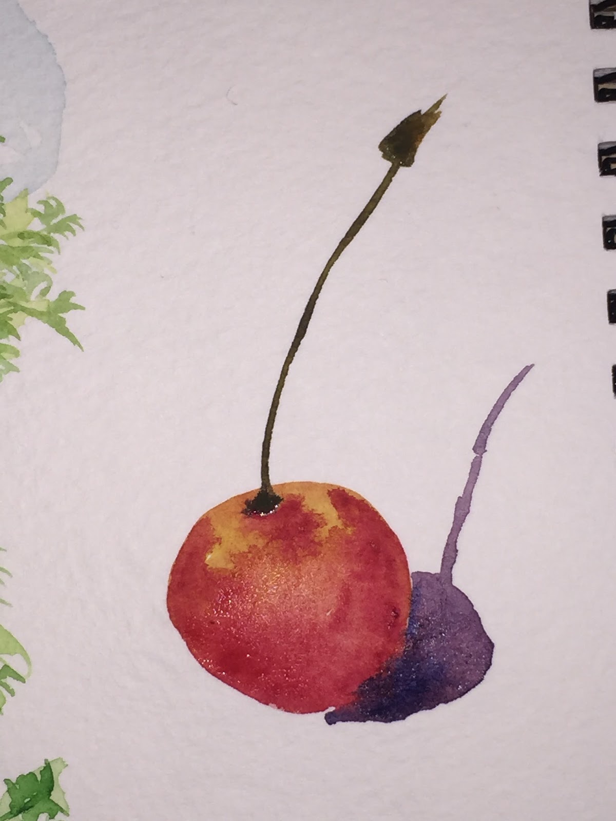
I had a little time on my hands during lunch, so I decided to sketch a few fruits.  Yes, red was the theme.  I gave myself two minutes a piece to paint each one.  I like the apple and the single cherry.  I really want o like the double cherry but the shadow i put on it kind of ruins it for me.  The tomato..... well, i think it went a little south.  lol.


Tuesday, July 7, 2015

Last One In This Series (Nudes)

I don't know what happened with this one.  I thought it started out great, and then I kinda lost a little momentum.   I think I started putting shadow where my brain told me shadow ought to be, rather than where it was at based upon the picture.

I have that problem every now and again.  I don't remember if I need a right brain or left brain shift to rid myself of that problem.  Maybe just a change in music will do it.  I've started listening to Dean Martin while I paint, but perhaps I need to listen to something just a bit different.

Well, m not disappointed in this, but I think I could do a better job if I were to do it again.

Regardless, hope you enjoy it.

Friday, May 1, 2015

Some Kind of Red Flower

Just playing around last night.  I thought this turned out nice.  Some flowers of undetermined species.

Got the whole paper wet, and threw down some red, blue, yellow and green.  Then when it dried I put in a little red to bring the petals to the foreground.   After allowing those to dry, went back and drew in the stamen and leaf edges.  A little water to tone them down and voila.

It turned out to be exactly what I wanted.  A loose painting of some flowers.  Done quickly, but with enough interest that it's enjoyable to look at.

Hope you enjoy it.  

Monday, October 13, 2014

Weekend Sketching

I love reading books.  I've probably read 30 or so already this year, and the latest was a watercolor book.  In it, like in all books of this sort, the artist tells you how to paint a myriad of different things and different techniques in which to accomplish this.

So, I decided to take this particular artist and author up on his challenge and started painting a few of the paintings from the book.  To the left is the second version of this painting.  It's not quite like his, but its not bad for a quick weekend sketch.

The second painting is my first attempt at the same scene.  Not bad, but not nearly in the league as the top one.

This last one is just one more that I took from him.  Again, not bad for a quick sketch.

I should say that these are all on my sketch paper, which is very similar to mixed media paper in texture.  That is, its smooth and almost a little waxy.  I got it so that I could easily take it with me and paint on location.  The air here is super dry and when I venture outside to paint, I find that I often have trouble keeping moisture on the paper.  Thus this paper.

Anyway, enjoy.

Friday, May 16, 2014

Buckets of Apples

Since I'm in the "Heavy Metal" challenge this month, I decided to paint a few more metal pictures.  I think that I get carried away trying to make my painting look "right."  Whatever that means.  In so doing, I end up putting a lot more paint on paper than I want to, and my paintings lose some of the transparency, or lightness that I want to keep.  I want to get to a place where very few washes will satisfy what I want the painting to look like, and then to stop fiddling.  I'm not there, but I'm still working to get there.

Hope you enjoy these fun little paintings.

Wednesday, October 16, 2013

Oh, My Blueberries

Well, I still don't have the color right with this scanner, but you get the idea of this picture.  Its a whole bunch of blueberries on a yellowish surface.

Firstly I will tell you that I am disappointed that the scan makes it look like i did this in purple, with purple and more purple.  I actually have a blend of 4 different blues, 3 different greens and two yellows to paint this picture.  Anyone who knows me, knows that I love blueberries.  I could eat them morning noon and night.  Mmmmmmmm sooo good.

Let't talk about the good things with this painting.  The berries really do look round,  You can just picture them laying on a yellow countertop.  I like the mixing of the colors, the reds, blues, yellows, and greens that make up the berries.  I like the blueberry crowns.  They look like they stand out just a bit from the round berry.  And I like that the countertop is much more pronounced in the front and much less in the distance.  I've said it before, but thats  a trick to get you to see some depth.  The darker the color in the front makes you think that its closer, especially when the top of the painting is very light.

I had painted the blueberries with all blue and red.  In my technique, I put on layer upon layer of paint.  It is great for giving depth to what you are painting, but you have to have durable paper.  Well, this paper isn't.  So I ended up with terrible white marks where I had scrubbed and rubbed.  Instead of having all the the highlights bright white, like the paper.  I threw a little yellow and green in there.  Just enough to give the hint of a bit of under color.  If you look closely, you can see where there is yellow on the berries, and which ones don't have any.

Well, at any rate, I loved painting this one.  Hope you enjoyed viewing it.

Friday, October 11, 2013

Pears on Table

Ok, so I put my shadowing the pears.  I think it came out pretty good.  As I was learning to put shadows on, I kept hearing how shadows are blue.  I would see people put pure blue on their paintings as shadow.  While from time to time it seemed to look ok, I never thought that was a good thing to do.  I did, however, follow suit with that.  As a result, I believe I have ruined some paintings that I thought were pretty good.

To me the shadow is not a color (like blue) on top of another color.  What it is is the lack of some light on an object.  Since there is less light, the color of the object should be darker.  The shadow should be the same, or nearly the same color as the object it is on.  In this painting the shadow on the pear in the back is green, and a little brown.  Those are exactly the same shades that are in the pear itself.  On the table the shadow color changes to a darker grey, similar to that of the table.  Notice that I am not saying the same.  Since I have really mixed the colors in the grey of the table, and the greens and browns of the pears, it is impossible to make the same color.

Maybe I have begun to crack the whole shadow thing, and maybe I don't have to be as afraid of painting them anymore.  Anyway, I hope you all enjoy the pears.

Monday, July 1, 2013

Santorini Sketching

 A couple of quick sketches I did in preparation of my previously posted work.  Each of these took about 10 minutes to do.  They were just to get an idea of whether or not I liked the picture, and whether or not I'd be able to paint a decent picture of it.  Obviously, I chose the second on to use as the finished painting.

Also, this is a good way to use the backs of those older, not so great paintings that accumulate around the house.

Enjoy.

Monday, April 15, 2013

A Couple Quick Sketches From the Hotel

Ok, so I just spent a few days at the Cliffs Resort in Shell Beach.  While I was there for an official work function, I was able to break away and do a couple of painting.  This is the first one.  It is the side of the resort.  To the right is where the swimming pool is, to the left is the Pacific Ocean.  I don't know what I liked so much about these trees.  I guess it was the fact that none of them were straight, and the cast a really interesting shadow on the side of the hotel.

This little group of palm trees was about 20 feet from where I sat to paint the picture above.  They were just in the middle of the small field that separated the hotel from the ocean.


Now that you have seen these pictures, take a closer look at them.  Know what you aren't seeing.  Pencil lines.  I actually started out drawing both these scenes.  The drawings were horrible.  Painting in my "studio"  I have time massage drawings and to make sure they look as right as possible.  For whatever reason, my drawings were not working out at the hotel.  After  a while I just decided that I could paint them better than draw them.  So I did.  And I did.  I know these aren't the most technically perfect paintings, but I spent about 5 minutes apiece on each, and given that amount of time, I think they are pretty good.  I've some others from this conference that I will post tomorrow.  They are quick and dirty paintings too, but look just a bit better.

Hope you enjoy these.  Thanks for looking.

Thursday, March 28, 2013

Woman on blanket

This painting for sale  9x12  $30
Alright, instead of just a head, this time I thought I would tackle the whole body.  It's not a perfect painting by any stretch, but I think its pretty good.  I had a reference picture that was black and white, so any I had to come up with all the color on my own.  I think did  a pretty good job of capturing skin color.  I will admit that she probably could use a few hours in the sun.  I think if (or when) I go back and tinker with this one, I'll add a bit more definition to her chin and neck.

The hair was difficult, because in the reference picture, she had platinum blonde hair.  I'm not sure how to paint that, so I made hers a bit dirtier blonde.  

Like always, the hands are terribly hard.  The one across her torso was a bit odd in the photo, and as such a bit odd on the painting.  A little more work and I'll get better at them.  All in all I think for a first attempt, this turned out terrific.

Tuesday, March 26, 2013

Eye Study


Just  a quick study of eyes.  A few weeks ago they seemed so hard to draw.  Like many people, I used to think they were almond shaped with a round thing in the middle.  Then throw in a black dot and you have an eye.

Well guess what, I've learned a huge amount about eyes.  They aren't really almond shaped.  The iris is lighter in the middle and darker near the pupil and edge.  The sclera isn't white, or fully white anyway.  You have a lid flap that covers your eye lid, and the whole thing is shadowed by the brow ridge.  Who knew?!  Like i said, a month ago an eye was an almond with whiskers coming off of it.

By no means do i think these few simple drawings make me an expert at eyes, but they have helped to show what eyes really are like.

Expect to see more simple studies like this one.  They really do help you to understand the subject.

Enjoy.

Thursday, February 7, 2013

Going Back On My Word


This painting for sale 9x12  $30
 Well it didn't take long for me go revert to my old ways.  A short few posts ago I swore off cars for kittens. It looks like I was abel to keep that word for all of a week.

With that, what we have here is a Studebaker.  I can just imagine this cars sitting, baking in the sun somewhere in Texas, or Oklahoma, Arizona or someplace like that. The blazing sun has cracked the pavement and provided no relief to the dry, brown dirt on the other side of the parking lot.


I didn't take pictures for the whole process this time.  This is the first one I took.  You can see the sky is already done, but there is plenty to do on the rest of the painting.  I tried hard to put in some coud details on this painting instead of just a plain sky.  It's a bit hard since we don't have many real clouds here to look at in real life.


I've jumped ahead quite a bit here.  You can see the shelter in the background is done as well as the sidewalk, the windows, and the chrome on the car.  If you look at the shadows, they are different than the final product.  I thought I had them right when I put them in,  then I stepped back to look.  Wow! was I ever wrong.  I had to go back in and fix them.  They look a lot better now.

Finally, a few finishing touches and the painting was done.  I strengthened a few of the colors and put in the trees and weeds.  They seem simple but they really do add a lot to the painting.

Hope you all enjoy.

Monday, February 4, 2013

Cat 3

SOLD!
Ok, so I am back on animals full time now.  Here is a nice calico cat I've been working on.  With the background colors, it kind of looks like some kind of Oriental painting or something.  I'm really facing a dilema.  How much fur, or detail do I put into these paintings.  It seems as if I put in none, it's way too little, but if I put in what I think there ought to be it's way too much.  Maybe I'll just have to stick with whiskers   I don't really know what to do about it, but I am determined to figure it out.  I guess you all are going to have to get use to seeing some animals for a while I work it out.    Enjoy

Wednesday, January 23, 2013

Another Old Truck

So I thought I would let you all see the steps I take to create a painting.  We'll start with a drawing and go through the final product.  I've kind of wanted to do this for a while now.  I think it is much more interesting than just seeing the final painting.  I apologize for the quality, or lack there of, some of the pictures.  instead of scanning all the picture, i just snapped a photo with my phone (wow, doesn't that sound funny?).  While I did use the flash on it, and the picture is under a light, I somehow still get grey spots on the photos.  So, without further adieu, here we go.


Here we are with the drawing.  Not too  much detail.  The truck has a lot of detail, but the foreground and background not too much.  I go back and forth between wanting more, and wanting less.
This is the first layer of paint.  It is this layer that will add the color that you will see on the truck.  You can see the reds, yellows, blues and greens.  Even though more coats of paint will go over the top, this layer will always be able to be seen.
Here is the second layer of paint on the truck body.  At this point I need to decide if I like the color or not.  If not, I'll add another layer to change the color.  What do you think from the final painting, did I add a third layer?
Here I've added a blue sky and some trees in the background.  Notice that the truck still isn't done.  What I have left is mostly detail work.  I like to leave that till the end.  Since a lot of the detailing is at or around the edges of the truck, I want to get the mid-ground and the foreground in place so that I can paint over it if I need to.
Nearly done now.  You can see I've go the grill done, and the shadowing in the cab, wheel wells and around the grill.  I've put some shadowing on the truck itself.  The last detail is to put in some weeds in the foreground.  Adding the weeds will help to push the truck back in the picture a bit.  This is also a good time to mention the red in the foreground.  I think I've mentioned it before, but red tints make things look closer, blue tints make things look further away.  Just look at the mass of trees int he middle of the picture.  They are clearly bluer than the trees around them and look much further away.
This painting for sale.  9x12  $30

And here is the finished product.  The truck sitting in a field rusting away with some weeds growing around it.  Hope  you all enjoy it.


Friday, January 18, 2013

Old Blue Truck

SOLD!
Ok, so I tried to do something that may not have worked out quite the way I wanted it to.  Then again, some parts of this painting are brilliant 

So, I started with a picture of this truck.  Someone had photoshpped it so that the only thing in color was the truck.  It absolutely burst off the page because it was a beautiful blue color.  (Well, actually it was blue, yellow, red and rust, but for the ease of this commentary, I'll just call it blue.)  The truck was sitting in the wood with tree trunks and branches all around.  I didn't think the background was all that exiting, but it made the truck jump out so much that I had to try it.  Well, as you may have guessed, I didn't use their background, I used my own.  Yes, thats right, just made it up on the fly.  I wanted to make my background a little darker around the truck and a little lighter everywhere else, but it didn't quite work out that way.  Oh, well, there is always next time.  One think I did  do, and you will have to look closely to see it is make the grey in the background more blue-grey, and make the foreground more red-grey.  If you look closely you can see it.  I did it because the blue makes things look more distant, and the red, more close.

As for the truck itself, I think its pretty good.  I did a lot of layers to give the truck the kind of mottled look.  The first was just water to get everything wet.  Then came yellows and reds.  Finally, blues on top. I tried to allow for highlights along where there were bends in the metal, but I didn't work out well this time and I quickly abandoned that plan.  As you look at the truck, take not of the lining.  Instead of making lines at the end with a pen, i actually used paint and brush and painted it.  Some of them look a little better than others, but in general, I think all the lined came out pretty good.   I like this painting and already have it hanging in my office.  Next week, I start a new painting.  Enjoy