Showing posts with label grey. Show all posts

Sunday, December 27, 2015

Mocking Bird

A friend of mine recently moved to Texas.  I asked her what the state bird was, and she tole me it was a mocking bird (never looked it up to verify, but I believe her).  I felt a wave of bird painting coming on and thought it might be fun to paint.  Here is what I came up with.

Its a classic bird shape.  Maybe the tail is a little longer than some, but for the most part it follows suit for songbirds in North America.

I looked through a number of pictures of mocking birds before settling on drawing this one.  Most of the mocking birds are a light grey to a brown in color.  A few, however, had a slight blue tint to them.  I don't know if they were juveniles, or if at a certain time of year the feathers look a bit different or what.   No matter, I chose to paint mine with a blue-ish tint.   I made the eye extra dark.  I want the viewer to notice it right away, and looking back at the painting, I think I made the right choice.

Like so many of my painting recently, it is accompanied by a video.  So if you want to see how I painted it, check out the video below.  Thanks for the quick read.  Drop me a line and let me know if you like it or not, or if you'd like to see me paint something specifis.


Tuesday, September 23, 2014

One Great Tit

Ah Hah!  Gotcha.  I posted a picture of a bird.  I don't think that's what you were expecting.  I love doing that.  Last year I posted a picture of some cantaloupe  melons.  I titled my post something like a great pair of melons.  I got more hits on that than I had on my site total to that point.

Well, as I have said so many times, I love painting birds.  Something about them makes me happy.  I always like to make up stories about them as I am painting.  And they all seem to have individual moods.

Usually when I paint, I paint from black an white pictures.  I did that with this one.  It really helps me see contrast.  But where I am able to see a lot of contrast, I often get my colors a little wrong.  On this guy, I should have had a grey tail.  He originally had a beautiful yellow tail, but once I finally looked at a color picture, I realized I should have given him a grey tail. I quickly tried to make an adjustment, but.....  

Ok, now let's talk about a little of the good for a second.  I basically painted this in about 4 layers.  I tried hard to leave his chest a little lighter and his belly a little darker.  I think I got it on the yellow.  And I was worried that his head wouldn't come out quite right when I started, but i really like how it turned out.

Well, hope you like this one.  Thank you.

Friday, October 25, 2013

Keeping it Reel

Yes, I know I said I was done with the whole fishing theme.  But I actually did this a couple of months ago, and had never gotten around to posting it.  As you can see, we have another reel.  This doesn't necessarily look all that old save the bakelite crank handle .

I had a bit of a had time trying to get several different colors and shades of grey or chrome.  I didn't want any one piece of chrome to look too much like any adjacent chrome.  Then I had to put a few shadows on.  I guess the jury is still out on how I did.  

I think the thing I still need to do on this is to paint or draw on some line and this one is done.  Hope you enjoy it.

Friday, October 11, 2013

Pears on Table

Ok, so I put my shadowing the pears.  I think it came out pretty good.  As I was learning to put shadows on, I kept hearing how shadows are blue.  I would see people put pure blue on their paintings as shadow.  While from time to time it seemed to look ok, I never thought that was a good thing to do.  I did, however, follow suit with that.  As a result, I believe I have ruined some paintings that I thought were pretty good.

To me the shadow is not a color (like blue) on top of another color.  What it is is the lack of some light on an object.  Since there is less light, the color of the object should be darker.  The shadow should be the same, or nearly the same color as the object it is on.  In this painting the shadow on the pear in the back is green, and a little brown.  Those are exactly the same shades that are in the pear itself.  On the table the shadow color changes to a darker grey, similar to that of the table.  Notice that I am not saying the same.  Since I have really mixed the colors in the grey of the table, and the greens and browns of the pears, it is impossible to make the same color.

Maybe I have begun to crack the whole shadow thing, and maybe I don't have to be as afraid of painting them anymore.  Anyway, I hope you all enjoy the pears.

Wednesday, March 13, 2013

Colorado

Well, here it is, a family portrait.  My mother and step father together in Colorado.  I think I did a fair job with this.  You can see in the picture below there was a lot of dark coloring in my step father's jacket and hat.  I had to compensate by making the collar and brim of his hat a bit lighter.  I did the same thing with my mother's coats.  I suppose there are better painters who could do a better job, while still keeping the collars and hats the same shade.  As for me, I thought it was a really good compromise.  I like the mottling in the pantlegs of the jeans.


Here is the original picture.  As you can plainly see, I didn't follow the proper background.  Well, I didn't know exactly what do do about the snow.  I've never painted snow and I didn't want to start now.  I wanted to give a soft diffused background that would compliment the subject color.  As it is I think I did a good job with it.  When you look at it, you notice the background but you immediately look away from it and are drawn to the subject.  I think I worked great.  Let me know what you think.

Also, don't you think it looks like mother is 20 years younger?

Thursday, March 7, 2013

Another Portrait

This painting for sale 9x12 $30
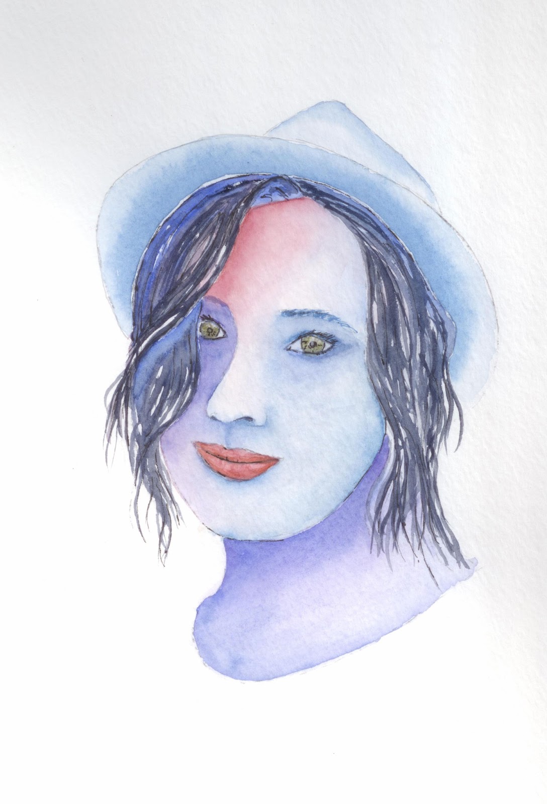
First off, I think this looks a bit odd because I didn't paint quite enough of his neck, but what the hay.  I painted this in the way I am gonna try to do all my paintings from now on.  I got the paper wet, and then let the paint do what it do on the paper.  I actually have about 5 or 6 layers of paint on most of this.  I don't know that I'll be using that many layers all the time, but I'll definitely be using two or three.

I didn't want to overdo the beard and hair for fear of doing too much too it.  I still might go back and draw in some individual hairs with a pen, but basically, what you see is what you are always gonna get.  I might go back and make the eyebrows a bit bigger too.  But again, I might just wanna leave it this way.


Here is the picture that I started with.  Sorry, hat I forgot to take it as just a drawing.  You can see part of the first layer of paint, though.


Here is the picture mostly done.  Interestingly, you can see that I took the picture with his beard just a bit wet. As the paint dries it lightens up, so you can see that it is much darker here.  Also, he looks a bit devilish with no eyeballs.

I had a great time painting this one, hope you have a great time viewing it.

Wednesday, March 6, 2013

Another Portrait, and maybe more to come

This painting for sale. 8x10 $20
Once again I have a challenge to paint portraits.  I guess I could try it a little more conventionally but... sometimes you just don't wanna do it that way.  If I had done this the conventional way, then you would know what everything was supposed to look like exactly.  You would immediately look and see flaws in the picture, and they would stick in your mind.

Painting this way, you see the colors, and the the shapes, but not necessarily what you mind tells you you should be seeing.  There is a little leeway for me to make a few mistakes.  Actually, I think it makes it a much more dramatic picture also.


Here is the picture I started with.  You can see the drawing and that I had just started to paint.  There are a lot of coats of paint on top of the one that is down on this picture.

Actually, I should say that I really like to paint this way.  It takes longer to paint any particular picture, but I think its more fun, and I think the result really looks nice.  I don't know if I could do something like a landscape this way, but for defined shapes, I could do this all day.


Here is the picture that I used for the basis for my painting.  I still might go back and splotch in some freckles to give her face a little more detail, but if I don't do anything, I'm totally still satisfied.

Oh, and yes, like the headline says, expect mor portraits.

Monday, February 4, 2013

Cat 3

SOLD!
Ok, so I am back on animals full time now.  Here is a nice calico cat I've been working on.  With the background colors, it kind of looks like some kind of Oriental painting or something.  I'm really facing a dilema.  How much fur, or detail do I put into these paintings.  It seems as if I put in none, it's way too little, but if I put in what I think there ought to be it's way too much.  Maybe I'll just have to stick with whiskers   I don't really know what to do about it, but I am determined to figure it out.  I guess you all are going to have to get use to seeing some animals for a while I work it out.    Enjoy

Wednesday, January 2, 2013

How Now Brown....Door?

Ive painted other doors before, and will paint plenty in the future, I am sure,  but this may be the one where I look back and say that I have kind of changed techniques.  I started by drawing a very (well, at least fairly) good representation of a wooden door in a stone wall.  I didn't draw any of the stones in the wall, but drew everything else.  I had plans to do what I always do, which is to paint this little bit, then move the paper, paint another little bit, then repeat, repeat, repeat until I have what I think is a finished painting.  Well, after I started the door that way, I took a little different turn.  Everything after the wood was done free form and in rapid succession.  While the coloring is a little less than imaginative, I think it made for some really nice bits to the painting.

Painting with the strict way I would have painted in the past, this painting would have taken me an hour or more,  but since I painted the brown of the door, this took me no more than 10 minutes.

For me, the stone really stands out,   I could have used a bit more color, but they really seem to stand out, and the door does look like it is set back just a bit in the jam.

Hope you like it.

Wednesday, November 21, 2012

Down on the Embarcadero

Ok, here we go again.  This is a second painting of Giovanni's Market and Gallery.  If you don't remember the first one, you can view it here.  This painting is from the opposite direction and some obvious differences.  

The first real differences is that this painting has all the proper colors.  The previous one was taken from a black and white photo, and I was working from memory on the colors. This one was painted from a color picture and so, all the colors are correct(ish).    I got a bit more ambitious with this one too.  Obviously there are people in the painting, but also there is tile and brickwork, among other things.

I used ink to outline and highlight edges on this painting.  My intent was to not to do that.  I wanted to only use paint to edge the painting, but I couldn't quite keep the lines straight enough, so i had to switch over to pen.  I like how the outlining turned out everywhere except around the main awning.  Oh well, that's how it goes sometime.

Anyway, I had a great time painting this, hope you all enjoy it.

Tuesday, August 14, 2012

Cotchett Education Building

This is the Cotchett Education Building on Cal Poly's campus.  In the foreground you can just see the word Design, which is on the Architecture Building.  Expect to see a picture or two of that building in the coming weeks.

I love the way the trees turned out on this picture.  They look like they have movement and life too them.  I also like the purple plants in the planter in front of the word design.  

In judging this one I think I should have made the shadows on the building darker. I think that would have given more definition to the building.  Also, I think I am gonna start to draw in pen so that I can get leaves on the trees.  As you can see I have loose drawings underneath the paint.  Drawing it this way allows me to have a general shape to the tree, but not get bogged down with a "tree" shape so that I can then just put the color on and let the tree become a tree.    Hope you all enjoy this.

Wednesday, August 8, 2012

Thursday, August 2, 2012

Gus's Grocery

Ok, I will admit, Gus's isn't in Morro Bay, it's in San Luis, but its an institution and everyone knows it.  I had to give it a try.  Incidentally, if you want a great sub, Gus's is the place to go.

Some good and some bad on this one, just like the rest.  Seeing the scanned image, i can tell my perspective is still off a bit, but I don't think it really takes away from the picture all that much.  Some good coloring on the trees, and a bit ont he brick on the front of the store.  The stucco, I feel like I am having trouble with.  Soooooooooooooo many of the building here are all stucco, and if you know me, you know that i think stucco is like the laziest way to finish a building.  It rarely ever looks good.  Maybe I feel I am having a little trouble painting it because of the way I feel about it.    After painting the Bayside, I was told that if I made the windows totally dark, or black, that they would be much more dramatic.  I have to say, That was some good advice.  Well, I hope you all enjoy the painting.

Tuesday, July 24, 2012

Back Door to the CM Office

So, I was painting outdoors again today.  Once again I painted building 186.  Some good and some bad.  This is the first floor.  The second and third are of course not represented here.  The very top of this painting is where the railing for the walkway would be attached.  Yes the windows are a bit goofy, the bottom pane is opaque.  There are a few plants in front of the railing that comes from the door.  The lamp post is perhaps a little too thin.  It is close to the bench that I sat at to paint.

Now the good, I've been working on not having solid colors,  I think I got some of that where not all the sections of the wall are the same color.  Not all the panes of the windows are the same, not even all the concrete is the same color.

One more thing.  All but one line and I've got the perspective lines right.  That means my drawing is actually getting better.   Hope you all enjoy.

Tuesday, July 17, 2012

College of Business

This is a painting of  the back side of the College of Business.  The closest building is Crandall Gym.  I've painted the front of it which you can see in a previous post.  Yes, the grey thing in the middle of the painting is a post that is really there. Could I have drawn it out of the picture, sure, but I thought it would be more interesting with it in.  I think i did a pretty good job with the HVAC system on top of the building.

Monday, July 16, 2012

Old Vines (Wisteria)

These are some old vines that are growing on a trellis on the College of Business lawn.  Looking at the painting now, I think I needed to add a little more shadow to the rear post, and though I didn't notice it while i was painting, I think I left out at least one post on the far side of the trellis.

There are two large sets of vines growing up, one on each side of the trellis, then going back across the top.  The closer vine is totally grown around an old timber.

A good effort for a 30 min draw/paintsession.  Hope you all enjoy.

Monday, July 9, 2012

A quick couple of birds

A quick couple of birds for today.  The top is of course a California Quail, the bottom a female robin.  I don't like the eye on the robin, but I think the rest is good.  The quail was a quick experiment.  I don't think either are my best work, but thats why they call it practice.

Friday, July 6, 2012

Broken Down and Rusting

Firstly, let me apologize for the quality of this image.  The size of the painting is larger than my scanner can hold so I had to snap a pic with my camera.  Obviously it didn't do quite as good a job as the scanner.

I've had a book of great pictures from across America for quite a while now.  One of the pictures had a truck in a field in front of a barn.  I like the truck a lot, the barn, not so much.  So here is my take on the truck.

When I drew the truck, I was thinking to myself, just dont screw it up.  When I had finished I thought I did a pretty good job, and wanted to take a picture so I could use the image again.  Then I though, if i can draw it once, I ought to be able to draw it again.  So I forged ahead with painting.  Then as I was painting the parts of the truck I kept thinking, don't screw it up its a long process to get back to where you are.  But in the end,  like the way it turned out.  I might to another one of these, but it wont be for a while.  I think I'll have more confidence in painting it knowing that I've already been able to do it once.


Painting is 11x15
For Sale - $20 - free shipping

Thursday, June 21, 2012

New Sketches

Two buildings from the Engineering complex here on campus.  I couldn't tell yo the names of them, but I can tell you they have some fun angles to try to paint.  I think these are really fun and I can't wait to get out and paint more of the campus.  While I was painting, a student happened along and stopped to look over my shoulder for a few minutes.  Truthfully, I was getting a little annoyed, when he said, "Those are looking pretty good" and went about his way.  

Hope you enjoy them too.

Tuesday, June 19, 2012

Fat Capped Chicadee

I hope its really cold and this litte guy has his feathers all ruffled to keep warm.  If not, he is a little portly.  I really feel I'm getting the hang of blending colors and can put them on and take them off as necessary.  I can see improvement in my paintings over the past few weeks.  I just need to keep at it.