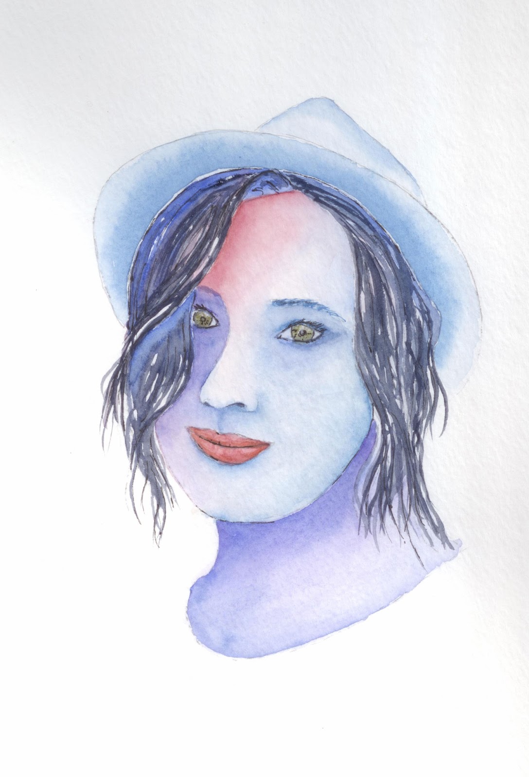
Showing posts with label lips. Show all posts

Saturday, May 30, 2015

Faces (not mine) WIP


Submitted for your viewing pleasure are a couple of WIPs.  I did this much last night and will probably spend much of the next few nights finishing them up.

I really just started with slapping some paint on, trying to block in some color, Then I remember that I stink at painting hair, and thought I should try somehow to make the hair more realistic  that in paintings past.  I can't tell you how many strokes I have in the hair on these two.  And I'm no where near done!!

Well, Tonight I will probably work more on the hair, some shading on the faces and maybe the shirt.   Then finish the hair and the background.   I don't know, I'll have to play it by ear, and see what hits me when I get back out to the studio.

Tuesday, November 19, 2013

Lips Incorporated

Ok, so last week I did a little study on eyes.  This week I am doing a small study on lips.  I had a few minutes at lunch so I quickly drew out some lip shapes, and then splashed on some paint.

Oh, and the flower was an extra doodle that just worked its way there.  No real reason why.

I saw a quick video on how to make lips a little more realistic, and thought I would give it a chance.  Basically it went like this.
1. Draw two circles separated by a third (invisible) circle, all of them the same size.
2. draw a center line where the lips meet.  The line should be slightly raised in the middle.
3. Draw a third circle the same size as the first two below the center of the mouth, as distant from the line as the two circles above it.
4. Make an arc just above and between the two circles above the mouth.
5. connect the arc to the ends of the mouth and connect the two ends of the mouth by drawing a line around the circle on the lower lip.

TA DA - now you should have two basic lips.

I guess it helped a little.  I don't know how great a help it was, but it did get me drawing and sketching.
Now, I tired to put my eyes and mouth together.  I know its not a great painting.  Remember, I'm sketching quite quickly.  I just kind of guessed at the proportions of nose to mouth to eyes, so that might be a bit off.  I'm still not happy with the eyes.  More practice!!

Thursday, October 3, 2013

A Little Attitude?

I'm not quite done with this one, but  before I screw it up, I need to take a break fom it.  I like the way most of this has turned out. Of course the thing that needs the most help is the hair.  One day I'll be able to paint hair.   I don't really know when that will be, but based upon the look of the hair in this picture, it's gonna be quite a while.

Anyway, until it's done and you see it again, enjoy.

Thursday, August 22, 2013

Laura

This is a portrait of an on-line friend.  She had posted a sepia tone portrait of herself, and for whatever reason (probably that it was in sepia tones and easy to see the highlights and shadows) I really felt that I could paint it and do  a good job of it.

I used VanDyke (I don't think it's named after Dick) brown, yellow ochre, alizarin crimson, raw umber and burnt sienna.  Starting with a sketch of her, i started adding color to her face.  A LOT of layers.  I basically put on a tiny bit of paint, then smoothed out the edges so there wouldn't be any hard edges.  Then move onto another spot and do the same.  Once an are dried I went back and did another layer.  I think at its deepest, there are 6 layers.  It makes for a glowing painting.  I did it this way because in the past I have put the colors on in thicker layers and it has just looked flat.

I did use colored pencil on the hair.  Hair is really tough for me (and probably for everyone.  I guess the only way to get better at hair is to keep practicing.  My only regret with this painting is that I used such soft paper, and it didn't like the constant washing.

All in all I think I did a pretty good job.  Laura I hope you like it.  Everyone els too.  Enjoy.

Monday, April 8, 2013

Nude, but covered

I'm calling this a WIP (work in Progress) because I am gonna go back and add a background at some point.  I like most of the shading and coloring, but I think it needs a bit more.  The only thing is that I am not quite ready to do it yet.  I've been busy and will be even busier throughout this week.  I don't wanna rush thought and put on a bad background.  I'd rather let it sit and come up with something better after a while.  I also think I need to put on a little darker shading.  Its really hard to notice when looking at it right after you've painted it.    Maybe that's the key.  Paint it and let it sit for a while before you mark it as finished.

I tried to give her some realistic skin tones, while trying to not just use one color.  There are reds and yellows and greens in in her skin.   Believe it or not, the only brown i used is in her hair.

I also used 120 lb paper, which I don't normally use, but it was all I had on hand when I started. The paper has a different feel, and holds water differently.  The grey that you see in the scan is from the paper being just off the scanner bed.

Well, I'm off for now.  Enjoy.

Monday, March 11, 2013

Another Head Shot

Well, this one didn't quite turn out the  way I hoped.  I think the problem mostly is with the hair.  Yes, her skin color is a little off, but I don't think that affects this painting in the least.  I was trying a slightly different technique for hair, and..... well, lets just say I think I need a bit mor practice with it.

The main point of this exercise for this painting were eyes.  On the original, I thought the eyes turned out pretty good.  looking at the scan, maybe not quite so much.

Here is the original picture.  You can see that it is a pretty plain picture to start with.  I think I got her nose pretty good.   You all will have to decide for yourself.  Hope you enjoy.

Friday, March 8, 2013

Another Face

Another face.   I think I just missed the mark on this one.  I may have to go back and tweak it just a bit.  I think the eyes are a bit better that previous pictures, but i don't think the scan is doing it justice.

I tried a little something new with the hair.  I for the most part it worked out.  The hair on her right hand side I think looks good.  On the left below her ear could use some work.  I love her smile, and I'm willing to bet that my auntie Roberta will like her teeth.

I think that I am gonna go back and rework this one a bit.  Maybe put a little more shadow on her forehead under he hair, and on her left cheek.  you might see this one painting re-posted at a later time.

This time, again, I used the same technique that I am hoping to use in most of my paintings from now on.  I've no idea what it is called, other than wet-in-wet painting (but it is not strictly wet-in-wet).  I do a lot more than just that.

Well, for now, this is what I've got.  I still have a few more portraits to paint, so be on the lookout.

Thursday, March 7, 2013

Another Portrait

This painting for sale 9x12 $30
First off, I think this looks a bit odd because I didn't paint quite enough of his neck, but what the hay.  I painted this in the way I am gonna try to do all my paintings from now on.  I got the paper wet, and then let the paint do what it do on the paper.  I actually have about 5 or 6 layers of paint on most of this.  I don't know that I'll be using that many layers all the time, but I'll definitely be using two or three.

I didn't want to overdo the beard and hair for fear of doing too much too it.  I still might go back and draw in some individual hairs with a pen, but basically, what you see is what you are always gonna get.  I might go back and make the eyebrows a bit bigger too.  But again, I might just wanna leave it this way.


Here is the picture that I started with.  Sorry, hat I forgot to take it as just a drawing.  You can see part of the first layer of paint, though.


Here is the picture mostly done.  Interestingly, you can see that I took the picture with his beard just a bit wet. As the paint dries it lightens up, so you can see that it is much darker here.  Also, he looks a bit devilish with no eyeballs.

I had a great time painting this one, hope you have a great time viewing it.

Wednesday, March 6, 2013

Another Portrait, and maybe more to come

This painting for sale. 8x10 $20
Once again I have a challenge to paint portraits.  I guess I could try it a little more conventionally but... sometimes you just don't wanna do it that way.  If I had done this the conventional way, then you would know what everything was supposed to look like exactly.  You would immediately look and see flaws in the picture, and they would stick in your mind.

Painting this way, you see the colors, and the the shapes, but not necessarily what you mind tells you you should be seeing.  There is a little leeway for me to make a few mistakes.  Actually, I think it makes it a much more dramatic picture also.


Here is the picture I started with.  You can see the drawing and that I had just started to paint.  There are a lot of coats of paint on top of the one that is down on this picture.

Actually, I should say that I really like to paint this way.  It takes longer to paint any particular picture, but I think its more fun, and I think the result really looks nice.  I don't know if I could do something like a landscape this way, but for defined shapes, I could do this all day.


Here is the picture that I used for the basis for my painting.  I still might go back and splotch in some freckles to give her face a little more detail, but if I don't do anything, I'm totally still satisfied.

Oh, and yes, like the headline says, expect mor portraits.

Thursday, January 3, 2013

Quick Sketches of Statues


Here are two statues from my house.  The first is a painting of a copy of The Thinker by Rodin.  You will recognize the classic form of the man hunched over with his chin on his hand.  I tried to paint it quickly and loosely using only a couple of colors, but varying them enough so that you might distinguish the depth of the statue.  I hope I did it justice


This second painting is one of a woman wearing a necklace and headdress.  Again I tried to keep to a couple of colors only, but while still allowing you to see the shadows and depth of the painting.  At this point I will admit to not being the best at seeing shadows in what I paint.  I try, but sometimes seem to only paint where I think the shadows are.  This is somewhat a mix of seeing and feeling where the shadows are.  Looking back i should have added a little more shadow around the jewelry, and filled in her hollow eyes.

This painting was done on drawing paper instead of watercolor paper.  Thus the warping of the paper that you can see in the scan.

How you enjoy.