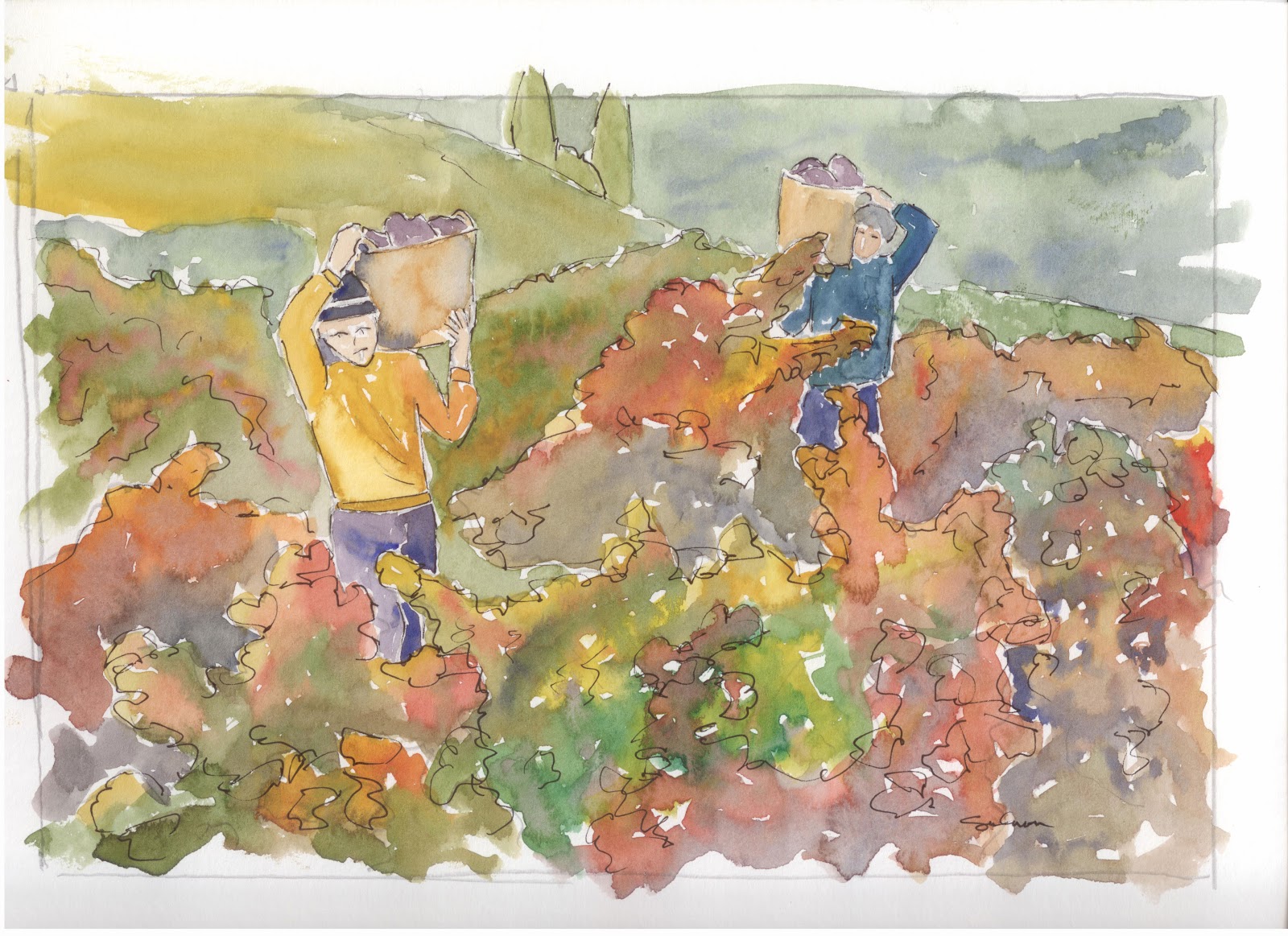
Ok, well, I'm at it again. Trying to put together a nice painting that someone would be proud to hang in their home or office. This had great promise, but i think got a little muddled. I like the grapes, I can live with the vines on the left, but the leaves in the middle, all kind of run together for me. I tried so hard not to let them do it, but perhaps I should have tried to simplify my painting just a bit more.
Well, I'm not gonna sweat it much. I'm enjoying painting again, and this one was a lunch hour painting. The way I see it, I had a great time on my lunch hour, and when its all said, and done, the paintings not too bad.
Showing posts with label hills. Show all posts
Thursday, June 12, 2014
Tuesday, February 19, 2013
GMC Truck
![]() |
| This painting for sale. 6x9 $20 |
I really like the distant hill. You can see that it is pretty blue and really looks like its way back there. I think I got that right on this painting (not always the case on my paintings).
I did one thing drastically different on this one than on others. I traced a picture using blue carbon paper. I don't know how much of the blue you can see, but it was really different painting with blue lines as opposed to grey lines. I don't know why it should make much of any difference, but it really did.
Also, i thought this truck had been taken slightly better care of than some of the cars and trucks I have painted in the past, so you can see much more of the paint job. I don't now why this one had to be yellow, but i just called to me to be yellow. Well, hope you all enjoy.
Wednesday, December 5, 2012
Another Old Truck
![]() |
| THIS PAINTING SOLD |
First, i tried to make the hill on the right hand side a little more mottled. It looks like there is some texture to it now. Additionally I made it a little bluer. It really makes it look like it recedes off in the distance. I also tried to put in another level of weeds around the truck. I thought this would really make it look like the back is way back and the front much closer. I don't know how successful that was, but I don't think it takes away from the picture either.
The truck is mostly the same. As I learned to paint shadows, I learned that they should be a blue grey and laid over top of the underlying color. I 'm not sure that that really makes for the best shadow areas. on this one, I tried to just put in a little darker more intense coloring in the corners so it looks like a bit of a shadow but nothing too harsh. Looking at it, I probably could have been even more aggressive with the color.
All in all, I am really proud of this one. I think it is at least as good as the first one. If anyone wants to buy, I'll sell. Just send an email and we can talk terms.
Labels:
California,
chrome,
grass,
grill,
headlights,
hills,
license,
old,
plate,
rusting,
truck,
turn signal,
vineyard,
watercolor,
weeds,
wheels,
wood
Thursday, September 20, 2012
Fishing Hole
Ok, so I heard of a possible fishing hole on campus. A little pond that was up above the equine unit. I'm always on the lookout for a place to take the kids fishing, and had to check this out. I decided to take my travel watercolor kit with me (yes, I keep it at work). I knew from looking on Google Earth that there might be some great views of San Luis from up there and I might be able to make a nice painting. Well, I got up there and, yes, there is a nice little pond. I found some fish in it, and yes, I plan on taking the kids. Also, I found some horses not too far away and decided to give a try at painting them. Now, I've never painted horses (or drawn them for that matter) before. So I know this painting isn't all that great. But what I really enjoyed was sitting on the side of the pont on a rock at the shore. I dipped my watercup into the pond and used that for my water. I was tickled to just be sitting there out side, with seemingly nothing around but a few horses, and painting whatever I thought I could. It was truly wonderful. And whats more, I could walk there, paint this picture and be back to my office within an hour. Im going back tomorrow, perhaps I'll take my camera so you can all see what I am talking about.
Monday, September 10, 2012
The Second Harvest
Ok, we are on to iteration number two. I didn't look at the first one when I painted this one, so i think I suffered from some of the same problems, but to a lesser extent. This one, to me, makes it look more like the grapes are growing on individual plants, whereas the first one looks like a giant mass of vines. I don't know that I am really blown away by the way it turned out, but I definitely like it.
Friday, September 7, 2012
Grape Harvest
The painting challenge for august is harvest. This is my first attempt at painting a harvest. I thought since the central coast is known for its wines, that I would paint a grape harvest. I think I got a bit too heavy with the mottled colors on the leaves, especially in the foreground. Im gonna try it at least one more time. I love the picture and would really like to produce a nice painting of it.
Thursday, August 23, 2012
Morro Bay City Limits
Yes, this is Morro Bay. I know there was some question about what this painting is. This was painted from a picture taken in Morro Strand. You actually have the city limit sign with some bushes behind it, and the rock in the background.
The thing I like least about this painting is the sign. I thought for sure I would like it best when I was drawing it. As it turned out, painting around all the letters was pretty difficult. I think I'm getting much better at letting the paint mix on the paper. If you look at the bush behind the sign, there are lots of different colors, brom yellows to greens, blues and purples. They all seem to work together to give you the feeling of a huge bush. and if you look at the ground around the bush, it is blue at the top, which pushes it back, and has a reddish tint on the bottom which serves to pull that area forward.
Hope you all enjoy this. It was fun to draw and paint.
The thing I like least about this painting is the sign. I thought for sure I would like it best when I was drawing it. As it turned out, painting around all the letters was pretty difficult. I think I'm getting much better at letting the paint mix on the paper. If you look at the bush behind the sign, there are lots of different colors, brom yellows to greens, blues and purples. They all seem to work together to give you the feeling of a huge bush. and if you look at the ground around the bush, it is blue at the top, which pushes it back, and has a reddish tint on the bottom which serves to pull that area forward.
Hope you all enjoy this. It was fun to draw and paint.
Monday, August 13, 2012
Vineyard
I was asked by a friend to paint a vineyard, barn, or boat. I've done a few of each with varying degrees of success. I decided to take up the challenge of a vineyard for her. This is one attempt. Actually this is a picture of a vineyard in the Paso Robles area, about 40 minutes from where I sit typing this. It won't be my last attempt at painting a vineyard. Like with all of my paintings, I think that I am getting better at painting them. I might end up just doing a bit of pen outlining on this one to give some definition to the grape leaves in the foreground. If I make any changes, I'll repost. Hope you enjoy.
Wednesday, July 18, 2012
John's Chicken
John is a faculty member her. His son took a whole bunch of pictures of their chickens one day and John asked me if I wouldn't paint one. I said sure. This is the result of my effort. No, its not an exact match. I never really try to make the exact match, but I think I got a fairly good likeness.
Subscribe to:
Posts (Atom)