Showing posts with label brown. Show all posts

Wednesday, January 13, 2016

Sparrow

I don't think I'll ever be able to get all the way away from painting birds, and I don't think I want to.  Like most areas of the country, I've got plenty of sparrows flying around my house.  I thought it might be nice to paint one.  I think I did one years ago, but they are nice birds and I always enjoy watching them at the feeder and flitting about too and fro.

This isn't any particular sparrow, but one of many that could be around my house.  He's just sitting there on a little branch looking for his friends to play with.

He was great fun to paint.  If you want to see a video of how I did it, check out the video below.

Wednesday, December 2, 2015

Hot Blueberry Muffins

Mmmmm, just like grandma use to make.  Delicious blueberry muffins.  These happen to be sitting on the table, but you can't have them they are mine.

I started out to paint something just a little different.  You see lot of painting of trees, and flower, and pets and people, but how many do you see of muffins?  I know, I know, your gonna say its just a still life like a bowl of fruit, or something, but is it really?  I really like painting things that not everyone else paints.  From the moment I saw this picture,  I knew I was going to paint it.  I didn't really know how I was going to do it, but I knew I was going to.

What I did was look at what color the muffin tops were, and develop my color palette from there.  The tops were gold, and brown and a really warm earthy yellow.  I decided on transparent orange oxide, yellow ochre, raw umber and van dyke brown.  The brown crusty parts are really just orange oxide.  and the in between parts are mostly yellow ochre.  Their is an under layer of raw umber and yellow ochre.  The muffin cup is mostly raw umber. I needed to make it similar to the top, but different enough that you could tell it was paper.  I tied it all together with a light yellow background and a few blueberries in the foreground.

If you want a more detailed description, you can watch the video below.  Thanks for taking the time to view it, I hope you like it, I had a blast painting it.


Wednesday, April 29, 2015

Conehead

I've gotten some kind of fascination with coneflower lately.  I don't know if its the big ball head on it or if its all the leaves around the sides, but they seem really nice to me right now.

I've tried to put the yellow in the background to make your eyes travel to the top of the painting.  I didn't like the green on the bottom, so, instead of trying to fudge with it too much, and overwork it, I'd rather just move your eye away from that.

I'll bet you didn't really even notice it until you read it, but now that you have, you notice that your eye just naturally drifts up in the painting.

Well, enjoy the painting.

Wednesday, February 11, 2015

Chicken Mania


In addition to last nights poppy painting session.  I also found a little time to paint a few chickens.  I really don't know why i keep painting chickens.  I do like birds, but if I were asked to list my favorite birds, chickens would be WAY down the list.

It must have to do with the fact that you can throw a few colors into a chicken shape and it always comes out looking good.

I started painting them to force myself to let the colors mix on the paper, and I guess I got a little addicted.  Well, at any rate, they are fun to paint.  I hope you like them.  


Wednesday, October 1, 2014

Some Red Head

Ok, here is a quick sketch of a little red bird.  Not exactly what kind of bird it is.

Working on painting loose, but may have gotten a little too loose around his head and on the branch in the foreground.

All in all it's not a bad little painting.

I've looked at this painting several times over the past day or so, and I keep trying to figure out what this guys story it.  I haven't quite gotten it, but whatever he is doing, it looks like he needs to wear gloves for it.  Maybe they are driving gloves?   Not really sure.  Well, anyway, enjoy.

Friday, September 26, 2014

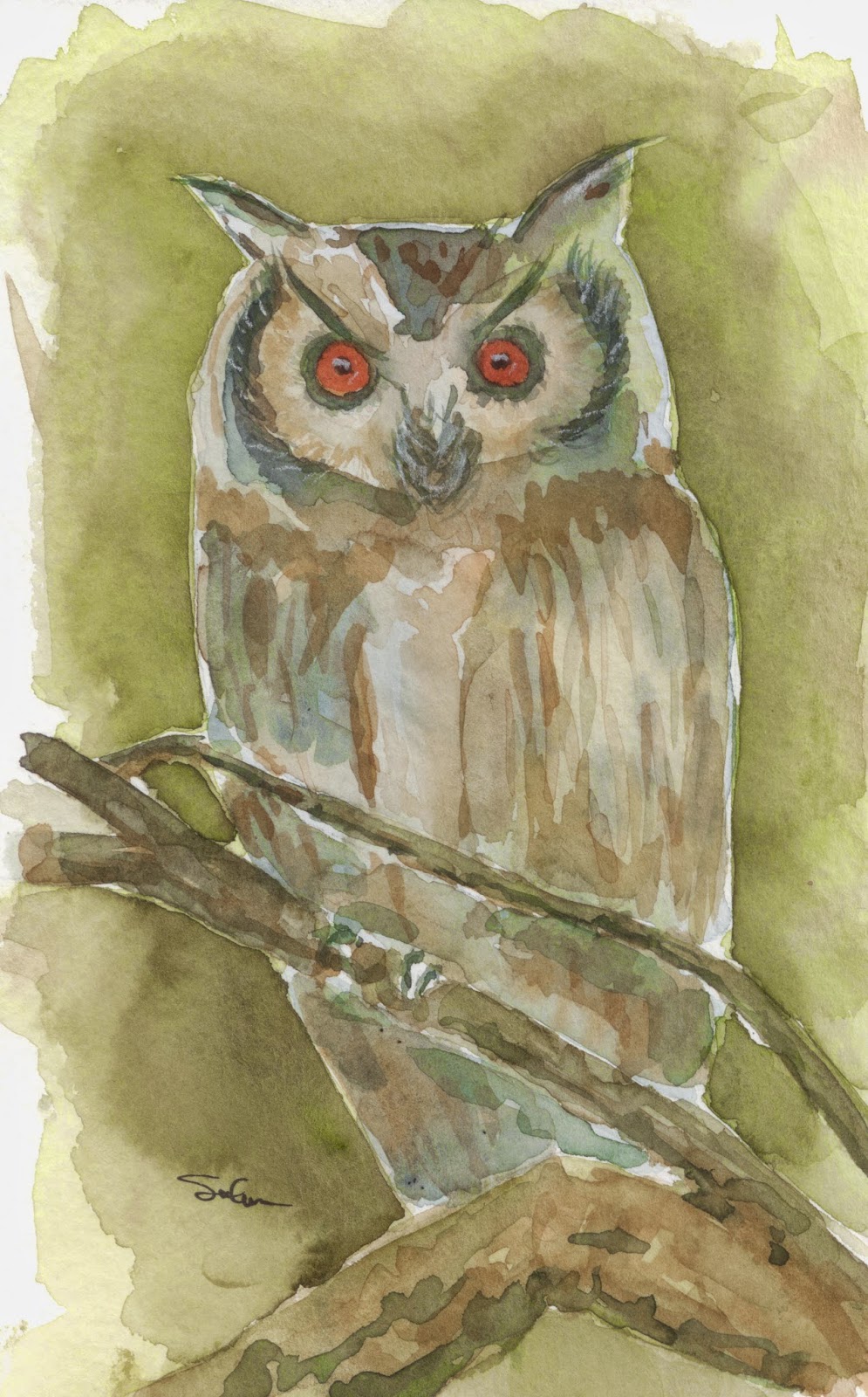
Owl at night

Ok, so they cant all be winners.  This one got away form me pretty early on, and I couldn't quite tell how to write the ship.  I just kept painting and painting.

After only about 5 minutes of painting I decided I didn't like this.  But having as thick a head as I have, I just kinda kept plugging away at it.  I will admit that the longer I painted, the better I felt about this.  I think one of my big problems is that when you paint owls, you have to put on two eyes.  You never see owl pictures with one eye.  The yes are what make the owl.  So... since the eyes are such a focal point of the owl, you have to have them look correct.  Right from the beginning (I mean even the drawing) I think my eyes were not quite right. Now they are different sizes, and that sets the painting off.  Grrrrrr... Oh well, that's why these are practice and I have an actual day job.

On the bright side, I painted lots of layers on this.  I would bet that there are places that have as many as 8 or 9 layers of paint.  And on the wing closest to you, you can really see that.

I've been trying to paint in more, lighter layers.  Trying to give my paintings a bit of depth.  The down side, is that in the back ground, on the inital layer, I had branches behind the owl.  Adding subsequent  layers has rendered them invisible.  Oh, well, take the good with the bad.

I still had fun painting this one.  I've got  friend who was looking for an owl painting, and this one just might end up in her office.  Thanks for viewing.

Wednesday, June 18, 2014

May Eye Have a Cup Of Tea

Well, now that it is summer and things have slowed a bit, I can spend a bit more time painting.  I'm not spending a ton more time, but just enough to be able to pump a few paintings out a week.  A while ago, I got interested in drawing and painting portraits.  Most of them were horrible, and should never see the light of day.  Since I had a few that were unmentionable,  I thought it a good idea to learn how to paint eyes, mouths, noses, ears, basically all the components of the face in hopes of bieng able to put them together into a cohesive picture.  Well, I didn't really follow through in earnest with that.  I did, however, continue to draw eyes.  Here is one I did in a few spare minutes today.  Yes, I will admit to being influenced by some videos that I have seen on line recently.  (Maybe I shouldn't watch any videos on line.?)  Below is the the same eye, but before I finished it off.


Here is the first iteration of the eye.  It is a little flatter, and a little blander.  Somehow the eye really does seem to pop out more in the finished one.  Who'd've guessed?
Also, I was able to do a little extra doodling this morning.  I painted my tea cup.  It's not a traditional tea cup by any sense, rather its a man's tea cup.  It's hand made pottery.  And truth be told, its a travel coffee cup.  But in my little world, never shall coffee be introduced to your coffee cup for fear of adverse flavors in your tea.  So, this one has been my tea cup for years.

Hope you enjoy these quick pics.  Thank you.

Tuesday, December 10, 2013

Green Motorcycle

Ok, I've been trying to paint a few paintings recently, and have been having a few problems.  I am not a trained painter.  I've never taken a course, and I don't prescribe to any  real system to do my paintings.  I have, however, reviewed like a million videos, and online tutorials on how to paint.  At this point in my artistic career, I should tell you I think they are all bunko!

I've done a few paintings recently (ones that you will never see) that were painted in this more traditional way.  Sky first, then background, foreground, blah blah blah.   They all stunk.  I think that method isn't going to work for me.  Looking back at all the pictures that I have done that I think look good, and that I have had fun painting have been done mostly opposite of this.  As was the painting of this motorcycle.

I sketched the bike and jumped right in with painting it.  The foreground, the background, the sky, they will all take care of themselves.  What I think is most important to get right, right away, is the subject of the painting.  (Yes, I will admit that I like these kind of diffuse foregrounds and backgrounds.  And if I wanted to at this poinet I could go back and put in whatever foreground or background details and no one would ever know I didn't do it the "proper" way.)

I will admit to making one HUGE error with this bike.  It was supposed to be blue!!  I was working on two paintings at once, on was drying and I started with the wrong color without thinking about it,  Oooops, what do I do?  Well, I just kind of went with it, and figured that some people have green bikes anyway.

I still like it, and hope you all do to.

Wednesday, December 4, 2013

Grape Redux

Ok, I warned you this was coming.  I painted a second painting of grapes.  I don't know which one is better, and I'm not really going to try to figure it out.  I like them both.  This for me turned out to be as much an exercise in figuring out which paper I like better as much as it was painting grapes.

So I said in the last post that the other paper allowed me to play with the water a bit more.  Well, sure enough, this paper, holding true to form, sucked up so much water so quickly I had quite a hard time with any kind of details.  As I was putting the second wash on the leaves (and forming the veins) it was all I could do to keep the paper wet enough not to have terrible hard lines in it.  I had to use a small brush to paint the small area where all the veins convers (on the big leaf), but before I could move away from that spot, there were hard edges.  Happened on each of the veins I did.  I just dind't have that problem with the other paper.  I guess I could have tried to do something like cover the whole paper with a quick wash of water, but I'm always afraid that the undercoat of paint is going to run, and I really dind't want that.

Well, enough of me griping about my paper.  I'll just have to adapt and move on.  On a positive note, I think I did a good job with the different colors of purple and blue and red of the different grapes, and given that I only used Sap Green as my green in this painting, I am happy with the many shades I was able to make out of it.

Nuts!!!  I just looked back and I have no details on the wooden post.  Ah, well, it's not something that is hard to go back an put in.  After I put them on, I'll update the picture.

Well, I hope you all enjoy this one too.  I did really like painting it.  I will admit however that I don't really wanna paint circles again for a while.

Friday, October 25, 2013

Keeping it Reel

Yes, I know I said I was done with the whole fishing theme.  But I actually did this a couple of months ago, and had never gotten around to posting it.  As you can see, we have another reel.  This doesn't necessarily look all that old save the bakelite crank handle .

I had a bit of a had time trying to get several different colors and shades of grey or chrome.  I didn't want any one piece of chrome to look too much like any adjacent chrome.  Then I had to put a few shadows on.  I guess the jury is still out on how I did.  

I think the thing I still need to do on this is to paint or draw on some line and this one is done.  Hope you enjoy it.

Friday, October 11, 2013

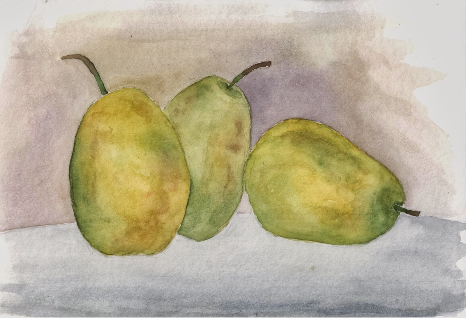
Pears on Table

Ok, so I put my shadowing the pears.  I think it came out pretty good.  As I was learning to put shadows on, I kept hearing how shadows are blue.  I would see people put pure blue on their paintings as shadow.  While from time to time it seemed to look ok, I never thought that was a good thing to do.  I did, however, follow suit with that.  As a result, I believe I have ruined some paintings that I thought were pretty good.

To me the shadow is not a color (like blue) on top of another color.  What it is is the lack of some light on an object.  Since there is less light, the color of the object should be darker.  The shadow should be the same, or nearly the same color as the object it is on.  In this painting the shadow on the pear in the back is green, and a little brown.  Those are exactly the same shades that are in the pear itself.  On the table the shadow color changes to a darker grey, similar to that of the table.  Notice that I am not saying the same.  Since I have really mixed the colors in the grey of the table, and the greens and browns of the pears, it is impossible to make the same color.

Maybe I have begun to crack the whole shadow thing, and maybe I don't have to be as afraid of painting them anymore.  Anyway, I hope you all enjoy the pears.

Thursday, October 10, 2013

A Nice Pair

Ooops, did I spell that wrong.    Well, it will probably pull in a ton of visitors to Dabfly Arts.  So I have a challenge this month of painting fruit in a group of three.  So far, I drew three that I liked, and painted them the way I liked, and am generally happy with them.  The problem is that now I am going to have to do the thing that I hate the most.  I hate it because it seems I take a relatively good painting and make it a horrifically terrible painting by doing this.

Can you guess what it is?  I need to add shadows.  you can definitely see that one pear is behind the other two, but there are no shadows on any of the pears and none on the table.  What to do.  I really like the green and yellow and brown that I have going in this picture and really don't wanna ruin it, but in order to make the picture complete, I'm gonna have to.

The question I have (for myself) is how long do I stare at this picture before I go ahead and attempt the shadowing.  I will probably get to tomorrow and have the finished product ready for you for the weekend.    Be sure to check back soon to see how it turned out.

Thursday, August 22, 2013

Laura

This is a portrait of an on-line friend.  She had posted a sepia tone portrait of herself, and for whatever reason (probably that it was in sepia tones and easy to see the highlights and shadows) I really felt that I could paint it and do  a good job of it.

I used VanDyke (I don't think it's named after Dick) brown, yellow ochre, alizarin crimson, raw umber and burnt sienna.  Starting with a sketch of her, i started adding color to her face.  A LOT of layers.  I basically put on a tiny bit of paint, then smoothed out the edges so there wouldn't be any hard edges.  Then move onto another spot and do the same.  Once an are dried I went back and did another layer.  I think at its deepest, there are 6 layers.  It makes for a glowing painting.  I did it this way because in the past I have put the colors on in thicker layers and it has just looked flat.

I did use colored pencil on the hair.  Hair is really tough for me (and probably for everyone.  I guess the only way to get better at hair is to keep practicing.  My only regret with this painting is that I used such soft paper, and it didn't like the constant washing.

All in all I think I did a pretty good job.  Laura I hope you like it.  Everyone els too.  Enjoy.

Friday, February 15, 2013

Not This One, The Otter One

SOLD
This is a little change from the norm for me.  When I started painting, just about all I did was wildlife in and around my town of Morro Bay.  Then at some point, I got away from it and started painting all sorts of other things, recently its been cars and trucks.  Well, this one brings me right back home.

I found this picture on line.  An otter all wrapped up in kelp.  For those of you who have never seen them do it, the love to.  I don't know what benefit they get from it, but they love to wrap themselves up in it.

Here is the picture I started with.  Just a basic outline of the otter in the water.  (apologies for the darkness of the photo, the flash on my iphone was on, but must not be quite bright enough. )


The next step was to add fur and kelp.  I kept the kelp really yellow at this point.  I wanted it to really stand out when you saw it on the finished painting.  To do that I make it really bright to start with, and then add more colors over top.  Blues, reds and browns will make the final colors of the kelp.

The real challenge is to paint the fur without making it all run together   I chose to make the feet a little darker, and the face a little lighter.  Hopefully it all worked out.

As you can see the finished product has water around the otter and just a bit of reflection.  

I hope you all enjoy this painting.  I really had fun painting it.


Wednesday, February 13, 2013

Another One??? Really??

This painting for sale.  6x8 $15
You love it, you know you do, you can't wait to see the next old, decrepit car sitting in a field.  Well, your wish is my command.

To be honest, I'm not completely sure what car this is, but I'm sure its pretty old.  Its got a lot of weeds growing around it, and it looks like one of its tires has fallen off.  It's got a yellow license plate, obviously out of date.  Hmmm who could have had yellow plates back in the day?  Well, it really doesn't matter.  The car has found a nice home under an old tree.  Hope nobody totally forgets about this old car.

This one, and yesterdays, are the first old cars I have really done with any color (other than rust).  It got me thinking, how come I don't see more color on old cars.  After doing a little research I found that most cars like the ones I paint have a fair amount of paint on them.  I've just been so focused on the rust, I neglected to see it.  So, from now on, when I paint an old car or truck, I'm gonna do a better job of incorporating some of the cars paint.  That doen't mean there wont be a fair amount of rust, but there is definately gonna be a bit more color.

Hope you enjoy this little painting.  I had a ball painting it.

Tuesday, February 12, 2013

Old Dodge

This painting for sale. 6x9  $15
This isn't a picture I planned on posting this week.  I had been working on this at home and had been taking my time doing it.  For some reason, I brought it into work with me, and then felt compelled to finish it here.

I've do this with just about every painting I do, and I thought I might share with you all.  My friend, Bob Ross, always says to make up a story about what it is that you are  painting.  When you do this, you will create a better connection to the picture.

This car is obviously sitting on a plain somewhere,  I imagine it is South Dakota.  The summer is gone, fall is in there air.  There hasn't been much rain for the past several months and the grasses are going dormant just before winter sets in.  Here the car sits, just rusting away out in a field.  Probably there are animal trails all around it.

Well, for what it is, here it is.  Hope you all enjoy it.

Thursday, February 7, 2013

Going Back On My Word


This painting for sale 9x12  $30
 Well it didn't take long for me go revert to my old ways.  A short few posts ago I swore off cars for kittens. It looks like I was abel to keep that word for all of a week.

With that, what we have here is a Studebaker.  I can just imagine this cars sitting, baking in the sun somewhere in Texas, or Oklahoma, Arizona or someplace like that. The blazing sun has cracked the pavement and provided no relief to the dry, brown dirt on the other side of the parking lot.


I didn't take pictures for the whole process this time.  This is the first one I took.  You can see the sky is already done, but there is plenty to do on the rest of the painting.  I tried hard to put in some coud details on this painting instead of just a plain sky.  It's a bit hard since we don't have many real clouds here to look at in real life.


I've jumped ahead quite a bit here.  You can see the shelter in the background is done as well as the sidewalk, the windows, and the chrome on the car.  If you look at the shadows, they are different than the final product.  I thought I had them right when I put them in,  then I stepped back to look.  Wow! was I ever wrong.  I had to go back in and fix them.  They look a lot better now.

Finally, a few finishing touches and the painting was done.  I strengthened a few of the colors and put in the trees and weeds.  They seem simple but they really do add a lot to the painting.

Hope you all enjoy.

Monday, February 4, 2013

Cat 3

SOLD!
Ok, so I am back on animals full time now.  Here is a nice calico cat I've been working on.  With the background colors, it kind of looks like some kind of Oriental painting or something.  I'm really facing a dilema.  How much fur, or detail do I put into these paintings.  It seems as if I put in none, it's way too little, but if I put in what I think there ought to be it's way too much.  Maybe I'll just have to stick with whiskers   I don't really know what to do about it, but I am determined to figure it out.  I guess you all are going to have to get use to seeing some animals for a while I work it out.    Enjoy

Wednesday, January 23, 2013

Another Old Truck

So I thought I would let you all see the steps I take to create a painting.  We'll start with a drawing and go through the final product.  I've kind of wanted to do this for a while now.  I think it is much more interesting than just seeing the final painting.  I apologize for the quality, or lack there of, some of the pictures.  instead of scanning all the picture, i just snapped a photo with my phone (wow, doesn't that sound funny?).  While I did use the flash on it, and the picture is under a light, I somehow still get grey spots on the photos.  So, without further adieu, here we go.


Here we are with the drawing.  Not too  much detail.  The truck has a lot of detail, but the foreground and background not too much.  I go back and forth between wanting more, and wanting less.
This is the first layer of paint.  It is this layer that will add the color that you will see on the truck.  You can see the reds, yellows, blues and greens.  Even though more coats of paint will go over the top, this layer will always be able to be seen.
Here is the second layer of paint on the truck body.  At this point I need to decide if I like the color or not.  If not, I'll add another layer to change the color.  What do you think from the final painting, did I add a third layer?
Here I've added a blue sky and some trees in the background.  Notice that the truck still isn't done.  What I have left is mostly detail work.  I like to leave that till the end.  Since a lot of the detailing is at or around the edges of the truck, I want to get the mid-ground and the foreground in place so that I can paint over it if I need to.
Nearly done now.  You can see I've go the grill done, and the shadowing in the cab, wheel wells and around the grill.  I've put some shadowing on the truck itself.  The last detail is to put in some weeds in the foreground.  Adding the weeds will help to push the truck back in the picture a bit.  This is also a good time to mention the red in the foreground.  I think I've mentioned it before, but red tints make things look closer, blue tints make things look further away.  Just look at the mass of trees int he middle of the picture.  They are clearly bluer than the trees around them and look much further away.
This painting for sale.  9x12  $30

And here is the finished product.  The truck sitting in a field rusting away with some weeds growing around it.  Hope  you all enjoy it.


Monday, January 7, 2013

A Barn in the 'Hood

Ok, so on this painting i was working on letting color mix on the paper.  You can see on the barn roof and siding, that the colors are not uniform.  We all want to think that colors are mostly solid, but if you look closely, most colors are a mishmash of many many different colors.  I think I am getting a handle on form and shape, I might even be getting a handle on depth in my paintings.   Painting while allowing multiple colors to make up the body of each object may well make my paintings look more alive and vibrant.

Hope you enjoy.