Showing posts with label sitting. Show all posts

Thursday, June 25, 2015

Continuing the Theme


Here are two more sketches.  Both done in under 30 minutes.  I spent less than 10 drawing each, and finished the painting at abut the 20 minute mark.

No these aren't museum quality, but it is forcing me to draw more, and also to think more about where i put my paint.  Since I am trying to paint in such a compressed time, I have to conserve my paint strokes.

I don't know if I mentioned that I have switched to painting with a travel palette.  Having a palette with only 12 colors on it actually makes it easier than having one with 24.  I guess I have to think less, or maybe I have to think more.  Not sure.  do know that having all 24 colors I just used to grab the exact (or nearly) color I wanted to use.  With only 12, I now have to mix my colors a bit to get colors, and I think the mixing of colors makes the paintings a bit more alive.

Well, they are what they are, enjoy.

Wednesday, June 24, 2015

Nude sketch

I was challenged by a friend to do a nude sketch.  I didn't have a model to sit for me, but thanks to the good folks at pixelovely I was able to find something to paint.

It is of course a woman sitting with her head turned away from us.  I wasn't initially happy with the sketch, so I added a little background.  The colors are nothing like the original picture, but I think they help.

Since I wanted light on the models back, I put yellow there and tried to make it progressively darker as we move to the left.  I think it helped with the representation of light.

I've been reading a bit about painting quickly, and I am excited to learn that these quick sketches really are a valuable to learn form, shading and water control for watercolors.  I really like doing them, since they are so quick and last about as long as my attention span.  This sketch, for example, from blank page to finish was about 30 minutes.

Hope you enjoy it.

Friday, April 17, 2015

red

Here is a painting I started a long time ago.  I just never seemed to have enough time to finish it, or maybe it was interest.  Well, at any rate, I spent a little time last night to finish it up.  Hope you like it.

Friday, September 26, 2014

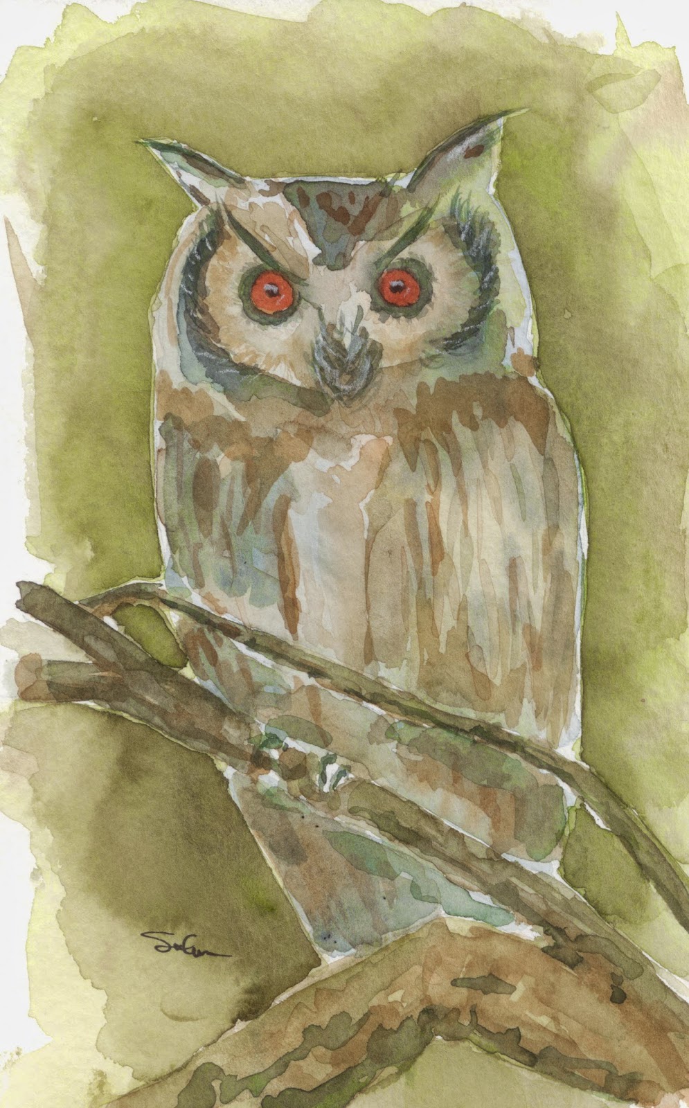
Owl at night

Ok, so they cant all be winners.  This one got away form me pretty early on, and I couldn't quite tell how to write the ship.  I just kept painting and painting.

After only about 5 minutes of painting I decided I didn't like this.  But having as thick a head as I have, I just kinda kept plugging away at it.  I will admit that the longer I painted, the better I felt about this.  I think one of my big problems is that when you paint owls, you have to put on two eyes.  You never see owl pictures with one eye.  The yes are what make the owl.  So... since the eyes are such a focal point of the owl, you have to have them look correct.  Right from the beginning (I mean even the drawing) I think my eyes were not quite right. Now they are different sizes, and that sets the painting off.  Grrrrrr... Oh well, that's why these are practice and I have an actual day job.

On the bright side, I painted lots of layers on this.  I would bet that there are places that have as many as 8 or 9 layers of paint.  And on the wing closest to you, you can really see that.

I've been trying to paint in more, lighter layers.  Trying to give my paintings a bit of depth.  The down side, is that in the back ground, on the inital layer, I had branches behind the owl.  Adding subsequent  layers has rendered them invisible.  Oh, well, take the good with the bad.

I still had fun painting this one.  I've got  friend who was looking for an owl painting, and this one just might end up in her office.  Thanks for viewing.

Thursday, January 3, 2013

Quick Sketches of Statues


Here are two statues from my house.  The first is a painting of a copy of The Thinker by Rodin.  You will recognize the classic form of the man hunched over with his chin on his hand.  I tried to paint it quickly and loosely using only a couple of colors, but varying them enough so that you might distinguish the depth of the statue.  I hope I did it justice


This second painting is one of a woman wearing a necklace and headdress.  Again I tried to keep to a couple of colors only, but while still allowing you to see the shadows and depth of the painting.  At this point I will admit to not being the best at seeing shadows in what I paint.  I try, but sometimes seem to only paint where I think the shadows are.  This is somewhat a mix of seeing and feeling where the shadows are.  Looking back i should have added a little more shadow around the jewelry, and filled in her hollow eyes.

This painting was done on drawing paper instead of watercolor paper.  Thus the warping of the paper that you can see in the scan.

How you enjoy.

Wednesday, September 19, 2012

Woman on Bench

Ok, here we go.  I think i got the proportions on her a bit better.  She still looks pretty flat, but at least her feet aren't twice the size of her head.  Her arms and legs seems to be about the right size and length.  Her head seems to be about the right size. She just doesn't quite look like there is any depth to her.  Hmmm, back to the drawing board.

Tuesday, June 5, 2012

Red (or greed) Again

Watercolor 7 1/2x9.  SOLD
Ok, so I had painted this picture, and actually thought it was not too good.  So, being the good watercolorist, decided to do something about it, and since my medium is watercolor, was able to do something fairly easily.

The first thing I did  was get most of the picture wet.  Then I began scrubbing off the old background.  I was able to get most of it off without too much trouble.  The only parts that didn't come off too well were the parts around the leaves.

Next I wanted to try out a new technique.  I actually tried it at lunch today on a different painting, and it work out really well.  (A little backstory.  We have a   faculty member here who is a professional watercolorist.  One of the things he does it make strong delineations around his subject.  Having a strong color and then blending to a light hue at the edge makes for a very dramatic painting.)  I tried his technique here and It worked out pretty good.  I couldn't make the light are too light because it would show the paint that I couldn't lift off.  but even so, the bird pops out of this painting, and looks 100X better than the previous one did.  I'm glad I took the time to do this.  Hope you all enjoy it.