Thursday, December 6, 2012

Who Doesn't Love the Shell Shop

Once more I'm tackling the more memorable sights in Morro Bay.  Everyone who comes here drives past the Shell Shop.  Some even stop.   I've lived here six years and been in there once.  But if you talk to visitors of our fair city, they all know the Shell Shop.  I don't think my last picture did it justice, so, armed with a different picture, I tackled it again.

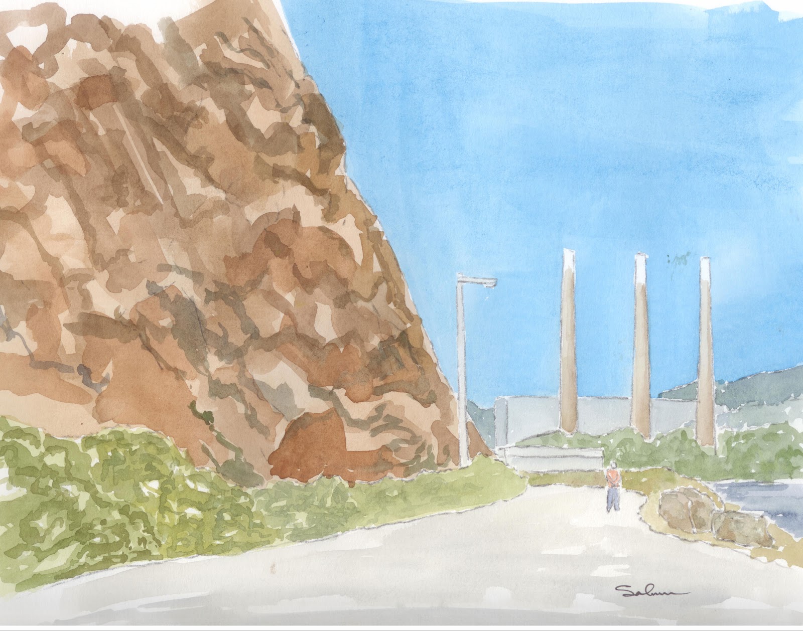
This one has much better perspective.  The really big thing I did differently, which I started on the last painting, but brought out more here, is the shadowing.  The shadows of the building are all building color. It's a more intense, darker color.  From this you can tell what part of the building is in shadow (most of it), and you can see the triangle at the bottom that is not in shadow.  I think it makes more sense to do shadows this way than by putting a blue grey shadow on everything.  I might have been able to mix a little more grey in the color, but I think the principal is one I am gonna continue with.  Shadows on the focal point of the painting are gonna be the same color as that of the subject.

Additionally, I think the anchor turned out pretty good.  The writing on the shell is a little crooked.  Its really hard to paint letters freehand.  Especially with red.  With red if you make a mistake, you can never take it off the page.  Other colors a a little more forgiving.

Well, thats it, I hope you all enjoy it, and when you come to Morro Bay, you can stop by the Shell Shop and see it for yourself.

Wednesday, December 5, 2012

Another Old Truck

THIS PAINTING SOLD
Another old truck. And surprise, its the same one as before.  The previous one is gone, off to someone else to look after it and I liked it so much I had to have one of my own.  Thus, this second painting of it.  I did a few things differently on this one.

First, i tried to make the hill on the right hand side a little more mottled.  It looks like there is some texture to it now.  Additionally I made it a little bluer.  It really makes it look like it recedes off in the distance.  I also tried to put in another level of weeds around the truck.  I thought this would really make it look like the back is way back and the front much closer.  I don't know how successful that was, but I don't think it takes away from the picture either.

The truck is mostly the same.  As I learned to paint shadows, I learned that they should be a blue grey and laid over top of the underlying color.  I 'm not sure that that really makes for the best shadow areas. on this one, I tried to just put in a little darker more intense coloring in the corners so it looks like a bit of a shadow but nothing too harsh.  Looking at it, I probably could have been even more aggressive with the color.

All in all, I am really proud of this one.  I think it is at least as good as the first one.  If anyone wants to buy, I'll sell.  Just send an email and we can talk terms.

Thursday, November 29, 2012

Smoke Stacks

If you have not been to Morro Bay before, then you probably don't know that there are actually two different thing that dominate our skyline.  The first is, of course, Morro Rock.  The second, which most people think of as an eyesore, are the smoke stacks of the power plant.  Personally, I think that the stacks have been here long enough that if they ever were to go away, people would work hard to find a way to restore them.  I've been working on a way to include them in a painting for a while now.  Well, I finally found one.  I painted this very quickly and loosely.  I think rock came out pretty good, and I even like the bushes in front of it.  I couldn't help but paint someone walking down the road.  All in all, I think its a pretty good representation of what they both actually look like.  Hope you enjoy.

Wednesday, November 28, 2012

Camping, VW Style

From the moment I saw this picture I thought of my neighbors.  They are quite old, and only live in California half of the year, but while they are here they do a fair bit of camping.  They have a brown VW Vanagon in their garage, and about every other weekend they get away for a little camping.   I don't really know if theirs is a pop up or not.

I painted this picture to give to them when they make it back to the Golden State.  But now that I am looking at it, I'll never be able to give it to them in this state.  I seem to ha ve forgotten to put shadows on this painting.  Shadows are always the last thing that you add, and oops....  Well, it wont take to too long.  It really is amazing how much interest a few shadow lines will put into a painting.

Well, I hope you all enjoy it, I'm off to add sahadows.

Wednesday, November 21, 2012

Down on the Embarcadero

Ok, here we go again.  This is a second painting of Giovanni's Market and Gallery.  If you don't remember the first one, you can view it here.  This painting is from the opposite direction and some obvious differences.  

The first real differences is that this painting has all the proper colors.  The previous one was taken from a black and white photo, and I was working from memory on the colors. This one was painted from a color picture and so, all the colors are correct(ish).    I got a bit more ambitious with this one too.  Obviously there are people in the painting, but also there is tile and brickwork, among other things.

I used ink to outline and highlight edges on this painting.  My intent was to not to do that.  I wanted to only use paint to edge the painting, but I couldn't quite keep the lines straight enough, so i had to switch over to pen.  I like how the outlining turned out everywhere except around the main awning.  Oh well, that's how it goes sometime.

Anyway, I had a great time painting this, hope you all enjoy it.

Monday, November 19, 2012

Top Dog Coffee Shop

Ok, here it is, the Top Dog Coffee Shop in Morro Bay.  Its right on Main Street.  I had a little harder time with this than the old truck.  I think it got started with the number of vertical lines I had to draw.  It followed through with the tables and chairs in front.  II think it came out pretty well but you will have to be the judge.

Friday, November 16, 2012

Things to Watch for Next Week

Just a quick look at what is coming up next week.  I've got a good start on the Top Dog Coffee Shop here in Morro Bay.   The lower picture is another one of Giovanni's Fish Market.

Seeing the pictures in various states of finish will also give you a little insight into what I go through in order to create these paintings.

Enjoy

Wednesday, November 14, 2012

Old Truck in a Field

SOLD!
This was a great picture to paint.  I lived doing it.  The picture I took it from was really dark, and I wasn't sure I would be able to lighten it up and still keep the same look.  I think I did a pretty good job.

Well, I tried to make the colors of the truck and the grasses in front of it brighter and more intense that those at the top.  That pulled the truck foreword in the picture.  It really does look like the field in the top right hand corder is a long way off.  Also, I tried the trick with the ground in between the rows of vines and the vines themselves.  They are darker the closer you get to the bottom of the picture, indicating that they are closer to you.

The chrome was a challenge.  How do you paint old rusty chrome.  Well, the answer for me was not too.  I merely made the chrome stilghtly different colors away from what I thought would be the most reflective part.  So between the top of the hood and the diamond in the middle of the grill, the chrome is brightest (again, allowing that to seem further toward the viewer).  As the chrome goes back from there, it gets darker, and of course as it goes down it gets darker.  If you look closely, you can see different colors in the chrome.

I tried to paint the body of the truck in different sections as they would have been put together.  The door, the cab, the bonnet, the fenders, the grill, each got painted at different times.  I was hoping they would come out slightly different colors to make it seem as though the paint is oxidizing at slightly different rates.  You will have be the judge.

My favorite part of this painting is the big dark front wheel.  It turned out great.  The color, the shadow, even the hub.  I love it.

Hope you all enjoy viewing this as much as

Wednesday, November 7, 2012

Grandparents Wedding

Well, for what it is, here it is.  The people don't look quite like they are supposed to, but I think I did a lot of things right on this .  You can tell where the suit coats come together, it isn't just one big blob of color.  You can just imaging grandpa standing there in his dress whites.  I'm glad i left some highlight in his hair.

The hair was a real problem for me.   I tried to leave a little highlight and allow you to see the hair texture.  Shading on the faces was really hard.  I knew it would be going into this, but wanted to try anyway.

Well, I'm chalking this one up to experience.  Its a piece I really wanted to do, and I still like it, but I think I fell a bit short of my expectations.  I'll have to use that as motivation to do better on my next one.

Enjoy

Tuesday, November 6, 2012

A hint of things to come

The purpose of this post is two fold.  First so you can see what is coming up from Dabfly Arts, and second so you can see what the process of painting looks like.


So I have this fantastic photo of my grandparents on their wedding day.  The picture was taken 70 years ago.  I projected the picture onto watercolor paper and traced out basic shapes.


From there, as you can see, its all about adding layers of paint onto the paper.  The first layer is just a basic layer, just trying to get colors all in the right vicinity.  This picture has two layers of paint on it.  You can see that I have put on some extra paint to try to begin defining shapes a bit more.


 IN this picture I have darkened things a bit more and really begun to give shape to the clothing.


Here I gave Emma-Jean, the woman on the far right a brightly colored suit.  And Bob, the gentleman on the far left a distinctive collar.  The next step will be to finisht Bob's suit, then hair, hats and deepening the skin tones.  Oh, and shoes.  I saved Grandpa for the last because his Navy dress Whites are so white that they are only gonna get some shadowing on them.

I am really hoping this is gonna turn out well.  I think it is, but the proof will be when I start painting the faces.  Faces will make or break this painting.


Hope you have enjoyed this little sneak peek into how I paint.

Thursday, November 1, 2012

Angel's Landing

Some good and some bad on this painting.  Lets start with the good.

I was gonna do a dark sky, or at least darker, but when I saw how this one turned out after only one layer of paint, I liked it so much I stopped.  And knowing what the sky looks like in Zion most of the time, there are no clouds anyway, so the sky seems about right.  The next thing that is really good, I think, are the mountains in the background.  They really do look like they are far away.  Just enough detail so you can see a few crevasses in the rocks, but not too much detail that its out of place.  I really like them.

Now for the not so good.  I don't think i got quite the right shape of this hill.  It is, in general, dome-ish, which I got, but somehow its not quite right.  I might go back and see if I cant make the far side of the path fall off just a bit, maybe that will help it look like it is rounder.

I might go back and pencil in some chains like on the real pathway, but I don't have time to do it today, but wanted to get this picture up.  If I make changes, I'll repost.  Hope you all enjoy.

Friday, October 26, 2012

It's So Nice I Had to Go to the Bayside Cafe

Well, this one too me a little more than an hour to paint.  In fact, it took me two lunch hours.  One to draw and one to paint.  And to tell you the truth, I am ecstatic with the outcome. I know that it is still not technically perfect, but it is a really good interpretation of the bayside, and I am learning a lot.

Check out the half barrels.  How do they look?  They look round.  Check out the tall stump behind the bench.  Round again!  and look at the shading on the umbrellas   They look like they could actually be in the sun.  The windows look like they are set back just a bit in their sills and the building has  a bit of texture to it.

The secret?  I'm learning to do things in multiple layers.  There is very little on this painting that was done with one layer of paint.  most of it has two three or four.  The stump, believe it or not, has six or seven, but i think it looks great.  I will admit that I had a bit of trouble with the grey in the windows.  They really need a go-over, but i couldn't bring myself to do it.  Any way, I really like this painting.

One more thing.  If you haven't seen it yet, there is a new drawing on Dabflyarts Drawings.   Just go to the top of the page, on the right hand side and click through.

Thursday, October 18, 2012

Be it ever so humble, there's no place like home

Here's home, Morro Bay.  This would be the view walking down the centennial stairway.  Of course every good picture of Morro Bay gas to have the Rock in the background.

Two things i really love about this painting.  The sky and the tree.  This is a new sky technique.  Still trying to get the darkest part of the sky toward the bottom, but building it up in layers.  This one is three layers deep. If you look you can see the three different coats of paint.  I think it made for a  really dramatic sky.  Then the tree.  This is the new tree method, where I don'f focus on painting a tree, but rather on putting colors where light and shadow might be hitting the tree.  It takes the focus off of trying to get individual leaves and twigs, etc.  and allows me to focus on the bigger picture.  In this, it works because it kind of makes the tree look slightly out of focus.   The real focus being on the chess board and the Sun-n-Buns.

I wish i had had some green ready when I painted the rock.  I love the mottled look of it, but it needed a little more.  I tried to get it to stand apart by making the base of it darker.  I think i did an acceptable job, but it needed a bit more.

Well, I had a great time painting this.  I hope you all enjoy viewing it.

Tuesday, October 16, 2012

More Arboretum Mayhem

Some more paintings from the Cal Poly Arboretum.  This on is a fountain in an english garden.  All the plants are cut with very specific shapes.  I really just wanted to paint the fountain, but have yet to figure out how to do it without quite a bit of greenery around it.  It was really hot today.  Had to be about 90 while I walked up to the arboretum, so I was glad that the place I sat while painting this was in the shade.  I actually think I was a bit too hot to paint as I had sweat rolling down my face while I was painting.  I'll revisit this at some point in the future.

This is a sign leading into..... you guessed it, the California Collection.  I don't know that I really got the wood of the sign the way I wanted to, but there are some things I like about this painting.  Using my trick of red in front and blue in back, it looks like the ground goes from front to back in the painting.  The rock in the front partly because of the red in the ground looks much closer than the sign or the rock behind the sign.  I don't know if you can tell, but the sign is not specifically perpendicular to our viewing angle.  The left side is just a bit smaler than the right.  I love the way the planter and plant came out.  It is just a mass of green coming out of this fantastic red pot.  I actually tried to paint the leaves individually, but quickly decided just a few splashes of a darker green would suffice for the leaves.

Hope you all enjoy these paintings.

Thursday, October 4, 2012

steps

Well, I went back to the arboretum today.  It was really nice.  Yesterday there was a group of people at the gazebo and they were making a bunch of noise.  Today there was nobody but me.  I sat in the same chair, but instead of looking down the hill I move the chair into the walkway, and faced it up the hill.  You can see some crazy plants at the top of the stairs, and there was a huge terra cotta pot on the left hand side.

I chose this because I like the rocks so much from yesterdays paintings that I had to do some more.  I don't think I quite got the contrast in the rocks that I wanted, but I think i got a fair representation of the rocks on the path.  I didn't have enough time to do all the shading that I wanted to.  I might go back and put some in later.  I might, also, to make the individual stones and rocks stand out a bit more, outline these in black pen.  I havent really decided yet.

I purposely left a lot of white in this painting.  There was mortar between the stones that make up the stairs, but I thought it might be a little better to leave those spaces white.  I'll bet yo that until you read that last sentence and looked at the picture again, you didn't notice it the white spaces.

I painted this whole painting with one brush.  Usually, I use two or three.  My travel set came with a very small pure sable brush.  I had never tried it before, but it has the benefit of being small and easy to carry (I know, all brushes are small and easy to carry).  Having tried it, I can definitely see why so many people love sable brushes.  Not only could I do thin lines with it, i could so a larger wash and every thing came out pretty good.  I might have to invest in one, or in a set soon.  I'll keep you informed.  In the mean time, hope you enjoy the paintings.

Wednesday, October 3, 2012

little plants

Well I took another trip to the arboretum today.  I found a nice place in the shade where there was a seat and a table and I sat down and drew and painted this.  This planter was on the side of the pathway and looked like a good subject to start with.  Start to finish was just about 1/2 an hour.    Thats pretty good.  With something like this, I want to work a little quickly.  What i hope is that working fast will make me be less literal in my interpretation of the subject and force me to focus on getting color on the paper.  I have to say, to some extent I think it really worked.

Looking at the top of the planter, it really does look like the plants in front are closer than those in back.  Also, the rocks look like they have some depth to them.  Wonderful!!  The bowl of the panter is a little flat.  I could have fixed that with a little richer color, but I guess that is what I learned from this lesson.  Hope you enjoy.

Monday, October 1, 2012

blue door

Getting back to the doorway theme I was working on a while ago, here is a blue door.  The proportions aren't quite right, the angles aren't quite right, bars over the door aren't quite straight, but for some reason I like this little picture.

Saturday, September 29, 2012

Atascadero

Here is a painting of the town square of good old Atascadero, California.

Friday, September 21, 2012

horses that look like horses, sort of

So I hiked up to my new favorite spot on campus again today.  And again, there were horses around the pond.  I decided to just try another sketch of them, and I think these ones came out a lot better.  The veiw is actually pretty spectacular, you can see the peaks like are in this picture but if you were to pan to the left you would see another one framing the valley behind.  The horses were very gentle and I took a few minutes to talk to and pet them on my way too and from the side of the pond.  I'm not sure if they wanted to be painted or not, but after about 15 minutes they got a little restless and 2 of them wandered off.  I guess I should have said that there really were about 6 or 7 horses there.

On my way back, I stopped off at the Arboretum.  I wanted to see if there was anything of interest there to paint, and if there were any seating areas where I could spread out.  As it turns out there are a lot of interesting things to see there. I'll definitely be doing a couple of paintings from there.  Get ready to check them out.

Thursday, September 20, 2012

Fishing Hole

Ok, so I heard of a possible fishing hole on campus.  A little pond that was up above the equine unit. I'm always on the lookout for a place to take the kids fishing, and had to check this out.  I decided to take my travel watercolor kit with me (yes,  I keep it at work).  I knew from looking on Google Earth that there might be some great views of San Luis from up there and I might be able to make a nice painting.  Well, I got up there and, yes, there is a nice little pond.  I found some fish in it, and yes, I plan on taking the kids.  Also, I found some horses not too far away and decided to give a try at painting them.  Now, I've never painted horses (or drawn them for that matter) before.  So I know this painting isn't all that great.  But what I really enjoyed was sitting on the side of the pont on a rock at the shore.  I dipped my watercup into the pond and used that for my water.  I was tickled to just be sitting there out side, with seemingly nothing around but a few horses, and painting whatever I thought I could.  It was truly wonderful.  And whats more, I could walk there, paint this picture and be back to my office within an hour.  Im going back tomorrow, perhaps I'll take my camera so you can all see what I am talking about.

Wednesday, September 19, 2012

Woman on Bench

Ok, here we go.  I think i got the proportions on her a bit better.  She still looks pretty flat, but at least her feet aren't twice the size of her head.  Her arms and legs seems to be about the right size and length.  Her head seems to be about the right size. She just doesn't quite look like there is any depth to her.  Hmmm, back to the drawing board.

Tuesday, September 18, 2012

Woman on Rock

Well, still trying to learn to draw people.  Took this from a simple picture of a woman laying on a rock. I think i got a little good and a little bad, like lots of my paintings.  The bottom half of her is too big, or perhaps the top is too small.    I tried to make her look 3D but I'm not sure i really got it.  There are parts of her that look 3D but all in all, she still looks flat.  On top of that, it looks like both her legs are at the same depth.  I like the shading on the bottom of her torso (what would be her oblique).  I tried several techniques to make her look more roundish and 3D.  First I put on the basic skin color, then I made the bottom and just a touch of the top blueish, then put some red in the middle.  in painting Blue things look further away, red looks closer.  I think I need stronger values.  Then I put shading on her limbs, took out some paint on where I thought light would be hitting, and finally shading under her.  All those together should have given her a more 3D look.

I think i just need more practice.

Monday, September 10, 2012

The Second Harvest

Ok, we are on to iteration number two.  I didn't look at the first one when I painted this one, so i think I suffered from some of the same problems, but to  a lesser extent.  This one, to me, makes it look more like the grapes are growing on individual plants, whereas the first one looks like a giant mass of vines.  I don't know that I am really blown away by the way it turned out, but I definitely like it.

Friday, September 7, 2012

Grape Harvest

The painting challenge for august is harvest.  This is my first attempt at painting a harvest.  I thought since the central coast is known for its wines, that I would paint a grape harvest.  I think I got a bit too heavy with the mottled colors on the leaves, especially in the foreground.  Im gonna try it at least one more time.  I love the picture and would really like to produce a nice painting of it.

Tuesday, September 4, 2012

Guy With Guitar (perspective)

Today we are going a completely different direction from tomatoes.  This is obviously a guy playing guitar, but I wanted to work on both drawing hands and on perspective.  When I stumbled upon this picture, I couldn't resist.

I really wish that the picture wasn't all blue and grey.  maybe I should repaint and use a red shirt or something.  Despite the way the left hand looks, I'm really proud of bing able to draw the hands as well as I did.  I think the main problem with the hand is not that it isn't drawn well, bu that the paint looks a little odd.  If you look at the hand again, you will see the fingers are formed well and in proportion.  Its just a little running I got from the pain that makes it look a little odd.

The left shoulder is supposed to be way in front of the right one.  I definately think I got the size of his arms right, but there is something not right about the way it looks.  It looks like this guy is sitting square to the viewer.  Well, I'll just keep at it, and I'll get it some day.

I tried hard to leave extra white in this picture.  I could easily have made his shirt a solid color, and it might have worked out ok.  But leaving the white gives a sense of highlights.

I am toying with the idea of putting guitar strings on this,  what do you think?

Friday, August 31, 2012

Red, Ripe, Delicious

MMMMMMM, tomatoes.  Yesterdays were green, todays are nice an ripe.  Still working on making round objects round.  The tomatoes are a prefect test for me.  Not only are they round, but most tomatoes have some yellow, orange and red all mixed together.  So I get to see how well I can allow the paints to flow into one another. I think I did a fair job of this.  Please let me know what you think.

Thursday, August 30, 2012

Tomatoes anyone?

I wanted to accent the green of the leaves and tomatoes with a nice blueish/purpleish color, but I think I got it too dark.  Well, it does really set off the green and make it pop off the page.

This one was really fun to paint.  It was a challenge to try to get all the greens side by side so that you could actually tell where one leaf or tomato stopped and the next started.  Im really happy with this.  I didn't need to line everything in black and you can see all the shapes and make everything out.

Hope you all enjoy this one.

Friday, August 24, 2012

PAC Center

This is a quick little painting I did of the PAC.  The Performing Arts Center.  People seem to call it the PAC Center for some reason.  Really they ought to call it the PA Center.  There are some dorms that really should be behind the trees on the left hand sid, but I took a little license.  And there should be some mountains behind the trees as well, but......  I think i did  a great job with everything I did put in.  Looking back a t the picture, the only thing i forgot to put on are some shadows across the sidewalk.  enjoy it.

Thursday, August 23, 2012

Morro Bay City Limits

Yes, this is Morro Bay.  I know there was some question about what this painting is.  This was painted from a picture taken in Morro Strand.  You actually have the city limit sign with some bushes behind it, and the rock in the background.

The thing I like least about this painting is the sign.  I thought for sure I would like it best when I was drawing it.  As it turned out, painting around all the letters was pretty difficult.  I think I'm getting much better at letting the paint mix on the paper.  If you look at the bush behind the sign, there are lots of different colors, brom yellows to greens, blues and purples.  They all seem to work together to give you the feeling of a huge bush.  and if you look at the ground around the bush, it is blue at the top, which pushes it back, and has a reddish tint on the bottom which serves to pull that area forward.

Hope you all enjoy this.  It was fun to draw and paint.

Tuesday, August 21, 2012

Campus Market

Can you guess what this is a picture of?  Yes, you got it, the Campus Market.  And guess what else, they have a potato bar.  Woooo Hooo.   I love the look of the metal, stone and glass on this  building.  I tried to do it justice.  In reality there are a few picnic tables in front of the building, but I tried to draw them and it got to be just a bit too much, so I left them off.  Looking back now, it really could use something in the lower right hand corner to balance the picture out a bit.

Monday, August 20, 2012

random weekend sketching

These are just some pictures that I painted over the weekend.  The top of a chair with a red box on it.


The lamp hanging in the corner of the living room.


These are some of the plants growing in my front yard.  Not sure what all of them are called.

 These are some of the plants growing in my front yard.  Not sure what all of them are called.


This is the tree from across the street.

This is the lamp from the dining room.

Friday, August 17, 2012

Can you spot the glaring problem with this painting

There is one huge problem with this picture.  Can you spot it?  I know that technically There are some problems with the picture, but there is one huge problem.  I didn't realize I had done it until it was time to scan the painting.

I on looking at this painting again, I think I need a shadow from the large pine tree on the left hand side.  I could go back and add that in later.  It's funny what you notice while you are painting and what you dont recognize until later.

Wednesday, August 15, 2012

buffalo wings

Today the Cal Poly Urban Sketchers met in the Biological Sciences Museum to do a little sketching.  After looking around at all the animal heads on the wall, I settled on this.  It is an African Buffalo.  It is really a dark brindle color, but I didn't want to make it quite that dark for fear of it becoming too dark.  I think this way it gets the point across.

As you can tell, it's really just a head.  It is hanging over the door, which i neglected to put into the picture.  From the size of the head, I have to believe that the beast is enormous with the hind 3/4 attached.  I definitely think our group will be back to paint again really soon.

Tuesday, August 14, 2012

Cotchett Education Building

This is the Cotchett Education Building on Cal Poly's campus.  In the foreground you can just see the word Design, which is on the Architecture Building.  Expect to see a picture or two of that building in the coming weeks.

I love the way the trees turned out on this picture.  They look like they have movement and life too them.  I also like the purple plants in the planter in front of the word design.  

In judging this one I think I should have made the shadows on the building darker. I think that would have given more definition to the building.  Also, I think I am gonna start to draw in pen so that I can get leaves on the trees.  As you can see I have loose drawings underneath the paint.  Drawing it this way allows me to have a general shape to the tree, but not get bogged down with a "tree" shape so that I can then just put the color on and let the tree become a tree.    Hope you all enjoy this.

Monday, August 13, 2012

Vineyard

I was asked by a friend to paint a vineyard, barn, or boat.  I've done a few of each with varying degrees of success.  I decided to take up the challenge of a vineyard for her.   This is one attempt.  Actually this is a picture of a vineyard in the Paso Robles area, about 40 minutes from where I sit typing this.  It won't be my last attempt at painting a vineyard.  Like with all of my paintings, I think that I am getting better at painting them.  I might end up just doing a bit of pen outlining on this one to give some definition to the grape leaves in the foreground.  If I make any changes, I'll repost.  Hope you enjoy.

Thursday, August 9, 2012

Another Clock

Here is the latest clock to come from Dabfly Arts. This one, as you can see, has a microchip where each number on a traditional clock face would be.  There are 12 hard drive controllers around the outside.  A piece of clear plexy holds the hard drive platter in place so it appears to be floating in the center of the clock.

Wednesday, August 8, 2012

Monday, August 6, 2012

Natural History Museum

This is, as the title says, the Natural History Museum in Morro Bay.  It really does sit atop a little cliff overlooking the bay.  It has stunning views and when the tide is out, like in this picture, the rocks at the the base of the cliff are visible.  I think I made the building a little small in this picture, but I'll get it all right at some point.  Just gonna keep working at it.  If I were to turn about 160 degrees to my right from where I was standing to take this picture, I would have Morro Bay rock directly in front of me.

I really like the look of this building sitting up there and am going to keep painting it until I get it right.  Oh, and by the way, until the 1950's, this was the clubhouse for Morro Bay Golf Course.

Thursday, August 2, 2012

Gus's Grocery

Ok, I will admit, Gus's isn't in Morro Bay, it's in San Luis, but its an institution and everyone knows it.  I had to give it a try.  Incidentally, if you want a great sub, Gus's is the place to go.

Some good and some bad on this one, just like the rest.  Seeing the scanned image, i can tell my perspective is still off a bit, but I don't think it really takes away from the picture all that much.  Some good coloring on the trees, and a bit ont he brick on the front of the store.  The stucco, I feel like I am having trouble with.  Soooooooooooooo many of the building here are all stucco, and if you know me, you know that i think stucco is like the laziest way to finish a building.  It rarely ever looks good.  Maybe I feel I am having a little trouble painting it because of the way I feel about it.    After painting the Bayside, I was told that if I made the windows totally dark, or black, that they would be much more dramatic.  I have to say, That was some good advice.  Well, I hope you all enjoy the painting.

Tuesday, July 31, 2012

Got Fish?

This came out a little redder that I had originally intended, but I still think it is a really great painting.  If you have never been, you need to go. Giovanni's is an institution in Morro Bay.  Great fresh seafood, and there is alway a line for fish tacos.

Monday, July 30, 2012

Dorn's The Original Breakers Cafe

Double click this picture to enlarge.
This was done over the weekend.  I found out one really important thing.  If you have two sick kids who are pretty needy, you aren't gonna be able to paint very much at any one time.  This entire painting was drawn and painted in one to two minute segments.

Even with the challenges this turned out ok. Now, I will say that I have been past Dorn's a thousand time, and I don't think the colors are right.  As it turns out, I had to paint the entire thing from a black and white picture.  I should also say that I felt so confident when I started this, that I didn't even do it on really good watercolor paper.  I did it on a slightly lower grade paper.

Saturday, July 28, 2012

Odds N Ends

This is a very quick painting of a couple of fishing  boats in the fog in Morro Bay Harbor.  
These are two quick sketches I did of the Harbor Hut tower.  Save the power plant stacks it is the highest thing around the south pier in Morro Bay Harbor.  It is obviously a south pacific themed restaurant.