Saturday, September 29, 2012

Atascadero

Here is a painting of the town square of good old Atascadero, California.

Friday, September 21, 2012

horses that look like horses, sort of

So I hiked up to my new favorite spot on campus again today.  And again, there were horses around the pond.  I decided to just try another sketch of them, and I think these ones came out a lot better.  The veiw is actually pretty spectacular, you can see the peaks like are in this picture but if you were to pan to the left you would see another one framing the valley behind.  The horses were very gentle and I took a few minutes to talk to and pet them on my way too and from the side of the pond.  I'm not sure if they wanted to be painted or not, but after about 15 minutes they got a little restless and 2 of them wandered off.  I guess I should have said that there really were about 6 or 7 horses there.

On my way back, I stopped off at the Arboretum.  I wanted to see if there was anything of interest there to paint, and if there were any seating areas where I could spread out.  As it turns out there are a lot of interesting things to see there. I'll definitely be doing a couple of paintings from there.  Get ready to check them out.

Thursday, September 20, 2012

Fishing Hole

Ok, so I heard of a possible fishing hole on campus.  A little pond that was up above the equine unit. I'm always on the lookout for a place to take the kids fishing, and had to check this out.  I decided to take my travel watercolor kit with me (yes,  I keep it at work).  I knew from looking on Google Earth that there might be some great views of San Luis from up there and I might be able to make a nice painting.  Well, I got up there and, yes, there is a nice little pond.  I found some fish in it, and yes, I plan on taking the kids.  Also, I found some horses not too far away and decided to give a try at painting them.  Now, I've never painted horses (or drawn them for that matter) before.  So I know this painting isn't all that great.  But what I really enjoyed was sitting on the side of the pont on a rock at the shore.  I dipped my watercup into the pond and used that for my water.  I was tickled to just be sitting there out side, with seemingly nothing around but a few horses, and painting whatever I thought I could.  It was truly wonderful.  And whats more, I could walk there, paint this picture and be back to my office within an hour.  Im going back tomorrow, perhaps I'll take my camera so you can all see what I am talking about.

Wednesday, September 19, 2012

Woman on Bench

Ok, here we go.  I think i got the proportions on her a bit better.  She still looks pretty flat, but at least her feet aren't twice the size of her head.  Her arms and legs seems to be about the right size and length.  Her head seems to be about the right size. She just doesn't quite look like there is any depth to her.  Hmmm, back to the drawing board.

Tuesday, September 18, 2012

Woman on Rock

Well, still trying to learn to draw people.  Took this from a simple picture of a woman laying on a rock. I think i got a little good and a little bad, like lots of my paintings.  The bottom half of her is too big, or perhaps the top is too small.    I tried to make her look 3D but I'm not sure i really got it.  There are parts of her that look 3D but all in all, she still looks flat.  On top of that, it looks like both her legs are at the same depth.  I like the shading on the bottom of her torso (what would be her oblique).  I tried several techniques to make her look more roundish and 3D.  First I put on the basic skin color, then I made the bottom and just a touch of the top blueish, then put some red in the middle.  in painting Blue things look further away, red looks closer.  I think I need stronger values.  Then I put shading on her limbs, took out some paint on where I thought light would be hitting, and finally shading under her.  All those together should have given her a more 3D look.

I think i just need more practice.

Monday, September 10, 2012
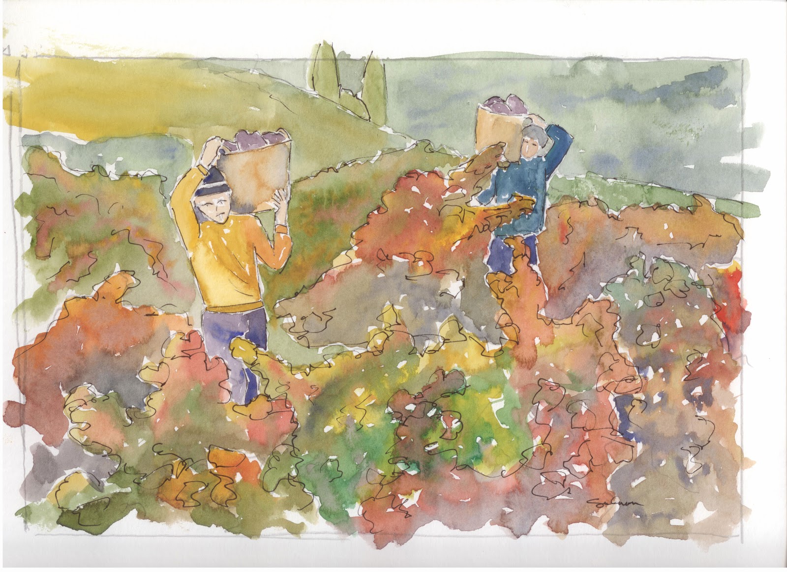
The Second Harvest

Ok, we are on to iteration number two.  I didn't look at the first one when I painted this one, so i think I suffered from some of the same problems, but to  a lesser extent.  This one, to me, makes it look more like the grapes are growing on individual plants, whereas the first one looks like a giant mass of vines.  I don't know that I am really blown away by the way it turned out, but I definitely like it.

Friday, September 7, 2012

Grape Harvest

The painting challenge for august is harvest.  This is my first attempt at painting a harvest.  I thought since the central coast is known for its wines, that I would paint a grape harvest.  I think I got a bit too heavy with the mottled colors on the leaves, especially in the foreground.  Im gonna try it at least one more time.  I love the picture and would really like to produce a nice painting of it.

Tuesday, September 4, 2012

Guy With Guitar (perspective)

Today we are going a completely different direction from tomatoes.  This is obviously a guy playing guitar, but I wanted to work on both drawing hands and on perspective.  When I stumbled upon this picture, I couldn't resist.

I really wish that the picture wasn't all blue and grey.  maybe I should repaint and use a red shirt or something.  Despite the way the left hand looks, I'm really proud of bing able to draw the hands as well as I did.  I think the main problem with the hand is not that it isn't drawn well, bu that the paint looks a little odd.  If you look at the hand again, you will see the fingers are formed well and in proportion.  Its just a little running I got from the pain that makes it look a little odd.

The left shoulder is supposed to be way in front of the right one.  I definately think I got the size of his arms right, but there is something not right about the way it looks.  It looks like this guy is sitting square to the viewer.  Well, I'll just keep at it, and I'll get it some day.

I tried hard to leave extra white in this picture.  I could easily have made his shirt a solid color, and it might have worked out ok.  But leaving the white gives a sense of highlights.

I am toying with the idea of putting guitar strings on this,  what do you think?