Friday, December 20, 2013

Orange Indian

This turned into a little of a rush job, and I'll probably have to go back and redo a bit of this at some point in time.  I wanted to finish this today, as this has been a lunchtime painting.  Today is probably my last day of work for the year, and I didn't want it sitting around unfinished for two more weeks.

I got the bike to stand out a bit from the background which I think is good, but I don't think I really captured the essence of this bike.  I'll definitely have to try it again at some time.  In the mean time, hope you all enjoy.

Wednesday, December 18, 2013

A Clockwork Green????

I got all excited this afternoon when I got an email from Etsy.  It seems that the last clock I made sold this morning!!!  I was so excited to hear it I went out and build another one.  Of course its not the same, not even close, but this one is cute.  Its a little clock, but has really nice symmetry.

This clock is made from 6 hard drive controller boards and one hard drive platter.   Luckily for me, all the holes lined up and  putting it together was fairly straightforward.  Sometimes I have drill my own holes to make a shape I like, and sometimes I just have to find alternative ways to get the look out of the piece that I want.


As you can see the boards overlap each other and surround the platter.  It gives it some interest as you look at it.

For any of you interested in this clock, it can be found in my etsy shop at Dabfly Arts on Etsy.

Thank you for looking, and enjoy.


Tuesday, December 17, 2013

Full Circle?

About a year ago, I painted about a half a dozen old cars.  When I was done, I thought I would never paint another.  Well, since I did that green motorcycle, I've kind of rekindled the fire for these old cars.  To that end, here is the most recent.  This one happens to be a Model T roadster.

It seems as though I've forgotten how to paint foliage.  Actually, as I painted this, it seemed like I forgot how to paint everything.  I know thats not quite right, it just seemed like it.  Well, anyway, enjoy!

Tuesday, December 10, 2013

Green Motorcycle

Ok, I've been trying to paint a few paintings recently, and have been having a few problems.  I am not a trained painter.  I've never taken a course, and I don't prescribe to any  real system to do my paintings.  I have, however, reviewed like a million videos, and online tutorials on how to paint.  At this point in my artistic career, I should tell you I think they are all bunko!

I've done a few paintings recently (ones that you will never see) that were painted in this more traditional way.  Sky first, then background, foreground, blah blah blah.   They all stunk.  I think that method isn't going to work for me.  Looking back at all the pictures that I have done that I think look good, and that I have had fun painting have been done mostly opposite of this.  As was the painting of this motorcycle.

I sketched the bike and jumped right in with painting it.  The foreground, the background, the sky, they will all take care of themselves.  What I think is most important to get right, right away, is the subject of the painting.  (Yes, I will admit that I like these kind of diffuse foregrounds and backgrounds.  And if I wanted to at this poinet I could go back and put in whatever foreground or background details and no one would ever know I didn't do it the "proper" way.)

I will admit to making one HUGE error with this bike.  It was supposed to be blue!!  I was working on two paintings at once, on was drying and I started with the wrong color without thinking about it,  Oooops, what do I do?  Well, I just kind of went with it, and figured that some people have green bikes anyway.

I still like it, and hope you all do to.

Friday, December 6, 2013

Quick Pin Up Girl Sketch

Just a quick sketch to keep in practice.  Forgot to erase the drawing grid, but on a practice sheet I don't think it matters that much.

Wednesday, December 4, 2013

Grape Redux

Ok, I warned you this was coming.  I painted a second painting of grapes.  I don't know which one is better, and I'm not really going to try to figure it out.  I like them both.  This for me turned out to be as much an exercise in figuring out which paper I like better as much as it was painting grapes.

So I said in the last post that the other paper allowed me to play with the water a bit more.  Well, sure enough, this paper, holding true to form, sucked up so much water so quickly I had quite a hard time with any kind of details.  As I was putting the second wash on the leaves (and forming the veins) it was all I could do to keep the paper wet enough not to have terrible hard lines in it.  I had to use a small brush to paint the small area where all the veins convers (on the big leaf), but before I could move away from that spot, there were hard edges.  Happened on each of the veins I did.  I just dind't have that problem with the other paper.  I guess I could have tried to do something like cover the whole paper with a quick wash of water, but I'm always afraid that the undercoat of paint is going to run, and I really dind't want that.

Well, enough of me griping about my paper.  I'll just have to adapt and move on.  On a positive note, I think I did a good job with the different colors of purple and blue and red of the different grapes, and given that I only used Sap Green as my green in this painting, I am happy with the many shades I was able to make out of it.

Nuts!!!  I just looked back and I have no details on the wooden post.  Ah, well, it's not something that is hard to go back an put in.  After I put them on, I'll update the picture.

Well, I hope you all enjoy this one too.  I did really like painting it.  I will admit however that I don't really wanna paint circles again for a while.

Tuesday, December 3, 2013

Are Grapes Really Made Out of Rehydrated Raisins?

Ok, so, like so many of my other paintings, I had an idea of what I wanted to paint, and then set about searching for the right picture.  In the course of looking for that right picture, I take about 300 detours and something completely different catches my eye.  This painting falls into that same category.  I started by searching for a truck to paint.  Don't ask me how I made it to grapes, I couldn't tell you.

What I can tell you is that this painting is not painted on watercolor paper.  It is painted on Mixed Media paper. Its the same weight, but has slightly different properties.  In my little region of the world, the air is quite dry and I have trouble keeping my paper even slightly damp as I paint.  As a result, I have to be very careful or I have A LOT of hard edges.  This paper has a slightly different surface that typical watercolor paper.  It's like its a bit slicker, or harder.  At any rate, this paper gives the paint a chance at flowing on the surface without immediately being drawn into the paper and drying out.  I found the paper in several different weights,   I bought a book of 90 lb paper to use for quick sketching, but this painting was done on 140 lb paper, just like my normal watercolor paper.

I made a concerted effort to use that to my advantage in this paintings.  You can see how wet the paper got if you look at the largest grape leaf and at the post.

I did an initial wash on this painting not worrying too much about what colors were where, and not trying to keep everything in between the lines.  Just tried to get the right colors in the right general area.  Then I went back an painted everything but the veins in the leaves.  What was the most fun for me was painting the dark between the grapes.  The grapes started as just a giant blue, red, purple blob.  Then I painted the in between parts and, Ka-Pow, there were grapes.  That was fun.  Iv'e actually got another version of this painting that I am working on.  Slightly different color scheme, but same basic grapes and leaves.  Hope you enjoy this one and that one.

Wednesday, November 27, 2013

Sad Puppy

Welll, I had painted a few cats a while ago, and always thought I would get around to painting a few dogs to even  things out.  well, Im finally getting around to it, its just that its nearly a year later.  This is my first dog.  Yes, its a bit flat, but its a start. At least it is recognizable as a dog, and I'd bet everyone can pick out the breed too.  

 I don' think I'll have another posting before the holidays so, to all, Happy Thanksgiving.

Tuesday, November 26, 2013

What Time Is It?

Ok, after so many paintings, its time to move onto something else.  And from the picture, that something is showing you that I have a beard and an iphone.  No, no, wait, that's not it.  What I meant so say was that I made another clock.  I've got a rather large supply of parts and I I started putting a few together and playing around and this is what came out.  I know its not the most elegant of all the clocks I've made, but it does have the advantage of have large chips at 12, 3, 6 and 9.  I've been criticized in the past for not lining things up, so I made sure I did it on this one.

Well, that's it for today.  If i don't get another post in I hope you all have a happy Thanksgiving.

Interested in this clock?  It can be purchased over at the Dabfly Arts Etsy Store.

Tuesday, November 19, 2013

Lips Incorporated

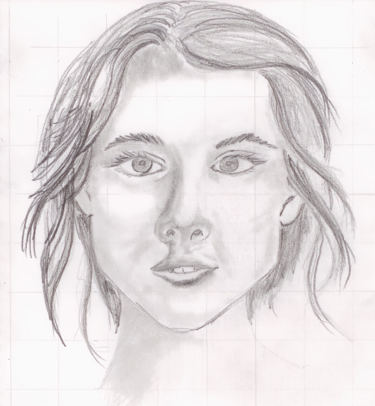
Ok, so last week I did a little study on eyes.  This week I am doing a small study on lips.  I had a few minutes at lunch so I quickly drew out some lip shapes, and then splashed on some paint.

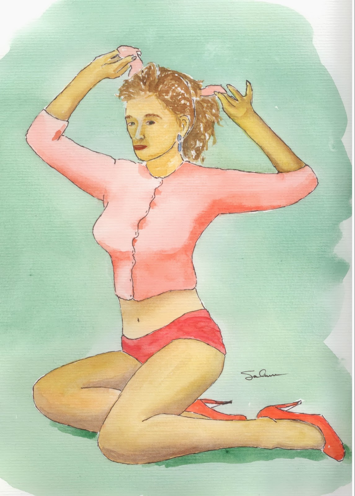
Oh, and the flower was an extra doodle that just worked its way there.  No real reason why.

I saw a quick video on how to make lips a little more realistic, and thought I would give it a chance.  Basically it went like this.
1. Draw two circles separated by a third (invisible) circle, all of them the same size.
2. draw a center line where the lips meet.  The line should be slightly raised in the middle.
3. Draw a third circle the same size as the first two below the center of the mouth, as distant from the line as the two circles above it.
4. Make an arc just above and between the two circles above the mouth.
5. connect the arc to the ends of the mouth and connect the two ends of the mouth by drawing a line around the circle on the lower lip.

TA DA - now you should have two basic lips.

I guess it helped a little.  I don't know how great a help it was, but it did get me drawing and sketching.
Now, I tired to put my eyes and mouth together.  I know its not a great painting.  Remember, I'm sketching quite quickly.  I just kind of guessed at the proportions of nose to mouth to eyes, so that might be a bit off.  I'm still not happy with the eyes.  More practice!!
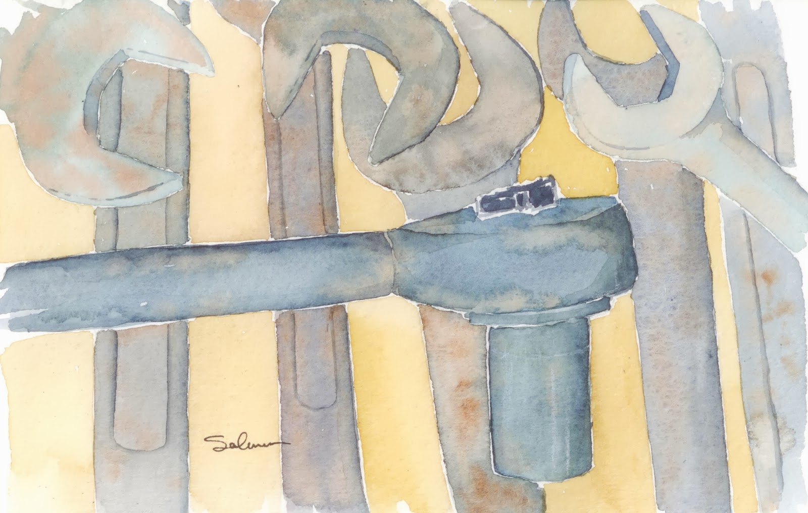
Tuesday, November 5, 2013

Eye Can See Clearly Now, The Rain Has Gone

Still doodling, and sketching.  Really trying to get better at painting people, so I am working on different body parts.  here are a few eyes.  I didn't have a reference photo while I was sketching, nor did I have a mirror, so the eyes are just kind of a made up assortment of parts.

It's really funny to think that sitting on my couch with a football game on, I can paint something that actually looks like what it is supposed to be.

Once again, I am just using regular paper.  I think the type of watercolor paper I have been using, in the climate I live in, is not really the best paper for the way I want to work.  Using this normal paper allows the page to be a little wetter a little longer.  My normal paper would soak up all the water right away and there could be no possibility of blending or mixing of color on the page.

These 3 eyes are watercolor and pencil.  I don't know if that is the most effective way to do this, but sitting on my couch, it seemed to work.  Looking back, i think I should have spaced them out just a bit and put on some eyebrows.  Well, maybe tonight.  Enjoy

Friday, November 1, 2013

sketching and drawing


 Ok, its time for a little fun.   Doodling and drawing seems to be more fun for me right now than sitting down to try to paint a really nice painting.  These are all quick sketches that seemed fun to do at the time,  and looking at the result, I almost like them more than the more serious paintings I do.


This one is what it looks like.  The beer I had on Wednesday.  (yes, I know it was a work night.  I didn't over imbibe.)


Olivia carved her own pumpkin this year.  I don't remember what these holes were.  The eyes are kinda on the other side.  Well, it doesn't matter, and when it gets explained to you by a 4 year old, somehow it all makes sense (or not).
These are just two things I saw out the window and took a quick pencil to.  There is no real significance to them other than I am making an effort to draw a few things a day, even if they are mundane things like these, to keep in a little practice.

Friday, October 25, 2013

Keeping it Reel

Yes, I know I said I was done with the whole fishing theme.  But I actually did this a couple of months ago, and had never gotten around to posting it.  As you can see, we have another reel.  This doesn't necessarily look all that old save the bakelite crank handle .

I had a bit of a had time trying to get several different colors and shades of grey or chrome.  I didn't want any one piece of chrome to look too much like any adjacent chrome.  Then I had to put a few shadows on.  I guess the jury is still out on how I did.  

I think the thing I still need to do on this is to paint or draw on some line and this one is done.  Hope you enjoy it.

Wednesday, October 16, 2013

Oh, My Blueberries

Well, I still don't have the color right with this scanner, but you get the idea of this picture.  Its a whole bunch of blueberries on a yellowish surface.

Firstly I will tell you that I am disappointed that the scan makes it look like i did this in purple, with purple and more purple.  I actually have a blend of 4 different blues, 3 different greens and two yellows to paint this picture.  Anyone who knows me, knows that I love blueberries.  I could eat them morning noon and night.  Mmmmmmmm sooo good.

Let't talk about the good things with this painting.  The berries really do look round,  You can just picture them laying on a yellow countertop.  I like the mixing of the colors, the reds, blues, yellows, and greens that make up the berries.  I like the blueberry crowns.  They look like they stand out just a bit from the round berry.  And I like that the countertop is much more pronounced in the front and much less in the distance.  I've said it before, but thats  a trick to get you to see some depth.  The darker the color in the front makes you think that its closer, especially when the top of the painting is very light.

I had painted the blueberries with all blue and red.  In my technique, I put on layer upon layer of paint.  It is great for giving depth to what you are painting, but you have to have durable paper.  Well, this paper isn't.  So I ended up with terrible white marks where I had scrubbed and rubbed.  Instead of having all the the highlights bright white, like the paper.  I threw a little yellow and green in there.  Just enough to give the hint of a bit of under color.  If you look closely, you can see where there is yellow on the berries, and which ones don't have any.

Well, at any rate, I loved painting this one.  Hope you enjoyed viewing it.

Friday, October 11, 2013

Taking Flight

We have had a bit of turnover at work.  We got a new ASC and she is into airplanes.  I thought it would be a good exercise to paint one.  This is a quick sketch of a plane that she likes.  Its called the Boomerang, and apparently is a prototype made by Burt Rutan.  I know its just all blue around the plane.  It's kind of like giving up on the background.  And I know that given the angle, you should be seeing ground under the plane instead of all sky.

Well, it's just a quick painting I did.  I didn't plan on spending a whole lot of time paint this, and therefore just wanted to block in some background.

Let me say one other thing.  I got some new software for my scanner.  Since I started using it, the pictures I have put up here have been terrible.  I don't know if it is all the scanners fault, or if it is something else, but when I post to blogger the color of the pictures goes all wonky.  If I look at them locally on my machine, they look great.  I'm going to get to the bottom of it, so please be patient while I work it out.  Thank you.

Pears on Table

Ok, so I put my shadowing the pears.  I think it came out pretty good.  As I was learning to put shadows on, I kept hearing how shadows are blue.  I would see people put pure blue on their paintings as shadow.  While from time to time it seemed to look ok, I never thought that was a good thing to do.  I did, however, follow suit with that.  As a result, I believe I have ruined some paintings that I thought were pretty good.

To me the shadow is not a color (like blue) on top of another color.  What it is is the lack of some light on an object.  Since there is less light, the color of the object should be darker.  The shadow should be the same, or nearly the same color as the object it is on.  In this painting the shadow on the pear in the back is green, and a little brown.  Those are exactly the same shades that are in the pear itself.  On the table the shadow color changes to a darker grey, similar to that of the table.  Notice that I am not saying the same.  Since I have really mixed the colors in the grey of the table, and the greens and browns of the pears, it is impossible to make the same color.

Maybe I have begun to crack the whole shadow thing, and maybe I don't have to be as afraid of painting them anymore.  Anyway, I hope you all enjoy the pears.

Thursday, October 10, 2013

A Nice Pair

Ooops, did I spell that wrong.    Well, it will probably pull in a ton of visitors to Dabfly Arts.  So I have a challenge this month of painting fruit in a group of three.  So far, I drew three that I liked, and painted them the way I liked, and am generally happy with them.  The problem is that now I am going to have to do the thing that I hate the most.  I hate it because it seems I take a relatively good painting and make it a horrifically terrible painting by doing this.

Can you guess what it is?  I need to add shadows.  you can definitely see that one pear is behind the other two, but there are no shadows on any of the pears and none on the table.  What to do.  I really like the green and yellow and brown that I have going in this picture and really don't wanna ruin it, but in order to make the picture complete, I'm gonna have to.

The question I have (for myself) is how long do I stare at this picture before I go ahead and attempt the shadowing.  I will probably get to tomorrow and have the finished product ready for you for the weekend.    Be sure to check back soon to see how it turned out.

Thursday, October 3, 2013

A Little Attitude?

I'm not quite done with this one, but  before I screw it up, I need to take a break fom it.  I like the way most of this has turned out. Of course the thing that needs the most help is the hair.  One day I'll be able to paint hair.   I don't really know when that will be, but based upon the look of the hair in this picture, it's gonna be quite a while.

Anyway, until it's done and you see it again, enjoy.

Tuesday, October 1, 2013

Pelican, Not Pelican't

Today I decided to use my watercolor pencils and crayons.  It's been a LONG time since I have tried them so I didn't really know what would happen.  In fact, I was so confident in my failure, like last weeks pelican, i just used old scrap paper.  And this is what I cam up with.

Here in Morro Bay we have two landmarks.  One is of course Morro Rock.  The other are the smoke stacks on the power plant.  Many people think they are an eyesore, but must admit that they, along with the rock are the first things people think about when they think of Morro Bay landmarks.  I've done a few paintings with the stacks in them.  Personally, I think that they are so integral to Morro Bay's history that they should always stand.

I'm also trying to get back to painting birds.  I thought I could get a little practice with both.  I found I was really shocked to see the colors jump off the page after I go the pencil lines wet.  Its like the painting was revealing itself to me for the first time, going from something dull and flat, to something vibrant.  Ok, the sky in this picture is a bit terrible.   I didn't remember that I would get such bad texture marks from the crayons.  But I really like the way the front wing on the bird worked out. And I really like the way the bird and the roof joist are clearly in front of the rest of the roof and the stacks.  I don't think the angle is quite right, but thats a different issue.

At any rate, this was a hoot to do and really quick.  I think I'll end up doing more of these quick pencil/crayon painting/drawings.

Thursday, September 26, 2013

A Few Quick Sketches

I've been asked quite a bit recently as to why I got away from painting and drawing birds.  My answer was of course that I wanted to learn to paint and draw other things and that I didn't want to be know as just a guy who paints birds.  But the truth of the matter is that I like birds and painting birds.  So, I've started drawing them again, and sketching a few.  Maybe this will even lead to a few full blown paintings.


Given that this is a quick sketch, I used some old paper.  When I scanned it, it must have had some dirt on it that really showed on the scan.    Its not quite this visible in real life.

Well, working my way back to painting birds and having a good time.

Tuesday, September 10, 2013

More Sketching

Another lunchtime sketching session today!  We all walked across campus to the market and sat at picnic tables.  I didn't have the best view, so i decided to paint what was right in front of me, literally.

Ed was busily painting the CAMPUS MARKET sign above the doorway while I was painting him.  When we were done and comparing paintings, we all had a good chuckle over my painting of Ed.

Yes, I know that the painting is completely bisected by the umbrella pole, that is kind of the point.  We are trying to paint exactly what we see.  I could have looked around the pole to paint Ed, but for what we were doing this is much more accurate, fun and funny.

I'm having just a bit of trouble with this paint kit.  I feel like the paint is either too strong or too weak, and I can't quite get it right.  The background in this painting should have been weaker to push it back further, and the cement table should have been a bit darker to bring it forward.  Well, live and learn.  It was still fun.

Monday, September 9, 2013

Return To Sketching

It has taken all summer, but my sketching group is finally getting back together.  We have all returned from places unknown and with luck will all be beginning to trek outside one day a week for some lunchtime sketching.  On campus we have a new building.  It is for the college of Science and Math.

I think i bit off a bit too much with this one.  I should have limited my scope a bit.  The building is just a big brick building with some white and black metal.

I mentioned that this is a new building.  While we were painting, there was construction worker drilling holes for handrials, movers moving furniture in and out of the building and the sprinklers got us all wet.  We may have tried to paint at this location a week early.


Friday, August 30, 2013

Metal Tackle Box

Well, here is the final one, I think, of my fishing series of paintings.  This one, is of course lures, in a metal tackle box.  Had fun painting it, though it took me a while.  I started this on my lunch hour last friday, and painted for about 15 minutes each lunch until today.  I like how some of it turned out, other parts, not quite so much.

Well, I'm keeping this write up short. Hope you enjoy.

Friday, August 23, 2013

Dabfly Arts is back on Etsy


Dabfly Arts has re-opened its Etsy store.  All paintings that are for sale will now be available for purchase through Etsy.  You can get a bit of the backstory for each piece of art on this site, and I will provide a link to the Etsy store where you can purchase it.

Remember, If you would like a custom painting, you can still contact Michael directly to discuss what you would like.

Thursday, August 22, 2013

Laura

This is a portrait of an on-line friend.  She had posted a sepia tone portrait of herself, and for whatever reason (probably that it was in sepia tones and easy to see the highlights and shadows) I really felt that I could paint it and do  a good job of it.

I used VanDyke (I don't think it's named after Dick) brown, yellow ochre, alizarin crimson, raw umber and burnt sienna.  Starting with a sketch of her, i started adding color to her face.  A LOT of layers.  I basically put on a tiny bit of paint, then smoothed out the edges so there wouldn't be any hard edges.  Then move onto another spot and do the same.  Once an are dried I went back and did another layer.  I think at its deepest, there are 6 layers.  It makes for a glowing painting.  I did it this way because in the past I have put the colors on in thicker layers and it has just looked flat.

I did use colored pencil on the hair.  Hair is really tough for me (and probably for everyone.  I guess the only way to get better at hair is to keep practicing.  My only regret with this painting is that I used such soft paper, and it didn't like the constant washing.

All in all I think I did a pretty good job.  Laura I hope you like it.  Everyone els too.  Enjoy.

Thursday, August 15, 2013

Fishy Fishy Fishy Fish

For Sale. Watercolor. 6x9. $25
Alright, sticking with my recents aquatic theme, I give you some more fishing lures.  I made sure to make the colors a little bolder and brighter.  And add a little shadow to the background behind.  My hope is that that would make them stand out just a bit more.  For some of the lures it really did, some not quite as much as I wanted.

As I was painting this one, i suddenly went, uh oh, its a brown background with a brown pole and some darkish color lures, I hope its not too brown.  Well, it does look a bit brownish, but I don't think it takes away from the picture as a whole.  I also tried to make the pole look round.  Not exactly sure how that one turned out!

Trying hard to loosen up my painting style.  The wall is supposed to have reds and yellows and greens in it.  Guess that was a bit too subtle.  The next one will have to be a bit better.  I think the mixing of the colors on the lures is better.  My favorites are the ones on the ends.  One other thing.  I started cheating my highlights.  You may look and see the white highlight lines.  They are not paint at all.  White colored pencil.  Takes all the stress out of trying to leave white area when I paint, and when you look at it, you looks like a real reflection.  Yes, I probably could do the same with white gouache, but this took all of a few seconds to do and looks nearly exactly identical.

Hope you all enjoy, I had a great time painting it.

Tuesday, August 13, 2013

State Park Marina

SOLD
If you ever stop by Morro Bay, California and by the State Park Marina, you will see a sight like this. The marina has about 8 slips to lease out.  Standing on the north shore, facing south, you could see a similar  view repeated on each of the 5 docks.   I've had the idea to paint this for quite a while now.  The kids and I go to the state park every so often.  On the south side the park system has installed a wooden boardwalk  that circles the peninsula.  Its a great walk if you have an hour or so.

Those of you who have been following my painting since the beginning will recognize that many of the first paintings I did were boats, and I always knew I would make my way back to them.

I've been getting to "tight" with my painting recently, and I purposely painted this one more quickly that ones I have done recently.  Sans drawing, this painting took me about 40 minutes start to finish.  Not bad, that still gave me time to eat my lunch at a leisurely pace.  I like this one, and hope you do too.

Thursday, August 8, 2013

Da Da Da La Da Da Da Da Feelin' Googie

For some reason, I was doing a search on Googie Architecture.  Its that futuristic style of architecture.  Don't really know it?  Think Jetsons, and you'll have it.  It was an architectural style that had its hayday in the mid to late 60's.  Anyway, there are all kinds of Googie buildings still around.  Most are now covered by historic preservation societies.

This restaurant is located in Rossmoor, California.  It is designed to look like its namesake.  Not only are the parasol ribs viewable on the outside of this round building, but on the inside as well.  Additionally, there are parasols hanging from the ceiling.  In case you are wondering, yes, I used to eat there when I live in Long Beach.  Its a cute little restaurant that I am happy to say has recently been saved from demolition and still in business today.

This painting probably means more to me than it will to anyone who views it here, but I think its great.  Enjoy.

Monday, August 5, 2013

What's Your Color

I love the way watercolors look when they are applied loose and fast.  The good folks over at urban sketchers (urbansketchers.org) do a great job of it.  In many ways I would like to do what they do.  For the most part they take simple images and add a bit of color.  They don't necessarily try to recreate an image with photo realistic accuracy.  The opposite is true in fact.  They try to paint quickly and give the impression of what they are painting, and let the viewers mind fill in most of what it needs.

This is the first painting I have  completed, that I think resembles ones that you will find on their site.  Hope you enjoy it.  Thank you.

Wednesday, July 31, 2013

Don't Get Hooked

This painting for sale.  Watercolor.  9 x 12.  $30
I'm calling this painting Dad's Tackle Box.  It is one more painting of something I am trying to elevate to art.  Looking at it, you just see a bunch of fishing lures, but  when displayed in a box like this, they do achieve some semblance of art.  Each of the lures has a white tag tied to it.  Obviously dad isn't gonna go fishing with these any more.  Too bad, I think I've caught fish on lures just like them.

Well, this one was much more technical than I am used to.  I Lots of tiny little places to paint, and trying to get all those strings in there was a bit much.  I hope I was able to stretch my abilities a little bit here.  I am going to have to try to do some more detailed paintings like this in the future.

Hope you enjoy this.  It certainly was fun to paint.

Wednesday, July 24, 2013

Keep it Reel

This painting for sale.  Watercolor 5 1/2 x 8 1/2.  $20
Well, in my attempt to elevate different everyday things to an artform, I give you the simple fishing reel.  Most of us probably have one or two sitting around in the basement or in the garage.  If you have ever gone to a garage sale, you've seen them. They get so unceremoniously tossed in a box and forgotten about for years and years.  Then one day you are doing your spring cleaning and..... Bammo..... there it is, and you have no idea what to do with it.  A quick search on Ebay to see if the reel is worth anything results in an overwhelming number or items that are tough to differentiate among.  Some are worth nothing, most worth a little, and a very few worth quite  a bit.

Well this humble instrument that allows us to have fun and catch our own dinner once in a while deserves more than that.  With this painting I hope to give it a little bump in the prestige department.  Hopefully viewing this reel will make you smile and feel good about your reel when you find it next spring.  Enjoy.

Tuesday, July 23, 2013

No More Monkey Wrenches

This painting for sale.  Watercolor 5 1/2x 8 1/2.  $20  
Part of trying to elevate everyday things into artwork.  I saw an image of some wrenches and couldn't help myself. I probably made the ratchet in the front a little blue, but somehow it doesn't seem to matter to me.

I am happy to say that this was drawn and painted in one lunch hour.  I used to do this a year or so ago.  Then I tried to do bigger pictures or more detailed pictures, and my rate of painting slowed way down.  Part of what I really liked and still like about painting is seeing things come to fruition in such a short amount of time.  I know that the subject is rather simplistic, and the handles don't have names on them, and I could point out lots of other flaws, or drawbacks with this painting, but I really like it.  I think maybe it is the simplicity of it that I really like.

Its a bunch of straight lines, with a few circles and arcs thrown in, but if you've ever worked on a car or bike or something, you will immediately look at this and it will bring back some memories for you.  Maybe, in the end thats why I painted it.  I saw the photo and it brought back a fond memory and I wanted to relive that as long as I could.

Anyway, enough of my rambling.  Hope you enjoy the painting.

Thursday, July 18, 2013

The Next Drawing

Ok, here is the next drawing.  I even managed to erase the gridwork over her face.  I know you need to put dark next to light when drawing.  It helps to add form to what you are drawing.  I tried it with this.  Not sure if it is working for me or not.  Well, I think this is a good effort none the less.

Wednesday, July 17, 2013

Lunchtime Drawing

So, I am determined to become better at drawing.  So, today during lunch, I drew a face.  Here it is.  As you can see I used a grid to make sure I had all the proportions and everything right, and set apart to draw it.

Well, as you can see, it helped, but not enough to make it look great.  I guess there is still a lot more to learn.  I'm gonna be sticking with this whole grid thing for a while at least in order to figure out proportions and what not.  I've got a grid draw on the photo I drew this from so you may see this one again at some point.

Hope you enjoy looking at this slightly cross-eyed girl.  lol


Tuesday, July 16, 2013

Pin-up Girl

Well, I wanted to get a quick painting in yesterday during lunch, and decided to paint a pinup girl.  As you can see, some good and some bad came out of it.    In general, I think its a pretty good painting.

I think I like her legs best of all.  There is some color to them, but they didn't get too yellow, or too red.  And the shadowing worked out pretty well.  Her stomach is ok, but her arms are way to yellow, and probably her face too.  Actually I had a lot of trouble with her nose, and mouth.

Her left palm is facing the viewer and also up.  I dind't quite capture that, and as a result her hand just looks odd.  And talk about odd, what is up with that pinky?  Well, I guess that's why they call it practice.

I thought as I was painting this that the background would show more blue and yellow in it.  As it turned out, it seems all green.  That's not all bad, but could be better.

Well, I had fun, and hope you all enjoy it.

Tuesday, July 9, 2013

Better 1, or Better 2. Better 2 or Better 3

If you were at the optometrist, you would hear something like, "Better 1 or Better 2."  In this case, you have three to choose from.  I was asked to do 3 paintings of the same thing.  It just so happens it was the doorway I previously did in blue.  I was also asked to do it in cranberry.  Now, I get cranberries in a baggie at Thanksgiving time like most people, and they all seem to be slightly different colors.  In that vein, I made the doors with mottled colors.  If you look, you can see reds, greens, blues, and terra cotta.

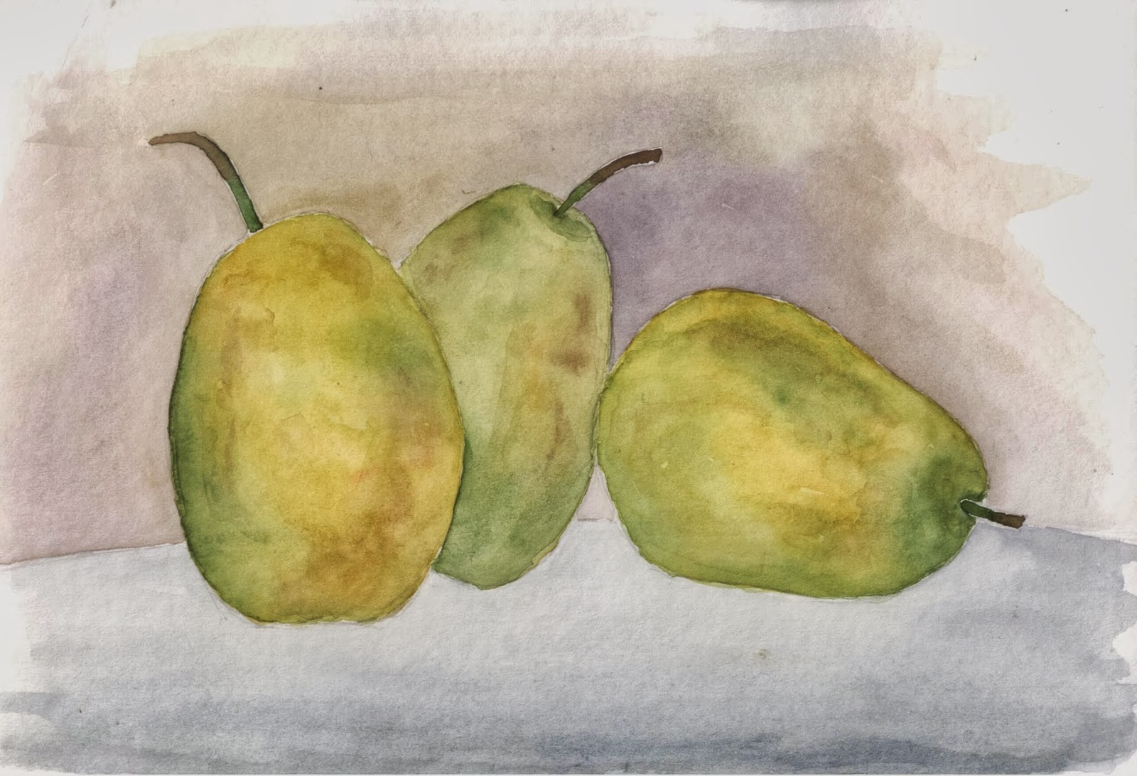
Tried to make the foreground just a bit darker than the background.  Also tried to be a little brighter at the top and a little darker at the bottom.

In general, I like the way they turned out.  I have some definite favorite parts of each, and think grab all those and put them on one page, it would be a knockout painting.

I hope you all enjoy them, and more than that,  I hope their future owners like them.

Monday, July 1, 2013

Santorini Sketching

 A couple of quick sketches I did in preparation of my previously posted work.  Each of these took about 10 minutes to do.  They were just to get an idea of whether or not I liked the picture, and whether or not I'd be able to paint a decent picture of it.  Obviously, I chose the second on to use as the finished painting.

Also, this is a good way to use the backs of those older, not so great paintings that accumulate around the house.

Enjoy.

Friday, June 28, 2013

Smoke 'em If You Got 'em

I am beginning a series of paintings of everyday things.  I think it an interesting challenge to elevate the things you see around on a daily basis to works of art. This is my first attempt.

While this picture was on my easel, I thought it was done.  Looking at it after it has been scanned, I think I am going to revisit it a bit, so you may see this one reposted at some time in the future.

 I walk through a courtyard, between the two buildings I work in, everyday.  With this being California, there aren't too many places to smoke anymore, but the students have found a spot, and squirreled away an ashtray next to a bench in a little nook.  Usually the whole tray is filled up with butts, but this day it had, as you can see a cup and some packs in it too.  I don't know what drew me to it, but I couldn't help but take a picture of it and paint it.

I really think it turned out great.  I'm looking forward to painting more in this series.  Hope you all enjoy it.

Wednesday, June 26, 2013

Santorini Doorway

So, I had this picture painted.  I was ready to call it good, but it was totally blah.  It didn't look bad, but it didn't look good either.  I had some shading on it, and the flowers were there, but it was just so so.  So..... I pulled a trick that I did on the last painting.  I pulled out the colored pencils.

Using them, it was easy to brighten up the flowers, and to bring out more distinction between the gate and the shutter doors.  I like the painting.  I think it turned out really nice.  Hope you all enjoy it.

Tuesday, June 18, 2013

Ellie

Here is my final painting of Ellie.  I tried something new with this painting.  I'm always having trouble with fine lines around eyes.  Seems like I either don't get the color I want on my brush or I don't get the intensity right, or more usually, I don't get the thickness of the lines right.  Well, in this painting I tried using colored pencil to do the detail work.  You know what?  It works.  I've watches lots and lots of videos of people doing it, and kind of thought to myself, I should try it.  But like using masking or white paint for highlights, I have so far resisted.

Well, I thought with some of the hairs on Ellies snout and geting the lines of her eyes right, that I would give it a shot.  As it turns out, it works great.  Why not use watercolor pencils you ask?  Well the answer is simple.  Watercolor pencil color runs a bit when it gets wet.  Regular colored pencils don't.  You can see in some of her whiskers that straight lines are easy.   If I had tried to put on the white whiskers with white gouache, I would have had a horrible time with it. How runny do I make it?  Do I even try to thin it at all?  How long a stroke can I make with it.  With the pencils, one stroke and done.  Brilliant.  I am definitely gonna use colored pencils in the future.

Well, I hope you all enjoy this painting.  I really liked doing this one and the sketches of her previously.

Tuesday, June 11, 2013

Angel Looking to the Heavens

SOLD!!
I had a challenge to paint a statue this month.  I looked at what seemed like several hundred pictures of statues and this one kind of stood out to me.  The original picture was really a lot larger and the figure has wings that extend off the right.  I wanted the face to be kind of what your focus was drawn to so I shifted the picture a bit (meaning I had to lose the wings).  I don't really think it matters. I like that you can really see that this person is hanging on a cross, and you can just imaging the robes hanging down from his/her arm.

Finding the reference photo was a bit of work, but once I found it, I immediately knew how I was gonna paint it.  I had a great time painting it and hope you had a great time viewing it.

Friday, June 7, 2013

Senorita

This painting for sale.  Watercolor 9x12.  $30
Ok, even after a little hiatus, I think I might still be stuck on portraits.  I saw this picture and knew I had to try to paint it.  I think it turned out pretty good, considering.  Considering, I'm still trying to figure out hair, and eyes give me fits.  Oh, and mouths, an noses aren't easy.  Heck, lets just throw the whole head in there as not being easy.  Then, I suppose we could talk a bout clothes, and flowers.... but wait a second.  Im Looking at this painting along side some others that I have done, and I think I am miles ahead of where I was even a few months ago.

I'm proud of this painting, and it is gonna hang in my office for a while.  I've taken down all my previous paintings, and made room for everything I am going to paint over the summer.  This is a great start to the wall.  I'll probably do some more portraits, at least until I feel I've mastered eyes, and lips and hair.  I'm working on more pictures of Ellie, and I want to start a series of everyday things.  Be sure to watch out for them

Hope you enjoy the painting.  I enjoyed painting it.  Thank you.