
Thursday, November 29, 2012
Smoke Stacks
Wednesday, November 28, 2012
Camping, VW Style

I painted this picture to give to them when they make it back to the Golden State. But now that I am looking at it, I'll never be able to give it to them in this state. I seem to ha ve forgotten to put shadows on this painting. Shadows are always the last thing that you add, and oops.... Well, it wont take to too long. It really is amazing how much interest a few shadow lines will put into a painting.
Well, I hope you all enjoy it, I'm off to add sahadows.
Wednesday, November 21, 2012
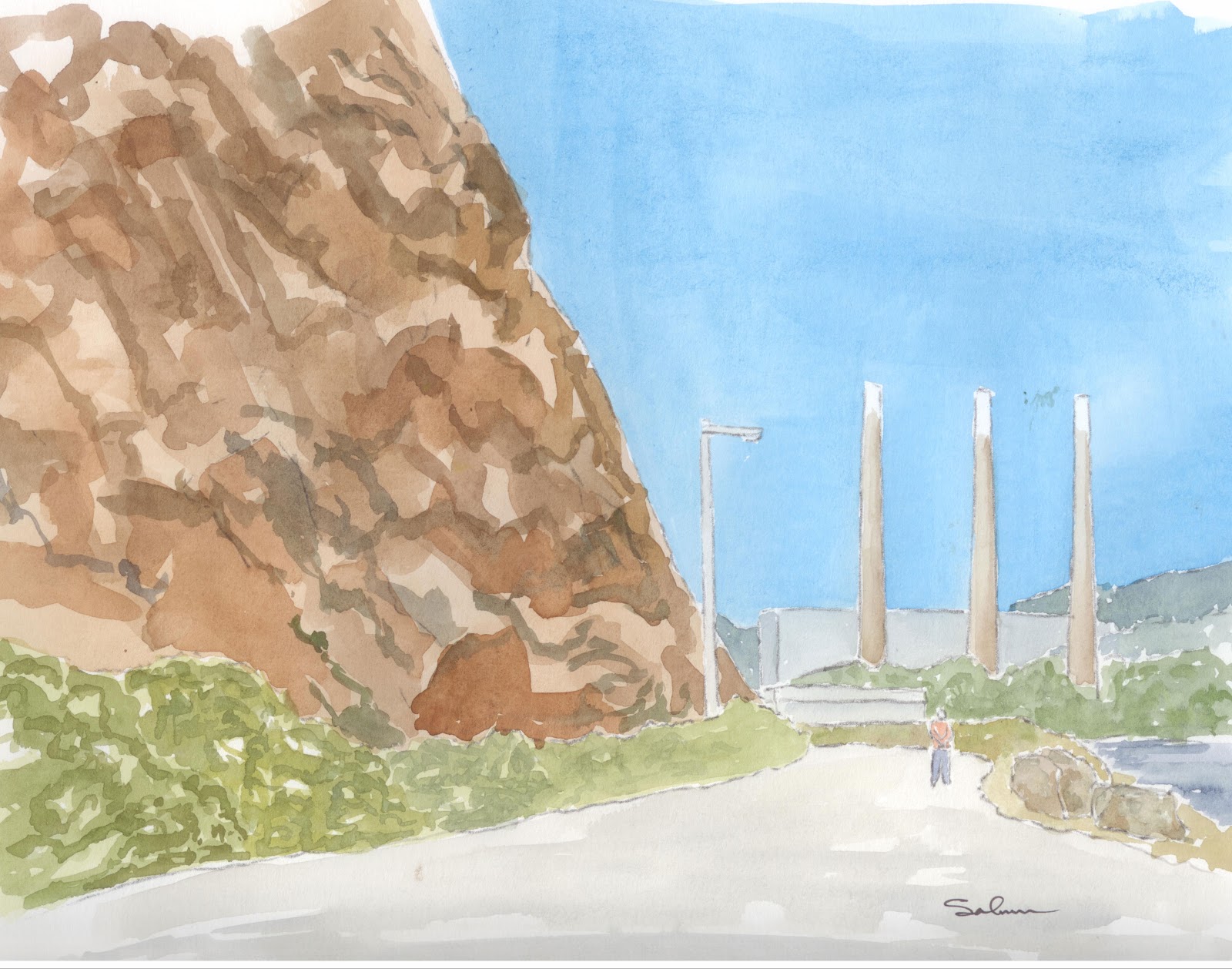
Down on the Embarcadero

The first real differences is that this painting has all the proper colors. The previous one was taken from a black and white photo, and I was working from memory on the colors. This one was painted from a color picture and so, all the colors are correct(ish). I got a bit more ambitious with this one too. Obviously there are people in the painting, but also there is tile and brickwork, among other things.
I used ink to outline and highlight edges on this painting. My intent was to not to do that. I wanted to only use paint to edge the painting, but I couldn't quite keep the lines straight enough, so i had to switch over to pen. I like how the outlining turned out everywhere except around the main awning. Oh well, that's how it goes sometime.
Anyway, I had a great time painting this, hope you all enjoy it.
Monday, November 19, 2012
Top Dog Coffee Shop

Friday, November 16, 2012
Things to Watch for Next Week

Seeing the pictures in various states of finish will also give you a little insight into what I go through in order to create these paintings.
Enjoy

Wednesday, November 14, 2012
Old Truck in a Field
 |
| SOLD! |
Well, I tried to make the colors of the truck and the grasses in front of it brighter and more intense that those at the top. That pulled the truck foreword in the picture. It really does look like the field in the top right hand corder is a long way off. Also, I tried the trick with the ground in between the rows of vines and the vines themselves. They are darker the closer you get to the bottom of the picture, indicating that they are closer to you.
The chrome was a challenge. How do you paint old rusty chrome. Well, the answer for me was not too. I merely made the chrome stilghtly different colors away from what I thought would be the most reflective part. So between the top of the hood and the diamond in the middle of the grill, the chrome is brightest (again, allowing that to seem further toward the viewer). As the chrome goes back from there, it gets darker, and of course as it goes down it gets darker. If you look closely, you can see different colors in the chrome.
I tried to paint the body of the truck in different sections as they would have been put together. The door, the cab, the bonnet, the fenders, the grill, each got painted at different times. I was hoping they would come out slightly different colors to make it seem as though the paint is oxidizing at slightly different rates. You will have be the judge.
My favorite part of this painting is the big dark front wheel. It turned out great. The color, the shadow, even the hub. I love it.
Hope you all enjoy viewing this as much as
Wednesday, November 7, 2012
Grandparents Wedding

The hair was a real problem for me. I tried to leave a little highlight and allow you to see the hair texture. Shading on the faces was really hard. I knew it would be going into this, but wanted to try anyway.
Well, I'm chalking this one up to experience. Its a piece I really wanted to do, and I still like it, but I think I fell a bit short of my expectations. I'll have to use that as motivation to do better on my next one.
Enjoy
Tuesday, November 6, 2012
A hint of things to come

So I have this fantastic photo of my grandparents on their wedding day. The picture was taken 70 years ago. I projected the picture onto watercolor paper and traced out basic shapes.

From there, as you can see, its all about adding layers of paint onto the paper. The first layer is just a basic layer, just trying to get colors all in the right vicinity. This picture has two layers of paint on it. You can see that I have put on some extra paint to try to begin defining shapes a bit more.


Here I gave Emma-Jean, the woman on the far right a brightly colored suit. And Bob, the gentleman on the far left a distinctive collar. The next step will be to finisht Bob's suit, then hair, hats and deepening the skin tones. Oh, and shoes. I saved Grandpa for the last because his Navy dress Whites are so white that they are only gonna get some shadowing on them.
I am really hoping this is gonna turn out well. I think it is, but the proof will be when I start painting the faces. Faces will make or break this painting.
Hope you have enjoyed this little sneak peek into how I paint.
Thursday, November 1, 2012
Angel's Landing

I was gonna do a dark sky, or at least darker, but when I saw how this one turned out after only one layer of paint, I liked it so much I stopped. And knowing what the sky looks like in Zion most of the time, there are no clouds anyway, so the sky seems about right. The next thing that is really good, I think, are the mountains in the background. They really do look like they are far away. Just enough detail so you can see a few crevasses in the rocks, but not too much detail that its out of place. I really like them.
Now for the not so good. I don't think i got quite the right shape of this hill. It is, in general, dome-ish, which I got, but somehow its not quite right. I might go back and see if I cant make the far side of the path fall off just a bit, maybe that will help it look like it is rounder.
I might go back and pencil in some chains like on the real pathway, but I don't have time to do it today, but wanted to get this picture up. If I make changes, I'll repost. Hope you all enjoy.
Subscribe to:
Comments (Atom)