Saturday, May 30, 2015

Faces (not mine) WIP


Submitted for your viewing pleasure are a couple of WIPs.  I did this much last night and will probably spend much of the next few nights finishing them up.

I really just started with slapping some paint on, trying to block in some color, Then I remember that I stink at painting hair, and thought I should try somehow to make the hair more realistic  that in paintings past.  I can't tell you how many strokes I have in the hair on these two.  And I'm no where near done!!

Well, Tonight I will probably work more on the hair, some shading on the faces and maybe the shirt.   Then finish the hair and the background.   I don't know, I'll have to play it by ear, and see what hits me when I get back out to the studio.

Thursday, May 28, 2015

Play Structure

This is the play structure that my kids play on at Del Mar Park.  They love this and have even gotten me to go down the big slide.  The whole structure is 3 stories tall.  It has 4 slides, a marble maze, benches, climbing wall, tunnel and probably more that I can't remember.

Well, its just a sketch but was fun to sit and draw, then fun to paint.  enjoy.


Wednesday, May 27, 2015

Quick Sketching (err, well, coloring anyway)


I've a friend who is continually publishing quick sketches that she does.  She works a lot with the human form, but will paint other stuff.  Well, I was going through some old sketchbooks I had laying around and decided to colorize them.  I don't know when I drew these.  I would say it was 3 or 4 years ago.  Tonight I was cleaning up the old studio when I came across these.  I thought it might be a good exercise to try to quickly paint theses.  I gave it a shot, but they are not anywhere near the quality that my friend does.

I realize, now, looking at these paintings, that they lack a bit of color.  I do have a good reason for this,  or perhaps I have several excuses.

Firstly, I was using the color that was already on my palette from previous paintings.  I didn't think I would need a lot of color to do this and thought this would be a good way to use up what I had left over from last nights painting.    Well, last night I was painting a Maine Coon cat, and the color diversity on that cat is not the greatest.  Secondly, and perhaps finally, its me.  If I can see a color, I can recognize it, I can enhance it, I can manipulate it, but I don't always do well creating color.  I saw an area for skin and put down skin-ish color.  TA DA.  In hind sight, I probably should have added a lot of depth to these so that they are a bit (ok a lot) more lively.

So, here you are, +Kelly Murphy, a couple of quick sketch es in the fashion of so many of the paintings you do.

Tuesday, May 26, 2015

Getting There, But First Lets Have a Smoke

So I am trying to make something beautiful out of something ugly.  I need to put in a few shadows and the labels on the boxes, but Im betting there.  A few more brush strokes and I'll be finished.  I am hoping to finish it up tomorrow.

Friday, May 22, 2015

Motorcycle

Not exactly sure I am finished with this yet, but I'm pretty far along.  There are some parts of this that I really love, and some that I'm not quite so fond of.

I really had trouble with the front wheel on this.  The fender isn't quite right, and wheel isn't quite right.  But after that, I think the whole painting is gravy.  I love the back 2/3s of this bike.

I got the shading mostly right, I think, and I got the amount of detail in the engine about right.

I had originally planned on painting all of the engine.  Incredibly detailed, like I've tried to do before.  But this time, I painted just a few strokes on it, then stepped back, and WOW, it seemed right.  I did put in a few more squiggles and lines, but noting approaching any real kind of detail in the engine.  Your eyes just kind of fill every thing it.

Like I said to start, I don't know how much more I'm gonna do on this, but I'm pretty happy with it so far.

Thursday, May 21, 2015

Painting on Photo Paper

This picture may look a bit of a mess.  And I guess it is a bit of a mess, but there is a very good reason.  I tried to do an experiment with this.  The painting is on photo paper.  I had some extra ink jet photo paper left over from a printer that I don't even have any more.  I thought it would  be a good experiment to see if I could paint on it.  

I found that it was really difficult to paint on.  since it was made for an inkjet printer, the paper really soaks up the water, and doesn't give you any time to move paint around or let it mix much. And then when the paper gets too wet, it just sits on top for a looooooooong time.

Well, it was an interesting experiment, but I don't think I'll follow up on it, unless......

Tuesday, May 19, 2015

Zion National Park


I've painted this picture before.  It was when I was just starting out in watercolors.  I spent hours drawing, and painting and fussing over it.  I tried hard to make something that would look nice, but in the end,  I think, I ended with a giant mess. 

So, over the weekend, I was going through some old works of mine and found this picture in the bottom of a drawer.  I thought I could paint it again to see how I could do.  This time, however, I handicapped myself.   

I went to my studio, only to find that my daughter and her friend had ransacked the place.  It took far too long to put back together.  So when all was said and done, I only had a very short amount of time to paint.  No Drawing for me.  Gonna have to paint wet into wet.  

Starting at the top, with a light orange wash, and changing to darker oranges and greens and grays as I made my way to the bottom.  The second wash saw me start in the very back with the same light wash.  Then onto the middle cliff,  a little more intensity.  The front was, of course the most intense.  Cliff walls done, it was on to the trees.  A little patter of green here and there.  A little grey for some water.  then wait just a sec and zip in some lines for tree trunks.  

I know its not high art, but given the time that I had to do it, I don't think its half bad.  And given that the first go round I did of this painting took many many hours, and doesn't look any better, I think its great.

Monday, May 18, 2015

More Hydrangea

In a quick painting session I had with my daughter, I painted a few hydrangea.  I didn't have long, as her attention span yesterday seemed to last only about 5 minutes on any one thing.

I actually got about 10 minutes out of her, but I was the one who had about 5 after getting paint, paper, water, and towel to paint with, then cleaning up after she was done.

Well, we did have a good time while it lasted.  Too bad it was such a short amount of time.

Friday, May 15, 2015

Surfer Girl on Beach (For lovelylightandpeace.blogspot.com), The Thrilling Conslusion

And here we are.  Kelly Murphy and I have both finished our write up of how we would paint out chosen photo.  Now is the time when we put our money where our mouth is, and actually draw and paint the painting.


Kelly Murhpy

Here is my process....

I sketched this out really quick....I tried to do the sketch within about 10 minutes....and I included a lot of extra lines....which infuses a bunch of motion and energy in the sketch...which shows up later in my watercolors....I like loose lines....and I tend to sketch quick with a water soluble graphite pencil....I tend to like to see lines all over my paintings...so I don't mind if these don't disappear when I start painting. 


Here is my sketch:

Just as I mentioned in my approach in Part 1.  I started with her left shoulder...I always start on the left. 


for colors....

I somewhat....haphazardly select colors....I have no plan....I have no real direction when painting...I jump about the page....with whatever feels like....where I should go. 

dipping into an ultramarine blue...a splash of some red...and watch it bleed and mix on the page...I never....or shall I say....rarely do I actually mix paint in any premeditated way....

as I mentioned to Michael....I just pick some paint and hope for the best.... let things bleed as they may....

oh, sure- I don't go all Dr. Seuss, oceans are blue....sand is sand color.....for this water...I think I used about 4 blues....with a dash of red...and some green....and splashed them about here and there.....

Next...I went for the girl....and splashed some brown....some orange....some yellow....some yellow ochre.... quickly...with lots of water. 

for added motion....after I splashed some color around....I used my watercolor pencils.....a blue one for some water....

and because I had picked up a purple watercolor pencil I found laying around...I used purple....which seems just as good as any to do some darker lines here and there...in her hair...and in the shadows. 


The thing is.....it seems as though.....the painting area....the palette...the way we approach the painting....and the actual painting of the thing....speaks volumes of us...our personalities....

the way....I haphazardly approach a painting....where my brushes lay around.....where I find my watercolor paint.....around the house....is who I am.  I'm disorganized.  If I want to sketch something...and I see a green watercolor pencil laying on a table....I pick it up and use that...for the reason that....it was there....and I used it.  just as good as any color....

and what happens is that...I think, at least in my method....much like life....sometimes you see an opportunity....or you're handed a certain tool....a situation....whatever may be handed to you....

and it's what you do with that.....thing....that counts....not exactly what that thing is....but how you use it to your advantage. 

and my lack of planning...only makes me....think about making the most out of the only watercolor brush I can find....or the only 3 colors on my palette....because I can't locate the others when I want to paint something that I'm driven to paint....I actually, I guess...create an environment that makes me....have to figure shit out....huh...how am I going to paint this with one brush and 3 colors? 

I just sit down and paint...whatever is around me at the time....is what is used....maybe I'm too lazy to go find all the tools...

or maybe....I just want to do the thing so bad....I just make it happen...no matter what I'm handed...

I'm going to make it happen. 

and believe me...I know my process...can drive some people mental....but so interesting to see how different we are as people....

you know....just....this kind of examination of how we paint....is really just....a bigger look at who we are...

everyone processes the world around them differently....we all just radiate our unique personalities through all we do....and when we start to examine how we paint...we see how we approach things in life....we see our strengths....and hopefully we can appreciate and love ourselves for the wonderful things we bring....and maximize those strengths....

because....by really thinking about these things....you start to know yourself....to really try to understand....where you are coming from...why you do the things you do....

and just.....LOVE YOURSELF FOR YOUR AWESOMENESS.....everyone should....

just....

do....

that. 


ahhhhhhhhh......man......deep philosophical stuff.....


peace...and love....and making.....it happen.  See Michael?  

This fun exercise just made me go off into....well, the place I go....life...painting....whatnot....how it all connects.  


Michael
So, I followed my own writings in order to make this painting.  First I started out with a nice drawing. There isn't a lot of detail here, so it didn't tae too long to do.


Next I tested a few colors to see if they really were what I wanted.  I was pretty satisfied with my initial color selections.  I don't think I needed to change any of them.  The only thing I did was mix a little of the quinacridone rose into the water color to get it a little purplish.


I'm really happy with the way most of this turned out.  There are a few things, however, that I wish I had done just a bit differently.  I must have rushed a few times.  First, the horizon line to the right of the girls head.  Second, some of the shading on her legs.  All these places there is just a little too much run.  I really wish that I had taken just a bit more time.  I will offer the excuse that it was considerably colder in my studio than normal, and the paper wasn't drying as quickly as I thought it would.

I am really happy with the hair.  I put it on just like I wanted to:  The mass of it one blob.  From there I began pulling out individual hairs and really putting form to her hair.  Then I darkened the color just a bit and began adding all the individual strands.  The overall effect of the hair I really like.

As for her suit:  its not really black.  I don't have black on my palette.  So I had to make a mix of all the primaries to get it the way I wanted.  Hopefully, you all like it.

Thank you to Kelly Murphy for being brave enough to ask me to help her on her project.  I had a blast chronicling my steps and producing what is, a very nice painting.  Thank you.


And so there you have it.  Two drastically different approaches to the same painting.  One, (mine) much tighter and literal, and one, (Kelly's) looser and free-er.  Both, I think, wonderful paintings.

Thank you, Kelly, for bringing me into your project.  I hope we can work on another one at some time in the future.

And thank you, faithful reader, for following what we did.  I hope you enjoyed it.   I know I did.


Thursday, May 14, 2015

Surfer Girl on Beach (For lovelylightandpeace.blogspot.com)

I was approached last week about writing a piece for an artist friend of mine.  Her name is Kelly and he has a blog, much like mine, in which she posts paintings that she does.  Unlike me she dishes out philosophy, and advice, and other helpful soul searching stuff.  We have talked often about how we paint and how we see a picture and interpret it so differently.  She had the idea to formalize how we see and paint a picture.  If you pop over to her website, you will see that her painting is drastically different than mine (http://lovelylightandpeace.blogspot.com).  At any rate, I thought it was a brilliant idea.  Kelly found a picture and away we went.

What follows are my initial thoughts on how to approach this painting, then her thoughts on how to approach the painting.  In a later blog, I'll post how our paintings turned out.  I hope that Kelly asks other artists to formalize how they approach this painting, and can post them to continue with her idea.

Michael's Thoughts
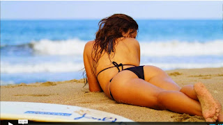
Beautiful surfer girl, beautiful tropical beach.  How would I paint this?  What should I focus on?  Here are my initial impressions of this painting.

1.  Lighting.  It must be overcast because there are no harsh shadows.

2.  Colors.  cool in the background, warm in the front.

3.  Focus.  Obviously the woman is the focus of this painting.  The ocean behind her is out of our field of focus, and if you notice, so are her feet and surfboard.

Ok, here is my plan of attack.  Lets start with a good drawing.  I don't like to get too detailed, but since there isn't a great deal of detail in this picture, we can go with a nice outline of the girl, the horizin and the sand.

I'm going to start with the sky and the water in the back of our painting.  The waves aren't just plain old blue.  From what I can see there are 3 distinct colors of blue.  The water beyond the waves is the coldest blue, and by coincidence or happenstance the cold blue seems like its far away from you when you look at it.  The water in front of the main wave has a very slight pink tint too it.  That pink carries forward until there is just a splash of darker blue just off the left arm of our surfer.

Im going to start in the upper left hand corner and paint down to my horizon line with a very faint pale, cold blue - probably a very light turquoise.  I'll let the paint dry a bit, then paint down to the beach.  Again, I'll be using a fairly pale color, and as I get closer to the beach, I'll tint my blue with a little pink or purple.  Just off her left arm, I'll put in a little spike of the original blue.    While the paint is still wet, I'll go back and lift out the waves.  For me, I'll try to lift them out in the shape of the wave.  I don't know if you will ever be able to tell in the final painting, but I think that if I do it, not only am I thinking of the shape, but I may miss a little paint that will remain to show the shape of the wave.  Be sure to put a little burnt sienna where the wave it breaking.  I don't know if its a reflection of the sand or maybe some seaweed, but the color will help define the wave from the water behind it.

My next move will be on to the sand.  Again, there isn't a lot of detail, so there isn't going to be too much to do.  Some nice blending color and move on. Given that in the painting you can see that the sand grains seem to be quite large, you could splatter a lot of paint on the paper using a toothbrush or something similar.  But I think for the purpose of the painting that will be unnecessary.  Get a good mix of yellow ochre and burnt sienna, you'll use both of them.  The trick will be to get the paint to flow from one color to another without making the sand look blocky, striped, or blotchy.  I'm going to use a mix of the two, heavy on the ochre in the distance and the same mix, more 50/50 in the front.  I want just enough variation throughout to have a little interest.  Where you can see impressions in the sand, I'll be using the same color I used in that area, only just a bit stronger, to make the mark.  Remember, since we don't have the sun out, we don't have deep shadows, only darkening of the colors that are around us.

So we have put paint to paper in two stages, one to put on the water, one the sand.  Now is where we make or break tha painting, our surfer.  Take a deep breath.

Here is the thing I think about her.  She is all shading.  Her body tone is pretty even.   So, we are going to paint her all at once, no stopping.  Paint her face, shoulders, back, arms,  butt, legs, and feet all the same color.  Do it quickly.  We need to work with wet paper to get the shading right.  Whatever tone you used, darken it.  touch her right shoulder, left arm, left flank, right hip, back of left knee, and everything on the underside of her left leg and right shin.  Did it? Awesome.  Before we go on, go back and redarken between her left arm and her body, and a few spots around her knee.  The only trick was to do it when the paper was just barely damp so the color wouldn't run very far, but would give the indication of a little roundness.  With the paint dry, we can go back with some black and paint her swimsuit on.  There really was no reason to paint it on before, the black will cover everything  underneath it.  That leaves us just two things, her hair and her feet.

Find whatever you think is the lightest color of her hair and paint the sold mass of her hair that color. Pull out from that all the tendrils of hair coming down her back and the few in the wind.  Now let it dry a bit.  Not too much, we still need a little workability.  Darken you color and paint the lowligths in her hair. Don't get too bogged down on it being exactly right, the viewers eye will fill in a lot of the detail.

Now the foot.  Go back to our skin color, and darken it just ever so slightly.  paint between her toes and just a very tiny bit on the foot behind her toes.

Sign that baby, you are done.  How does it feel?  Pretty good, right?  And I bet your painting looks pretty good too.  We broke it down into 3 easy steps and tackled them one at a time.  In so doing, we were able to focus on each one and give it just the care it needed.  when it all came together at the end it was like "boom."  Congratulations.

Kelly's Thoughts
When I want to paint something...and lately it has been mostly the human form....I find something that interests me by pose and shape....and what I've learned....is that I decide on things by the cool shapes and angles I see....I don't normally pay much attention to color....initially....

I look at this picture and I think....cool perspective....that would be fun to draw....and then...later after I draw it...I'll try to figure out some color to put in there....

the thing is...I may find a cool pose...and go to my box of watercolor pencils...and watercolor paint and grab the first thing that catches my eye....not really adhering to the colors I see in the picture...but maybe the color that grabs me when I go searching....

this is the usual way I approach things I want to paint.  I mostly react to light vs dark...and the contrast creates shapes...forms....and cool forms and the way angles direct movement draw me in and around the pictures...this is the first thing that I notice...and this is the first thing I want to tackle...I want to pour all over the angles....and shapes....and then I want to play around and get creative with the colors afterwards. 

so...for me...I'd start drawing the woman...first. 

I'd start at the shoulders....and follow down the arm....that is the very first place I'd go....and follow the curves around to her legs.....and I'd try to figure out her foot.  and then I'd go back up and figure out the other side....as I meet up with the other shoulder....

I'd probably do a quick wash of background....and let the color bleed between sand and water, for fun. 

as far as specific colors....I would use....probably my lunar blue and ultramarine blue...but light light....washes...with a lot of water....I generally use a lot of water with a little color.  Also....some yellow ochre for the sand...with tiny spaces of some type of warm brown...with the same warm brown for the body...but with splashes of warm orange....and maybe even some bits of red....with naples yellow....or something light for the lighter parts of her body.

I'd also start to squint...and see the lights and darks of the contours of her body.....so I could push those even further....squinting helps you see the contrast better.....and in this pic...the contrast isn't as sharp between lights and darks...so yeah....

and voila.   that's what I'd do. 


Monday, May 11, 2015

Hollyhock

So I decided to branch out a bit.  Today's offering is a simple hollyhock plant.  I tried using watercolor pencil to draw lines on the petals, but I don't know how successful I was.  While I don't dislike the finished product, I don't truly love it either. I think that I rather like using a brush better, but I still want to give it a fair try, so I'll probably do this again.

Well, I had fun painting, hope you have fun viewing.

Thursday, May 7, 2015

Another WIP

Another one with a lot of work to go.  I've also been kicking this one around for about 3 or 4 months.  Literally putting in a brushstroke or two a night.  Just while I'm waiting for other paintings to dry.  I think its about time to put in some serious work to finish this.

Just a quick posting to let you all know I haven't been slacking too much.  Thanks for taking a look, and remember to check back later to see how it ends up.

Tuesday, May 5, 2015

Motorcycle WIP

You knew it was gonna happen.  it was only gonna be a matter of time until I got back to painting cars and trucks and the like.

I put on a really loose layer to get some base color, and have been slowly adding to this painting.  I think I started a week ago, and while waiting for other paintings to dry, or while in between other projects, I put just a touch of paint here and there.    I don't know how much time I've got into this, And I don't know how much I have to go.  I'm gonna keep on pecking away at it and we'll see how it goes.  For now, it's still a work in progress.  enjoy.

Sunday, May 3, 2015

Driftwood Christmas Tree Centerpiece

I had at one point in time, seen, on Etsy, these cool driftwood Christmas trees.  I thought to myself, I could make those.  I live near the ocean, and have an ample supply of driftwood.  All I need to do is collect the right pieces. and find a way to put them together.  How hard can it be.
Fast forward 2 years and I have my first one.  Its not that I couldn't have done it.  Having made this first one, I have found it to be just as I thought it would be.  I just hadn't had the time 2 years ago, and by the time I got back to it, I'd forgotten about this little project, and my stack of driftwood relegated to a back corner of the garage never to be seen again.

Well, this weekend I found the wood, and constructed my first Christmas Tree centerpiece.  Its just the right size to sit at the center of your holiday table, and looks nice enough it could sit out all season.  The biggest problem I had was trying to balance all the pieces so that the piece would be stable and sit flat.  Once I got that accomplished, all went smoothly.  

Event though it is only May, I might have to build a bunch of these, and have them ready for sale when the holiday season comes rolling around.  

Thanks for taking a look.  Hope you enjoyed seeing this little project.

Too Red Poppies

Two things I really like.  One, for some reason, painting poppies. 2 painting where I don't have to stay in the lines.  This painting checked both those boxes for me.

I did one thing a bit different with these poppies that I didn't do with all my other paintings of this style.  Normally i'll start by putting down some color in the general shape of the flower, making sure that all the color flows from the bottom of the petals, and gets lighter and less intense as it goes up.  then I redefine the shape of the petal on a second layer of paint.

On this particular one, I didn't worry so much about keeping the bottoms intense.  I really let the paint and water go where it wanted to on the first layer.  As a result I got a fairly uniform layer of paint.  Albeit a layer that still had not a lot of shape or definition to it.  As before, I went back with a second layer and defined the petal edges.  The only difference is that on this one, I tried to then go back to the base of the petal and put in some intense red and let it diffuse to the now defined petal edge.

Not entirely sure I was successful.  But from looking at the picture, I wasn't completely unsuccessful either.   Enjoy.

Friday, May 1, 2015

Some Kind of Red Flower

Just playing around last night.  I thought this turned out nice.  Some flowers of undetermined species.

Got the whole paper wet, and threw down some red, blue, yellow and green.  Then when it dried I put in a little red to bring the petals to the foreground.   After allowing those to dry, went back and drew in the stamen and leaf edges.  A little water to tone them down and voila.

It turned out to be exactly what I wanted.  A loose painting of some flowers.  Done quickly, but with enough interest that it's enjoyable to look at.

Hope you enjoy it.