Ahhh... one of my favorites. I love little turtles. In fact, I used to have one. His name was Tucker, and he was the funniest little guy. We don't really think of turtles as having a personality, but I kid you not, Tucker had one. Tucker was by far the most social turtle I have ever been around. Instead of diving in the tank to get away from you, he would try to swim towards you. And when I took him out of the tank, he would follow me around my apartment wherever I went. When I sat down, he would stop right by my feet, and when I walked away, he got up and followed me, albeit at a slightly slower pace.
Well, here I've painted a red eared slider. I think it turned out really nice, and this guy looks totally at home sitting there among the grasses sunning himself.
Anyone wishing to try this out will find it fun and rewarding (and it was easier than I thought it would be). Check out the video below to see how I did it. Thanks.
Ahhh the lovely camellia. Such a nice flower. I wanted to paint one and and thought this would be a good time to do some graded washes. Well, I accomplished both of those things with this painting, but I don't think I did either really well.
The painting is OK. There really isn't anything wrong with it, though its a bit banal. I could really have punched this up by doing a couple of things.
See, in watercolor to make a dramatic painting you need to have lights next to darks, and darks next to lights. Well, I've got lights next to darks with the petals. you can see how the center is lighter and the tips darker. This makes for a nice petal (here its a bit bland, but nice). But Ive also got a background that is the same intensity as the petals. There is no room for light and dark to touch, both edges are dark. Hmmmm what to do...
Well, I could just as easily put on another row of petals (this would have made the flower look fuller too. Right now its a bit small). The outside row of petals would have been all light. That lightness would have served two purposes. First, it would have ensured that they looked as though they were behind the petals in front, then it would have allowed me to make my background as dark as I wanted.
Well, there is always next time. I think its a good project for tonight, paint this one again.
If you have interest in seeing how I did this one, watch the video below. Thank you.
If you've read through my blog thoroughly, then you know that I like rusty things. If you haven't then I'll let you in on a not so secret, secret. I like rusty things. Well, as I happened, I found a picture of a rusty lock on line and wanted to take a crack at painting it. So.... Here is how it went.
I really like the hasp. I think it turned out pretty good. It looks old and a bit warn, but still could be used today. And I really like the nails in the wood, and how the rust has kind of run and stained the wood.
As for anything else, well.. lets just say i struggled a bit. I'm not saying this is a bad painting, but I can do better.
As a critical assessment, I should have had more color variation in the wood, and probably made . a few more cracks. As far as the lock goes. I could have been more precicse with the bronze. Though I do think the right hand side of the bronze locking mechanism looks great, the left leaves a bit to be desired. Then we come to what I thought was gonna be the best part, the rust, and well, it fell a bit flat. First off, its too dark. And being that dark, doesn't allow me to put much roundness into it.
If I were to do this again, I'd be able to do a much better job. I am sure of it. In fact, maybe I should do this one again to prove it to myself.
Think I'm right? Think I'm being too hard on myself? Leave a comment and let me know.
If you want to see me painting this lock in a video, check it out below.
Here is one of the cards I am sending out for the holidays this year. A Snowman!!! I really think he looks great.
Last year I did Christmas tree bulbs and I thought they turned out pretty good. This years card I think is so much better. I make a conscious effort not to try to make him look "perfect". What I wanted was that layering that you can only get with watercolors.
I started with one layer of cobalt tea to se the background color of the snowman. A second layer darkened him up just a bit. The third layer is Pthalo Blue, and then the 4th is Pthalo also. added this many layer, painting just a bit less with each successive layer, in order to add texture and shadow to the snowman.
Finally, a bit of turquoise for the background and a mix of ultramarine and cerulean for the base. All in all, I think it looks fantastic.
The real test, I suppose will be in the comments I get from the people who receive one of these cards. Thats really all I have for this update. Thanks for the quick read.
As always, or usual, if you would like to see how I painted this, check out the video below. Thank you.
Who doesn't like watermelon? I don't think there is anyone who doesn't. Probably no other food encapsulates summer as much as a watermelon.
Hers is my take on the simple watermelon. Delicious slices. I've painted these two pieces of watermelon with just a little bit of a shadow underneath. I wanted to give some dimension to these slices, not just make them pink slabs with a green end and some black dots.
What I did was to make the hard edge of the slice the lightest part of the painting. normally, I like the foreground to be the darkest part of my paintings, but here I had to make an exception. The white on the corners is supposed to, along with the drawing, make this really look three dimensional. I think I've accomplished that somewhat. Tell me what you think.
Hope you enjoy this little painting I did. If you would like to see a video of it, check it out below. Thanks for the quick read. Stop back again for the next update.
Gus's Grocery is one of the best Sandwich shops in San Luis Obispo. To call it a Grocery really is a misjustice. Yes, you can go in and shop for a few things: chips, soda, and beer, but in reality it just a sandwich shop. Well, not just a sandwich shop, probably the best sandwich shop in around.
Step up the the order window and give them your order. Your sandwich will be fresh made right in front of you. Most of the time they will slice the cheese and meat at the time they make the sandwich. I'm partial to the Italiano. Oh and by the way, make it a Bomber.
Well, thats it, enjoy the painting. I had a great time painting it, and really do hope you like it.
A few pictures of Zion National Park. I've been there many times and am always in awe of the beauty of the Park. There are so many trails you can take, and even on a hot day you can find a canyon that is nice and cool.
I've been on the edge of cliffs with sheer dropoffs of probably a thousand feet. I've hiked up creeks and river, under waterfalls and through small ponds. I've also trod across trails that are so hot and dusty it seemed like I would burn up.
Here are a few sketches of Zion. The Narrows. The Watchman. Angels Landing.
I can't wait until I can go back again. it is such and amazing place.
I found a picture of this bird while surfing the web nearly a year ago. I printed it out and then it got lost in a drawer somewhere. I found the picture the other day and realized that I needed to paint it. I was thinking what could I do to this picture. There really isn't a lot going on with it. Just a bird standing there.
So much like the beach here where i live, when you look, the beach just kind of disappears in the distance and the sky starts. There is no real line of demarcation. I tried to make this painting resemble that. A nice gentle transition from sand to sky.
As for the bird, i really like everything except its head. I just don't understand what happended there. Love the wing, love the underbelly, like the legs. Head.... meh. Oh, well, I guess thats why they call it practice. Thanks for taking the time to read, and check out the picture. Hope you enjoyed it.
Students on our campus usually play an active role in shaping the physical landscape of campus. These first two pictures are houses build by students. They reside out in the canyon and have not been lived in in quite some time but with a little work could be brought up to date and made live-able.
The final picture is a horse statue that is now it the library. It is called the living library mustang. I'm not sure how living it is. It seems to only have a couple of plants stuck on it after the fact, but..... oh well. The students build the entire statue from recycled materials.
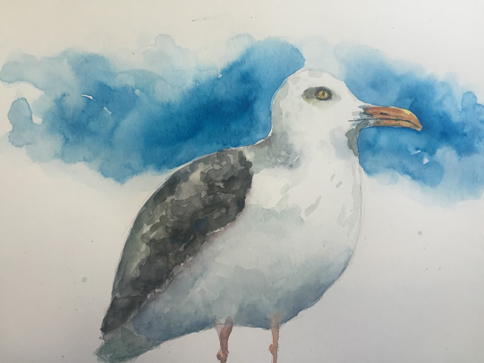
I've been invaded by seagulls!!! Living near the ocean, it's hard not to see seagulls every day. Usually I try to pay them as little mind as possible. For some strange reason, I got a hankering for painting them. Here is what I came up with. One I did on my lunch hour, and one I did in the studio.
There are bits of both that I really like, and bits on both that I wish I could do over again. I'll not go into what things are which, but let you all take a guess at it.
On both of these, I started drawing from the head, and, as it turned out, should have either made the head smaller or started higher up on the page. The bird kind of ran off the bottom of the paper. For me its not a big deal since I don't like painting feet anyway, but it would have made a bit nicer picture if the bird was planted on something.
As in the past, I did make a video of myself painting this seagull. If you have an interest, please check out the video below.
Thanks for the quick read, and I hope you enjoy the paintings.
Here are just a few of the people who ride my bus. I've taken to sketching on the bus from time to time, and this is what I've come up with. I am new to drawing figures, so they aren't perfect. But even though they aren't perfect, I think they look great nonetheless. You can clearly see what these people look like an what they are doing.
I am looking forward to painting more bus people as the days go bye.
Since most of the people are sitting in front of me in the front of the bus, they have a pole next to them. That's just the way our bus is lined out. The woman with coffee was actually sitting behind me which is why there is no pole for her.
Please check back from time to time to see more sketches. And be sure to let me know if you like these or not.
Ok, the title is a little misleading. I kinda did that on purpose. Every time I put a title like that I get a massive amount of hits to that posting. I am sure the same will happen to this one.
But what I actually have is a Blue Footed Boobie. Fantasticly weird bird. He was fun to paint, and fun to research, I'm gonna keep going with painting odd, different things that most people wouldn't paint. This one is a start. Anyway, he's fun and funny.
I struggled with two things on this painting, and if I had to do it again I would change a few things. First, I would put some green in the lower half of the sky. Make it look like very far away hills. His right foot just gets lost. I don't really like that at all. Secondly, I would barely tap in the shadow that is under him. I got a bit carried away with it in this painting.
I might just have to paint this guy again just to make those changes, or maybe I should do a whole series of paintings of boobies. I'll think about it. At any rate, there is a video that goes along with this one. You can check it out below. Thanks of the quick read, and the view.
So here is it, the first piece I've made to display my art. I've got stacks of painting in the studio and yes, I could pin them to the wall, but that would put holes in the paper. I don't really want that. What I wanted was a quick and easy way to display my paintings. Something I could move around at a whim, was cheap, and something I could make all on my own.
Enter Mr. Fork. The perfect utensil for the job.
The fork is nearly perfect. Its got a long handle that will help support the paintings as they as standing upright. The tines can be bent so that the ones in front hold the picture in place, and the ones in back provide stability. If the handle isn't quite at the right angle, its just a quick bend away to make everything perfect.
So with that in mind I set about trying to make one of these. Yes, before you ask, I do have a video of my making one, but lets not get ahead of ourselves. This one is actually the only one I've made to date. I've got a stack of other forks, but have yet to set about bending them. You can see that it really doesn't take very many bends to make a highly effective holder. The only thing to watch out for is that you get the two upward bends of the outside tines as close to the same as possible.
Once you've gotten the outside tines bent, the rest really is just adjustment. You can make the fork sit up higher, or lower, you can adjust up or down the handle. Whatever you want.
But you know what? I don't want to give away too many of my tips here. If you want them all, you are gonna have to watch the video below. Don't worry, its short and painless. LOL.
At any rate, enjoy the picture, enjoy the video, and thank you for the quick read.
This is a fun painting I did for the coming of spring. It's Poppies!! The state flower of California. I've got these growing wild everywhere around my house. They add a beautiful splash of color.
Many poppies have a dark center. This variety instead has a bright vibrant yellow center. I thought they would make the perfect subject to paint.
Oh and as for the background.... Well, I wanted to play a little and let these have some fun. So a half wash and some splatter were just what the doctor ordered.
I painted this picture with a very limited color palette, and was delighted to see that even with that you can paint a beautiful paintings. I really hope you enjoy it.
Oh, and if you are curios about a video of this painting, I've got just the thing for you. I did make one and posted not long ago. (yes, I've been delinquent about posting to this blog). Anyway, you can find the video below.
So, I've been trying to get better at painting animals. I love cats, so it made sense that I would paint a few of them. I've tried to paint animals in the past and have always been disappointed in how I painted fur. At that time I was trying hard to make photorealistic paintings. It was all ok, but thats not really how I want to paint. I want to give the impression of a thing. When you look at one of my paintings I want you to get the emotion and feeling that I put into it out of it. If the painting looks exactly like the object it was taken, great, if it doesn't so be it.
So, here I am painting this cat, and wanting to convey to you a bit of grumpiness from this cat without explicitly painting a perfect cat. I think you get a bit of that from this cat.
Want to see how I painted it? Check out the video below. Want me to paint something for you? Curios how someone would paint something. I'd love to take a crack at whatever you can dream up. Leave me a comment or shoot me an email. Thanks for the quick read, and enjoy the video.
With Valentine's Day approaching, I thought it appropriate that I put up a Valentines posting. The first was the idea I had to make a heart into two lovers heads This one has the man on the right and the woman on the left. I added the extra splashes of paint and water to give the picture a little bit of life. I'd do it just a bit differently if I had to do it again, but I think that it tuned out quite nice regardless.
My second picture is two chili's that come together to form a heart. One pepper is just in front of the other. I guess if you have a spicy hot lover, you could give this to him or her.
As with other paintings, I do have videos of these two, you can find them below.
Today I give you two felines for your viewing pleasure. I'm trying to figure out fur, but it's proving a bit difficult I know it has a certain texture, but getting it just right is tough. I want to paint a million little lines, but in addition to taking forever to do, that really isn't the style I want to paint in. I want to be a bit looser than a literal interpretation of a cat. An getting too loose just makes the cat look like a blob. Im working on it and will get there soon, but it might take me a little bit.
For those of you who want to see how I painted these two, I'm attaching two videos below.
I'm back again with another pin up girl. This one is sitting outside on a picnic blanket. She has a basket of fruit a jar and a lollypop.
I'm totally stoked about the blanket, her skirt, legs, and the jar. I had a bit of trouble with the color of the shadow on her arms and so it is a bit of a drawback for me. Also, I like the shading of her top, and her bangs.
I tried really hard to make her pretty lifelike. I think I really got it, save her face. I know thats a somewhat important part of a painting. I don't think it turned out too bad, just not quite right.
This one won't be my last, so stay tuned for more pinups.
I've painted a few statues in the past and really loved doing them. This one is no different. I started with just a bit of paint to put on a base color of this statue. Then I just painted all the shadows. I allowed those to give form and shape to the statue. After several layers of shadows and a little rounding of the edges, this statue looks like it is 3 dimensional.
I also put on a very dramatic background. Mixing reds and blues around this statue that has lots of yellow and green in it make the image jump off the page. Contrasting colors will always make images pop from your paper.
Like I said I had a great time with this. If you want to see how I did it, take a look at the following video. It's sped up because the whole painting took me about an hour to do, and I didn't want anyone to have to sit through an hour of me talking. Check it out, its pretty good.
So, I got on a little bit of a mermaid kick lately. It started a couple of weeks ago, and has just about run its course. This might be about my last one. I really think her tail fin turned out great on this on. Also, I'm really happy that the shading of her skin turned out pretty good.
Under her hair is darker than her face and chest. Her left arm is darker than her right. She even has a little shadow on one butt cheek. Not too back on a little painting.
The hair didn't quite turn out like I thought, but it isn't too bad either. I'm totally happy with this little painting.
If you want to watch me paint this, you can view the video below.
For those of you who still make valentines day cards. I thought that instead of just a heart, it might be nice to do something a little different. The difference is, of course that each lobe of the heart is a persons head. On the left a woman, an don the right a man. They must be in a passionate embrace.
I did a little splatter over the top of the heart to give a little more movement and life to the painting. It's just a valentines day card, but I think its a whole lot better than any card you could buy in the store.
I don't think I'll ever be able to get all the way away from painting birds, and I don't think I want to. Like most areas of the country, I've got plenty of sparrows flying around my house. I thought it might be nice to paint one. I think I did one years ago, but they are nice birds and I always enjoy watching them at the feeder and flitting about too and fro.
This isn't any particular sparrow, but one of many that could be around my house. He's just sitting there on a little branch looking for his friends to play with.
He was great fun to paint. If you want to see a video of how I did it, check out the video below.


